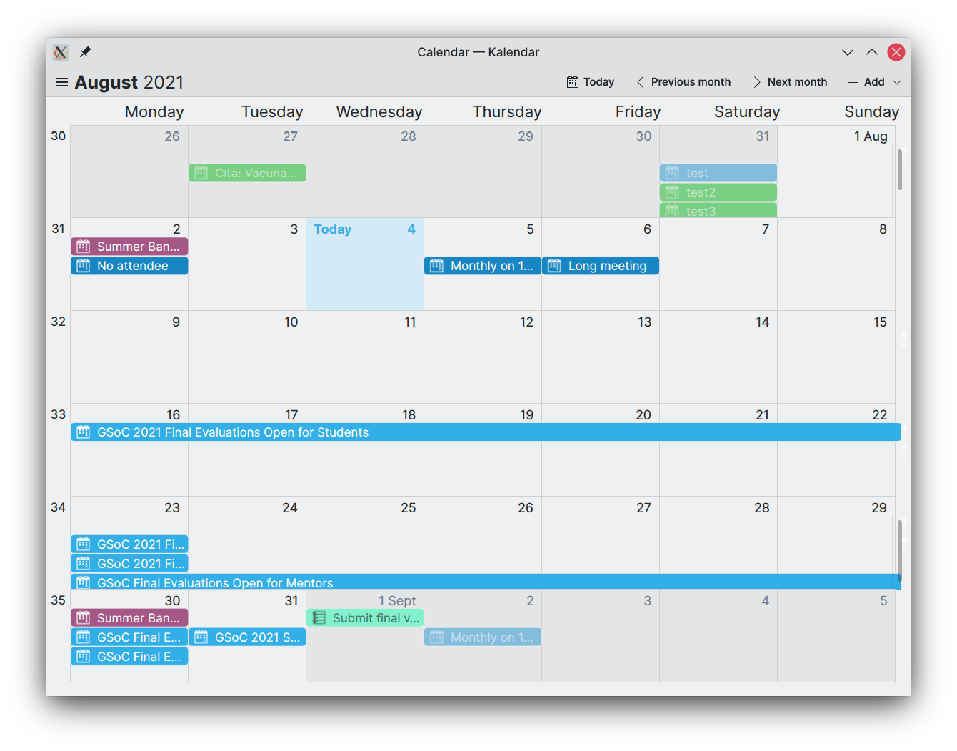
This week, we spent some time making Kalendar more pleasant to look at. We took some of your feedback from last week (thank you for your ideas!), and we think you will like what we have in store for you in this post.
There’s another feature some of you have asked for that you will also see here. 😉
Improved the appearance of the month view and visual consistency across views
!14: Improve month view and schedule view visually
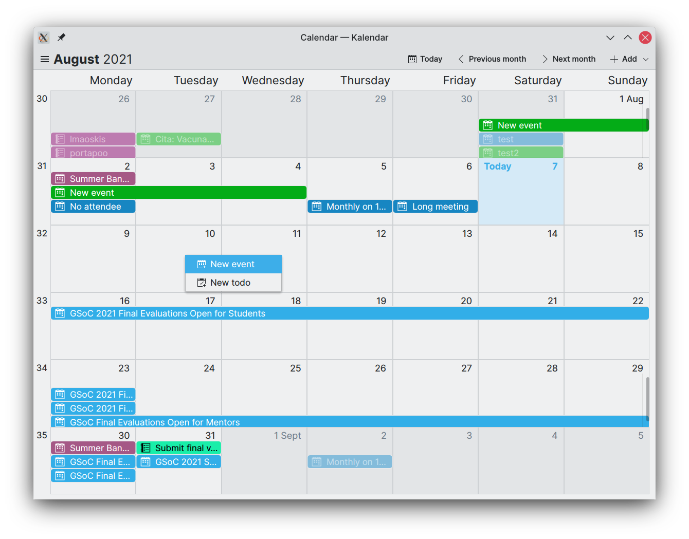
Here’s a comparison of the old (left) month view, and the new (right) month view:
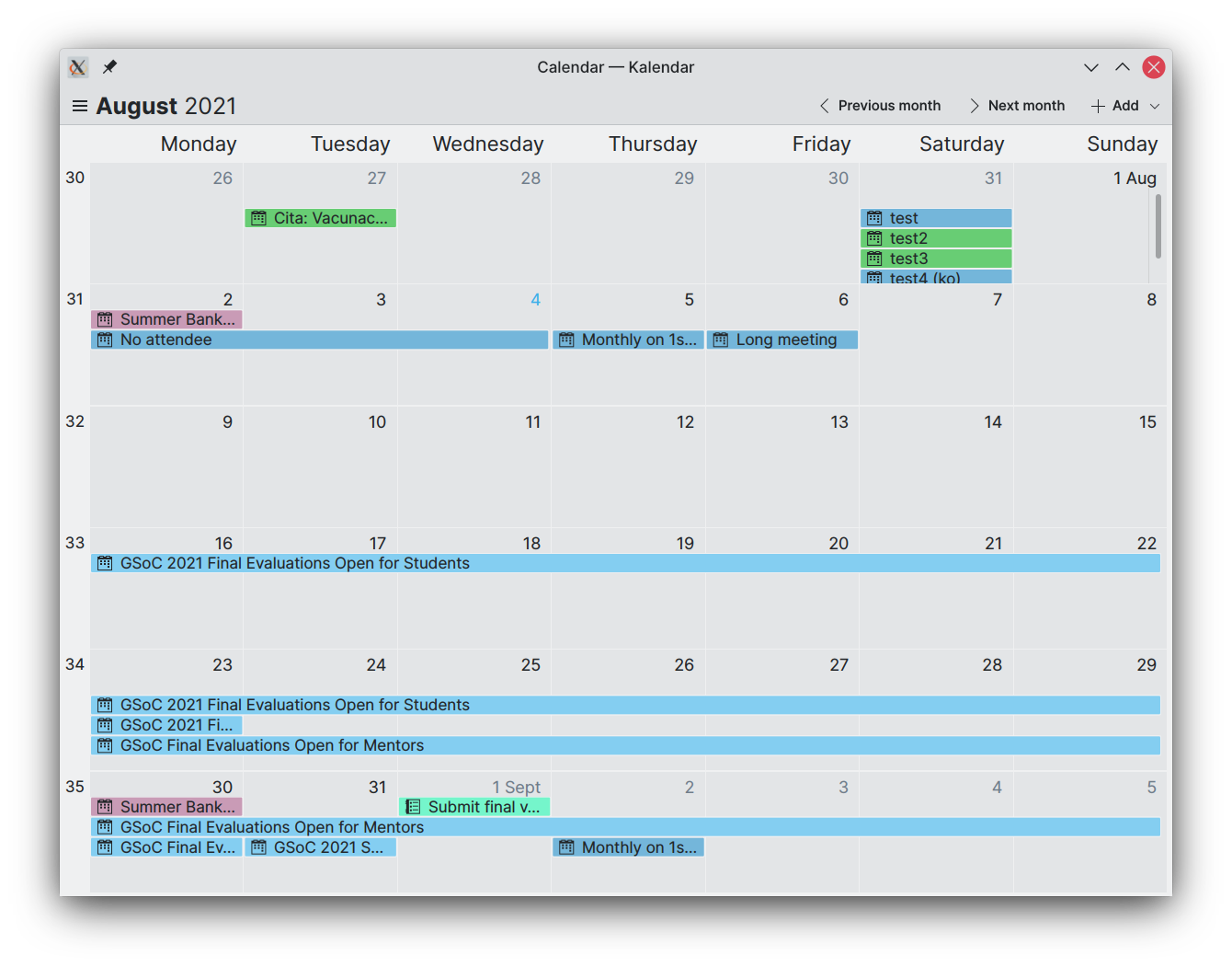
Better, right? Well, a lot of little visual tweaks do add up to make a big difference. We started with the event ‘lines’, which were previously not very contrast-y and sometimes tough to read. Now, we have given these event lines more vibrancy and ensured that the text colour changes depending on the colour for better contrast.
We have also given these lines slightly more padding, making them feel less cramped. Adjustments to the border radius now also make their shape match those of the incidence cards in the schedule view.
More changes for consistency include the separation lines between the cells in the month view grid, which are now the same colour as the Kirigami separator components used in the schedule view.
The most noticeable change is the differential colouring of the month view cells. Cells that correspond to months other than the selected month are now darker, and their events have less contrast. For the cell corresponding to the current day, the background is now highlighted, and the day number is bolded with “Today” text being featured alongisde it. This should make it much easier for you to locate the current day on the grid.
By the way, we also added the “Today” highlight to the schedule view. 🙂
Added location map to incidence information drawer
No MR yet: code can be found on branch work/location_map
We are also working on including a map in the incidence information drawer for incidences that have a set location. I know some of you asked for this, and I’m glad you did: it looks pretty cool!
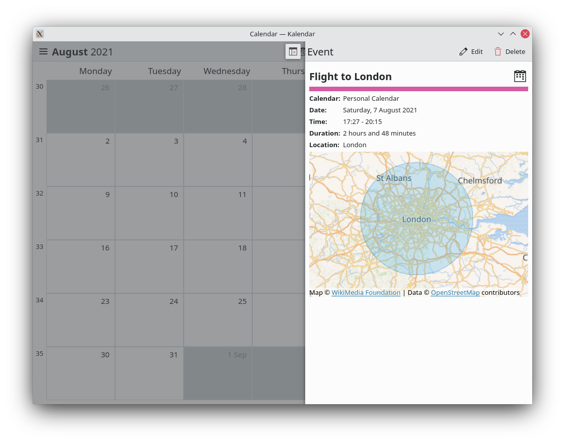
When opening the drawer, Kalendar fetches data from OpenStreetMaps to display the area where your event or todo is taking place, overlaying a blue circle for the exact location. In cases where a location can’t be found from the event’s set location information, you’ll see a dismissible warning instead.
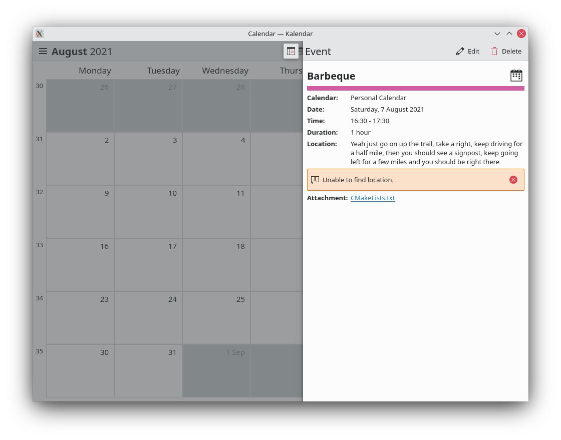
If you like exploring around the map, that’s fine: as soon as the location leaves the map’s viewable area, a button will show up that will take you right back to the location.
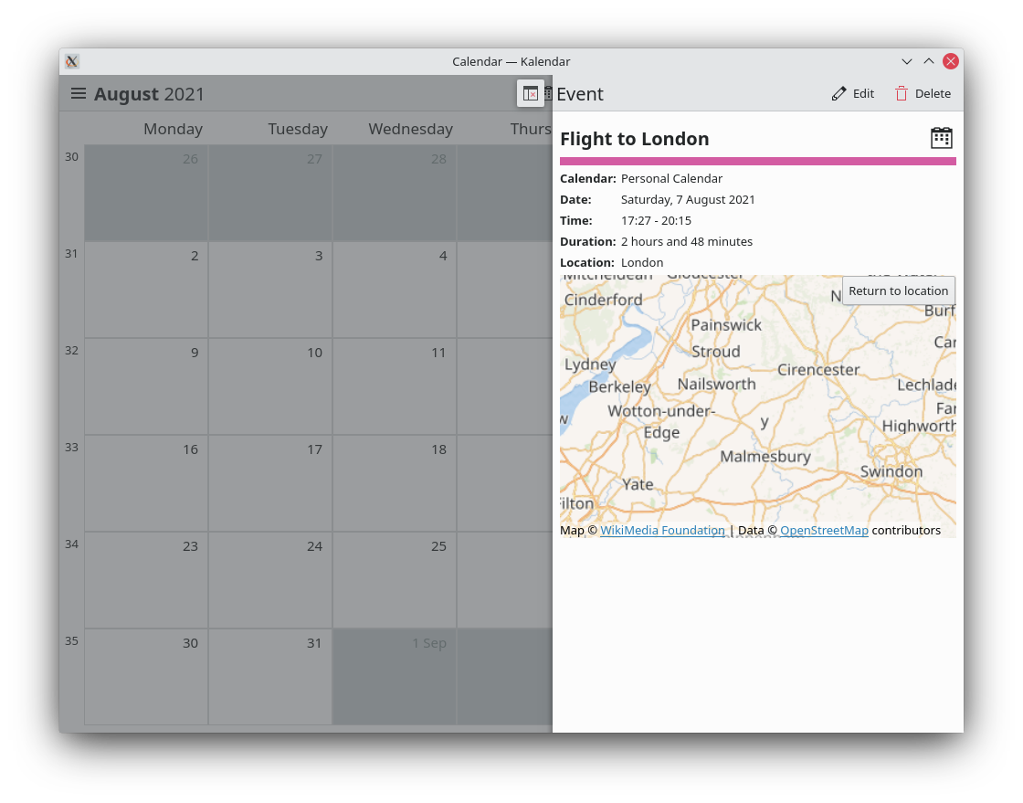
This feature, unfortunately, comes with a big caveat. There are several reports of QtLocation Map components crashing QtQuick applications on some systems (including my own!). We are going to keep working on this feature, and hopefully most of you will be able to enjoy it — but it will be opt-in so that users with machines affected by these crashes can still use Kalendar as normal.
If you know about this issue and know of a workaround/fix, please let me know!! It’ll make me very, very, very happy. 😀
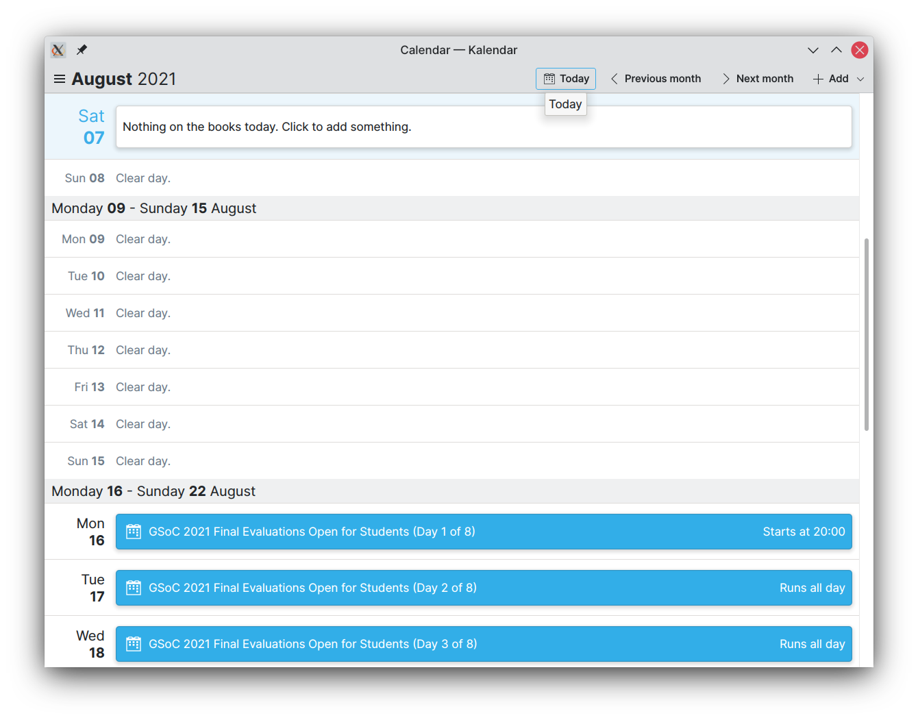
Added “Today” button in all views
!14: Improve month view and schedule view visually
Both the month view and the schedule view now feature an action that lets you quickly return to the current day. This should make it easier to get back to where you want to be in your calendar.
Day drop-down menu now also available in the month view
!14: Improve month view and schedule view visually
Right-clicking on a day in the month view now popups a helpful drop-down menu that lets you quickly and easily add incidences of your choice to your calendar.
To be honest, this should have been working before, but it wasn’t. Now it is. Yay!
Added additional icons to the schedule view
!14: Improve month view and schedule view visually
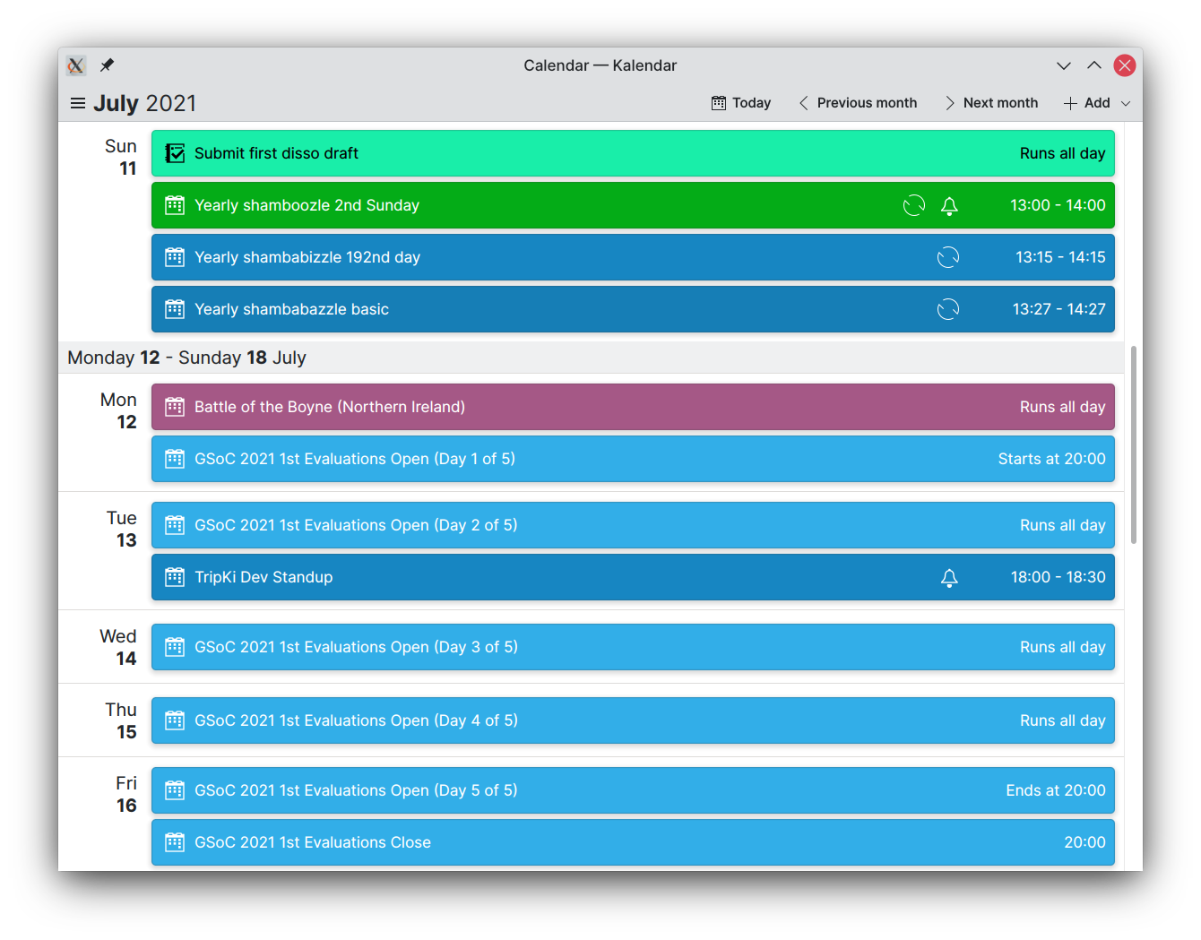
Previously, the cards on the schedule view displayed an icon when an incidence had a set reminder. Now, the cards in the schedule view also display whether an event is recurring or not.
Bug-fixes
Two important bugs have been squashed over this past week.
- Multi-day incidences that span over several weeks are now displayed properly, instead of spanning over the entire following week (!14: Improve month view and schedule view visually)
- Calendars are now selectable when running Kalendar on non-bleeding-edge versions of KFrameworks/Qt No MR yet: code can be found on branch work/collection_fixes
These fixes should go a long way to letting more of you test Kalendar!
Coming up next
Work on the location map will continue over the course of next week. Fingers crossed, we’ll be able to find a fix for the map crashes and get that feature rolled out to everyone. We’re also in the process of making a todo view, which should let Kalendar take care of much of your time-related productivity needs.
Is there anything you’d like to see added to Kalendar? Get in touch! I’m @clau-cambra:kde.org on Matrix.
Is it OK if I leave a comment instead of opening issues?
Don’t write “Calendar – Kalendar” in the tile bar. A single-purpose applications does not need to spell out its purpose in the title. Either spell out the current view (“August 2021 – Calendar”) or only the app name.
In the title bar, use an en-dash (“–”), not an em-dash.
Use the “plan” is already a great icon. Use that. It’s part of the Breeze Icons set.
Keep up the good work.
Thank you for your suggestions! Honestly, I hadn’t given the title bar much thought but you are right, it needs changing.
As for the icon, yes, we need one. We haven’t settled on one yet but yes, “plan” is not a bad choice at all. 🙂
This looks so much better with the new colors! Thank you! 🙂
However, there are some visual glitches, you may already have spotted yourself for sure in the very first screenshot:
https://claudiocambra.com/wp-content/uploads/2021/08/Kalendar_monthview_new.png
* the calendar icons within the events look blurry
* July 31 and August 23ff: There’s some space left on top, why does the last of the three events need to be vanishing at the bottom?
* If you look at the very far right, where the scroll bar is:
– Aug 1 and Aug 29: There’s a vertical line
– Sep 5: The tile looks wider than the one above
– There are white calendar icons behind the scrollbar
* For some reason the the dates in July looked crumpled
Is the hamburger menu and August 2021 strictly related? if not, I would probably add some margin between them. 🙂
All the best!
While the “y”s of “Monday” and “Tuesday” are for sure definitely above the corresponding column, the ones of the later week days, especially the “y” of Sunday, are no longer correctly aligned.
Looks great! Amazing work on this! That map feature is really cool and useful and the use of icons and text for buttons and clear ways to navigate between views, like a “Today”-button everywhere, really makes it feel practical and easy to use. Looking forward to using this as my main calendar!
This has also been fixed over the weekend!
Here’s an up-to-date screenshot of the monthview:
https://claudiocambra.com/wp-content/uploads/2021/08/Screenshot_20210809_002513.png
Thank you for your eagle-eyed observations. 😉
* I will take a look at the icons, they do look off.
* Yes, we need to fix something in the function that lays out the lines for the events (or in the QML that places the lines there).
* The vertical lines are scroll bars — if you have too many events in a week and there is not enough vertical space to fit them all, you can scroll the entire week row to view all of them.
* The white calendar icons, along with the event lines poking outside of the day grid, were fixed over the weekend — this screenshot is a few days old. 🙂
* I have only been experienced some of these glitches on my Nvidia powered laptop, which leads me to believe that this is likely something further down the line. The crumpled dates in July, for example.
* Good point. Will add spacing!
You are welcome! 🙂 Just noticed in your latest screenshot (Screenshot_20210809_002513.png), which already looks very much improved:
1) There’s some margin between week 31 and 32 as well as 34 and 35. All others touch each other.
2) Maybe you can make the scroll bar centered within the vertical line and the outlining of the tile?
I am really looking forward to trying it out myself soon. All the best!
The margin is, once again, an issue with Nvidia rendering and likely something to do with display scaling. I haven’t seen this issue on any other machine or in my VMs — I’m still trying to figure out why it’s happening on my hardware though.
To be honest, I’m not entirely happy with the way that the scrolling on the week sections works, this still needs more work. I will mess around with the scroll indicators and see if they can be improved!
Looks good! How does one get Kalendar?
Thank you!
Kalendar is still under development, but you can try it out if you’d like to test. Its Git repository can be found here and the description contains some instructions for compiling. You might need to install some libraries. 🙂
Have you seen Elementery OS6’s calendar?
> https://blog.elementary.io/images/elementary-os-6-odin-released/calendar.png
I like that the weekdays’ names are shortened and centered and have their own cell. What do you think?
and I find it pretty there is some margin on the left and right between the tiles’ borders and the events.
Yes, padding is something that has been on my list too 🙂
Sorry for the many posts, I should have just waited a minute until I got all my ideas together:
I also very much like their toolbar, especially “Previous / next month+year” and “today”.
It’s much prettier and easier to grasp imho. Do you think you could implement it? That’d be awesome. 😀
The problem is, elementary’s layout only really works on a desktop with a pointing device. Kirigami’s adaptable layout makes the previous/next month actions work on both desktop and mobile.
We also want to remain consistent with the layouts of other Plasma applications. Elementary-style headerbars wouldn’t really fit, unfortunately.
> Elementary-style headerbars wouldn’t really fit, unfortunately.
Oh, not necessarily, have you seen the new spin boxes’ design?
https://invent.kde.org/plasma/breeze/-/merge_requests/108
They resemble the ones from ElementryOS6 rather much and can be used from Plasma 5.23 on.
Though they just need optionally left/right arrows instead of ^ and v 🙂
The new spinboxes are very nice and definitely welcome, but I’m not sure how they’d be integrated into a Kirigami page toolbar which has pretty strictly defined action spots (left, main, right). I will investigate, though, as it’s definitely worth a look!
We already shorten and center the weekday names when the window becomes smaller, though I prefer the longer name when there is enough space. I will play around with the alignment and see what works best — I suspect this will be a matter of preference. In which case, it should be a setting you can change. 🙂