Last week’s large merge request added the ability for Kalendar to add, edit, view and delete todos alongside events. That MR was merged on Friday and you can now play around with it on Kalendar’s master branch!
This week, a lot of time was spent polishing that MR as well as adding a few additions to make it even nicer for you to use todos. A new MR has also been added this week which adds a convenient new feature to the incidence creation process.
Let’s go through what’s new!
Making todo completion more granular and accessible
!12: Add support for more incidence types
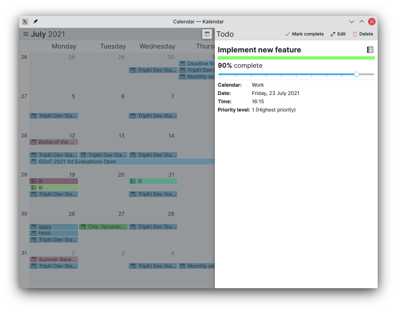
Since last week, you were able to create and view new todos and mark them as complete or incomplete from the incidence information drawer. That was nice, but it didn’t offer much granularity over setting exactly how complete a todo was.
This week, the incidence view component now includes a slider that lets you easily change how complete an ongoing todo is. The completion of a todo is also clear and easily visible near the top of the drawer.
Adding support for todo-specific features
!12: Add support for more incidence types
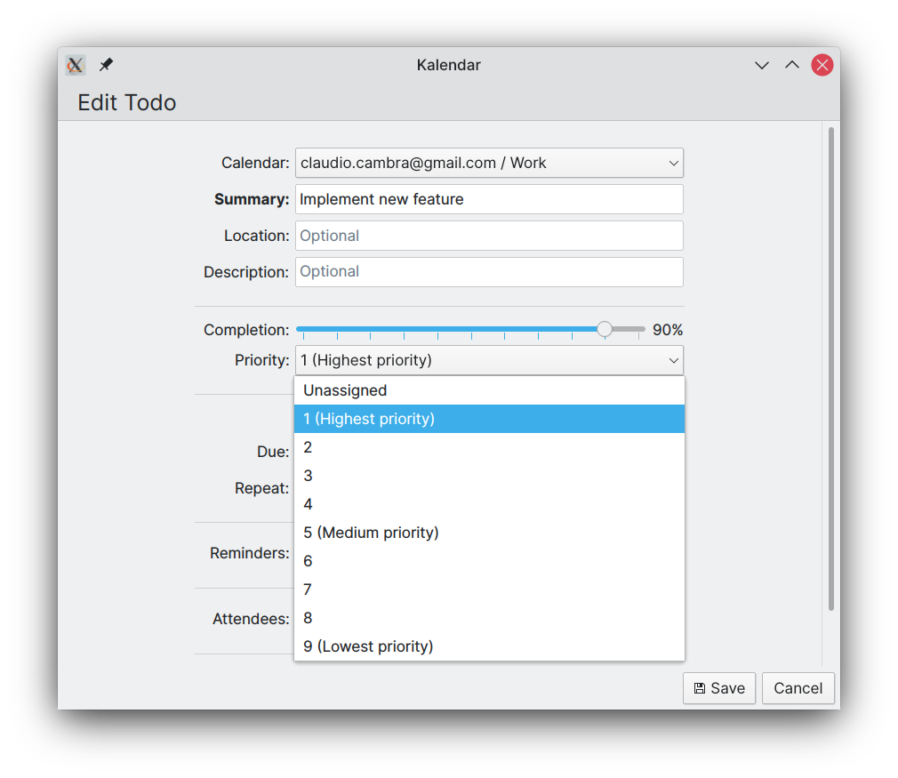
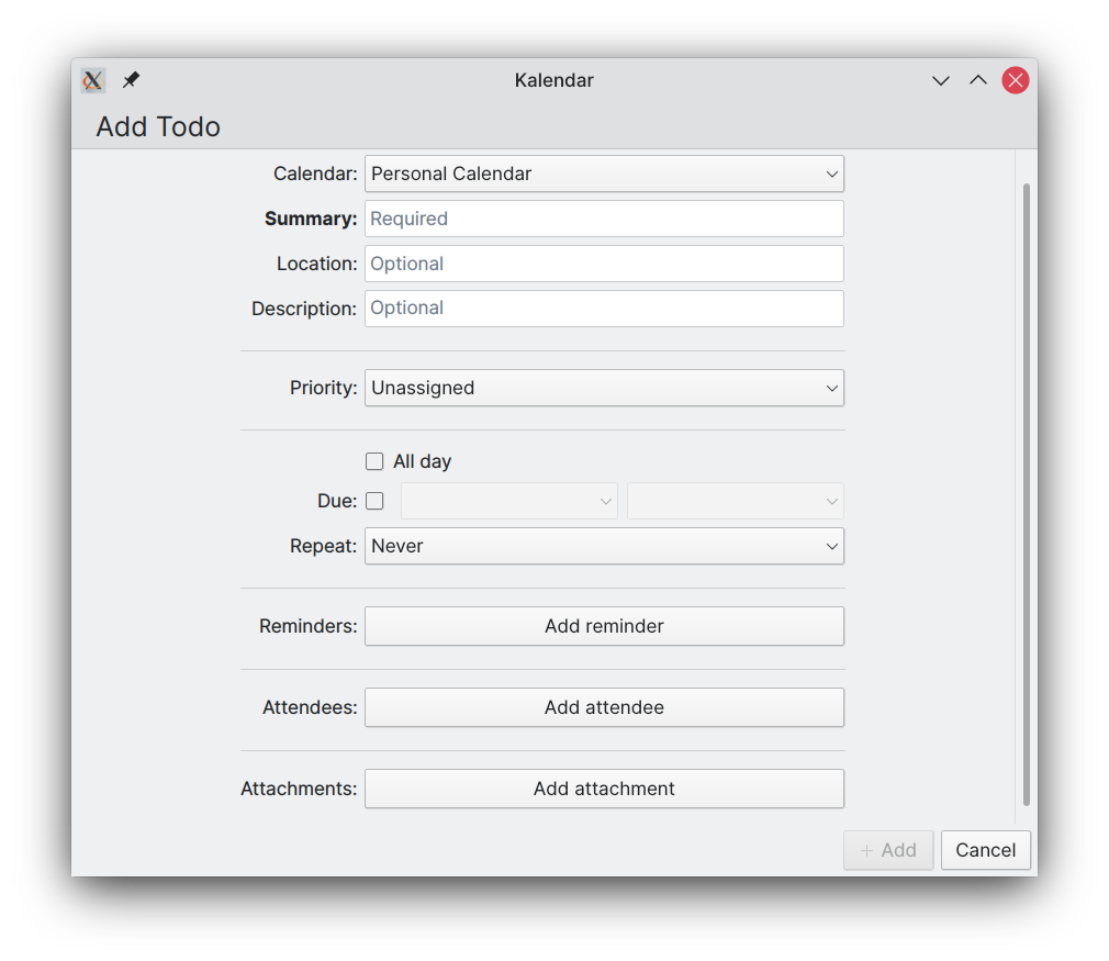
Kalendar now also lets you adjust the priority level of a task. Priority levels will let you quickly see how important a task is, and to manage your schedule in accordance with the importance of different todos. Priority levels can be set on a scale of 1–9 (descending order of importance). This is then presented to you in the information drawer, with a short description of what that priority level means.
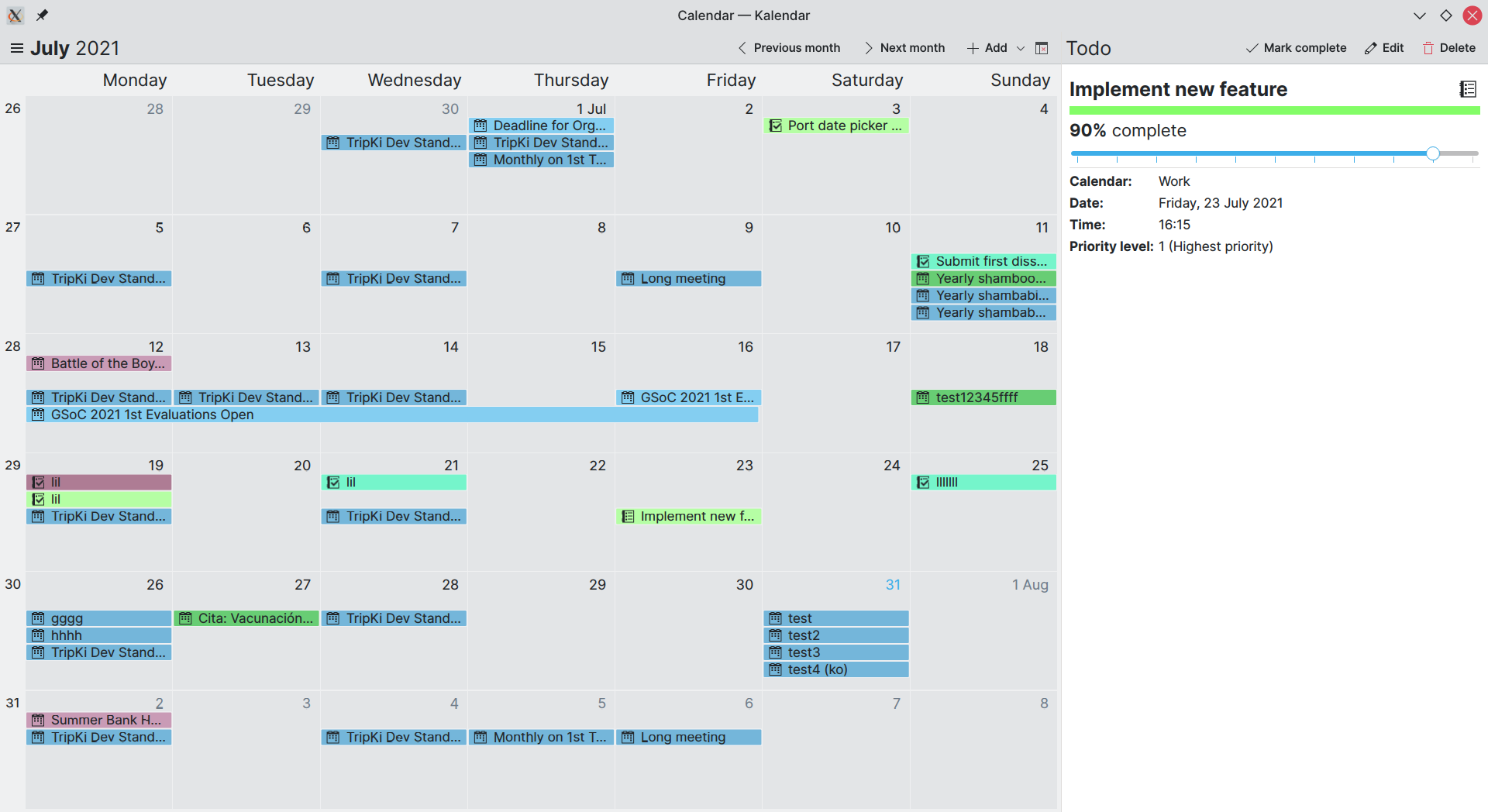
Another new feature specific to todos is the ability to create todos without a set due date. This currently makes the todo invisible on Kalendar, as it won’t show up on the currently supported time-based views… but this will not be the case forever. 😉
Making incidences’ right-click drop-down menus more useful
!12: Add support for more incidence types
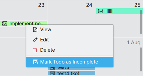
Whereas in past weeks right-clicking on an event or todo only presented you with the choices ‘Edit’ and ‘Delete’, the drop-down menu is now a little more useful. Two new options have been added: the first is ‘View’, which opens the information drawer in much the same way that left clicking an incidence would do. On todos, you are also presented with the option to mark the todo as complete or incomplete depending on its status, which should make it easy for you to quickly alter that todo’s status.
Adding a contact picker
!13: Add a contact picker for easy attendee addition
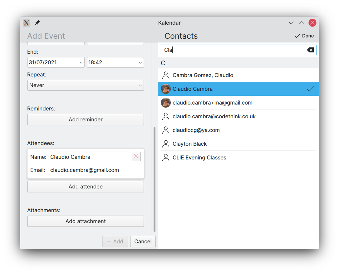
Kalendar’s incidence editor now features a convenient contact picker. You are given the choice of using it when choosing to add new attendees to an incidence, helping you add guests more quickly and easily than doing so manually.

The contact picker features a list of your contacts (including those in your synchronised online accounts), letting you select them, remove them, or search through them as you please. Adding a contact as an attendee is as simple as tapping them, with their addition indicated by a checkmark next to their names. Doing the same on a contact that has already been added will remove them from your attendees.
The contact picker’s user interface is heavily based on the work done by the Plasma Mobile Phonebook team, so a big thanks to them for making such a nice-looking app. 🙂
Coming up next
Remember when I said that those todos without due dates won’t be inaccessible forever? Well, work is ongoing on a todo view that will let you view, edit, and sort through your todos exclusively. Thanks to comments from readers like you, we also have some ideas about new additions we can make to areas such as the information drawer.
Is there anything you’d like to see added to Kalendar? Get in touch! I’m @clau-cambra:kde.org on Matrix.