Ticking this off the todo list — Kalendar week 7 (GSoC 2021)

Last week brought a significant new addition: the schedule view. It, and all of the other features explored in last week’s post, have been added over the course of this week and are now part of the master branch of Kalendar!

  1. !8: Improved event info drawer, event collection editing, attachments
  2. !9: Add undo/redo functionality
  3. !10: Add a schedule view to Kalendar

This week brings a number of smaller visual tweaks and a significant new feature that has involved a lot of wrangling inside Kalendar’s guts. Let’s go through ’em!

Making the incidence editor prettier

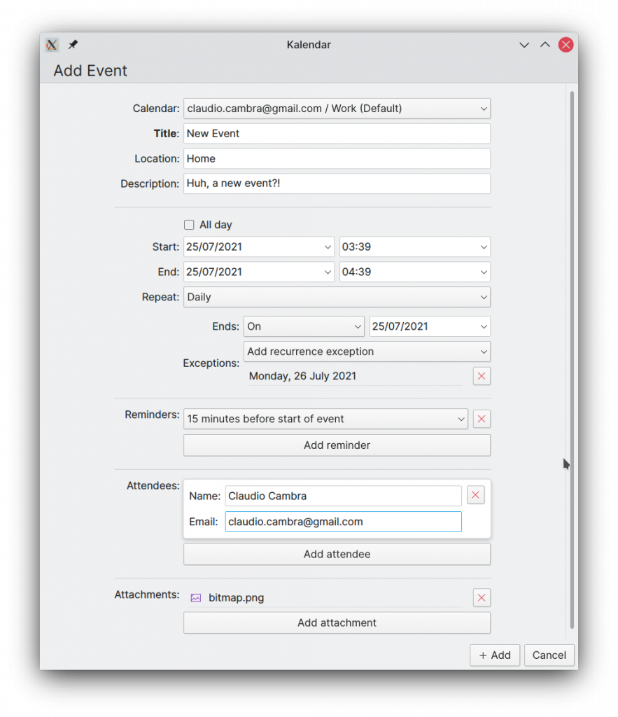
!11: Improve appearance of incidence editor

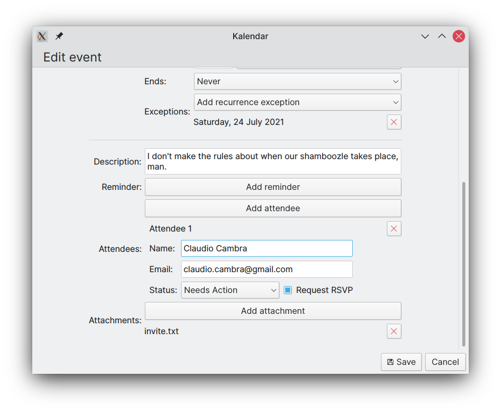
The incidence editor’s has been modified to make it nicer to look at and easier to differentiate between its different sections. The description textarea has been moved to the top, and separators have been added between each of the model-driven sections (attendees, attachments, reminders, and recurrence exceptions).

Additionally, these model-driven sections have been changed to use much more visually attractive Kirigami components.
Tweaks to the calendar views

!10: Add a schedule view to Kalendar (and tweak the month view)

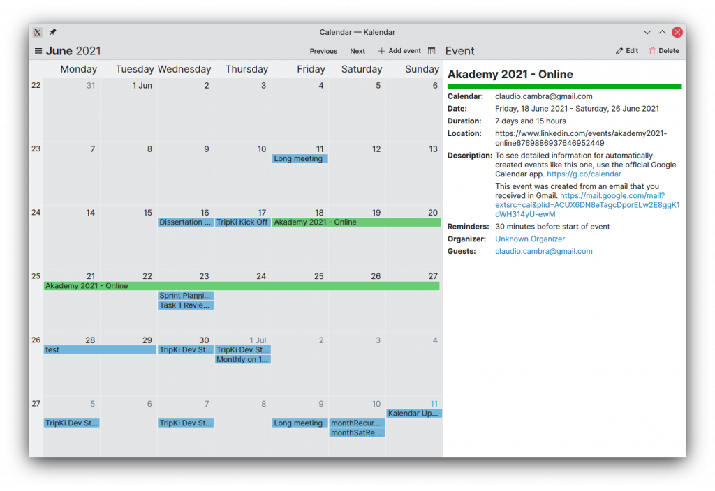
Kalendar’s views have seen some small changes. First, the schedule view: on desktop, the padding on the cards has been reduced in order to present more incidences at once, since on desktop the cursor allows you to click on smaller cards just as precisely.
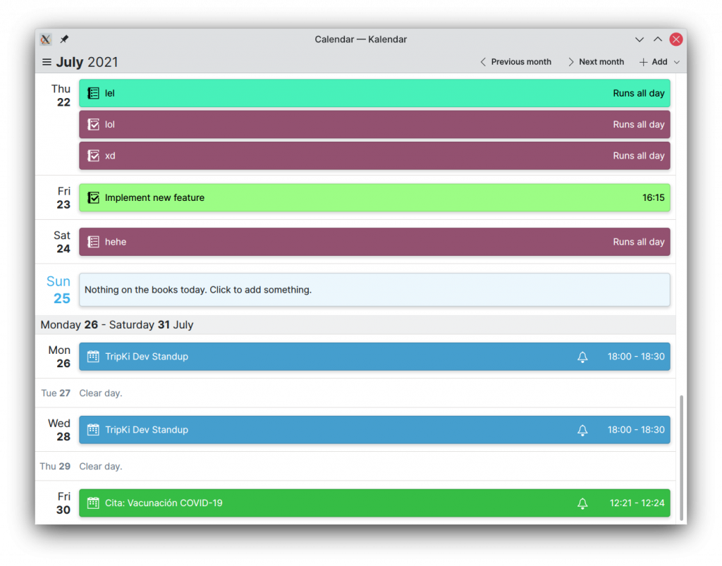
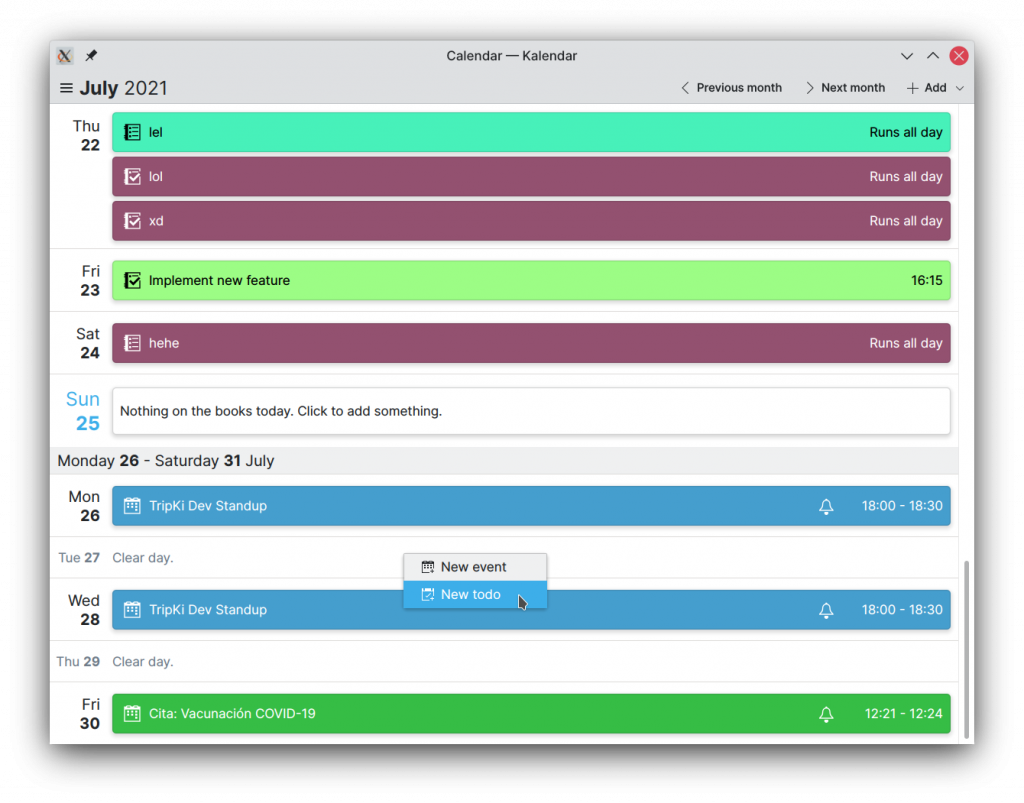
Additionally, both the schedule and the month view now let you double-click on a date in order to instantly open the event addition window set to the date you double-clicked on. Right-clicking opens a context menu that lets you specify what kind of incidence you’d like to add.
New incidence types

!12: Add support for more incidence types

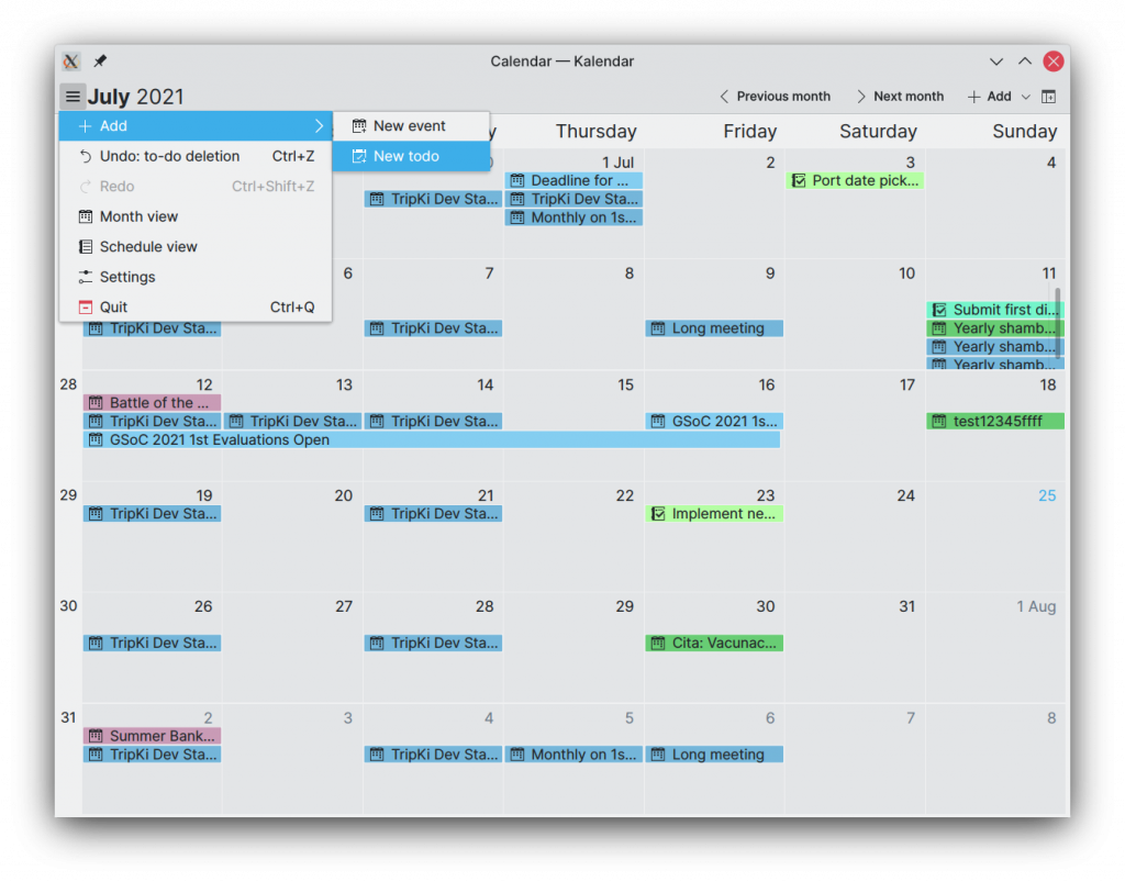
That’s right! A lot of work has gone into Kalendar this week in order to let you view, edit, and add different types of incidences. Now, you can add todos in addition to events to your calendars. This has meant significant changes under the hood, which should make work to add support for additional types of incidences much more straightforward.

Including new types of incidences has also meant some changes to the UIs of different parts of the application. Event addition buttons are now replaced with menus that let you select the type of incidence you want to add, for example. Both the month and schedule views now show what type of incidence something is alongside its name. The layout and contents of the incidence editor also change depending on what sort of incidence you are adding or modifying. In the case of todos, you can also mark them as complete or incomplete from the incidence information drawer.
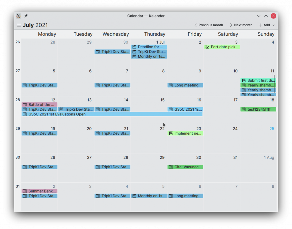
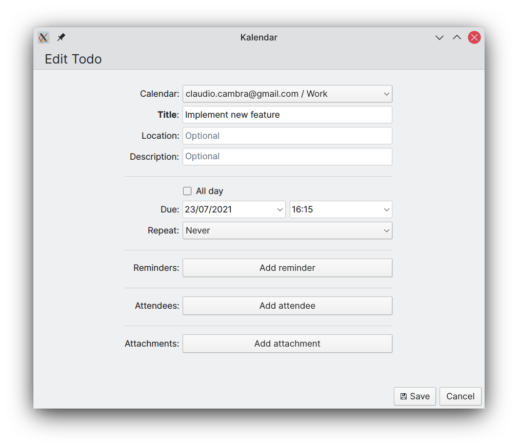
This merge request is big, so it is still under review (sorry!) but it should land over the next few days.

Coming up next

Up next will be to finish tailoring the different aspects of Kalendar to accommodate new incidence types. This will include changes to the incidence editor to include support for additional and specific features of todos. Journals will also be added in the next few days.

Also coming up is the addition of a view focused on todos — but more on that when it’s ready. 😉

Is there anything you’d like to see added to Kalendar? Get in touch! I’m @clau-cambra:kde.org on Matrix.

*BZZT* Your 12 o’clock is next on your schedule — Kalendar week 6 (GSoC 2021)

It’s hard to believe, but we are now half-way through Google Summer of Code. Wow, does time fly. 6 weeks ago Kalendar let you view events from your local and online accounts — now, it does a lot more than that!

This week brings quite a few big changes. We don’t have one merge request, but three!! They’re all in the polishing phase, and they each should get merged over the coming days. You can find each of the MRs here:

  1. !8: Improved event info drawer, event collection editing, attachments
  2. !9: Add undo/redo functionality
  3. !10: Add a schedule view to Kalendar

There’s a lot of ground to cover, so let’s get started:

Improving the event information drawer/sidebar

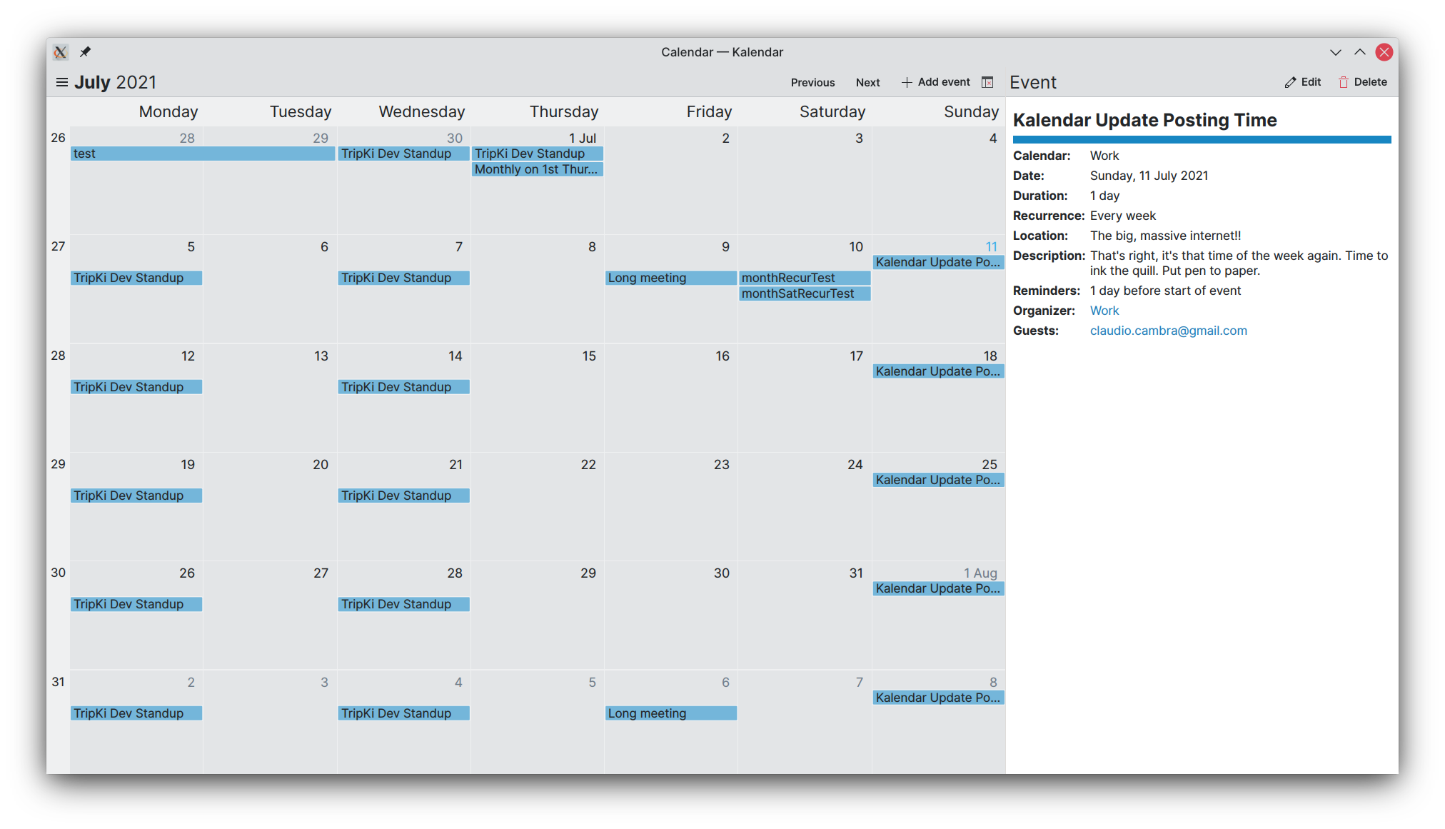
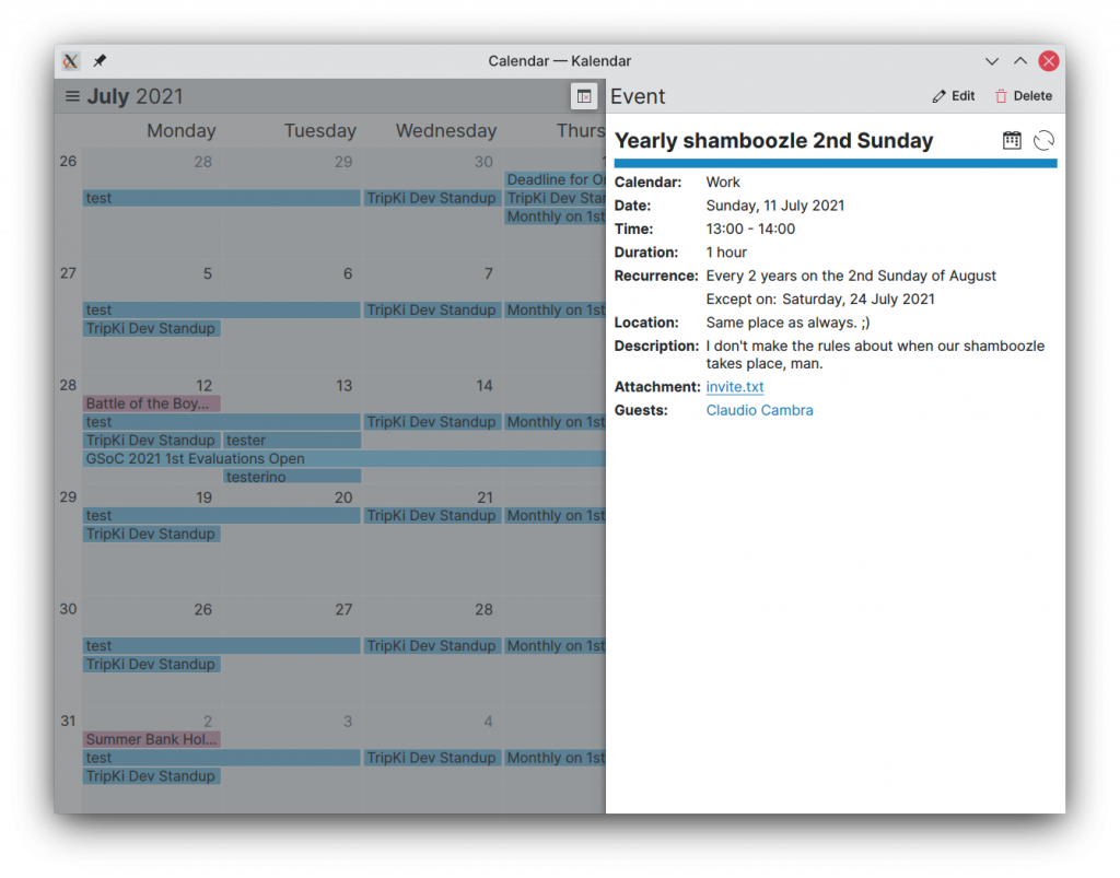
Last week, we introduced the event information component, which appears on the right-hand side of Kalendar’s window. This week, we are adding more information to this component. With these additions, the event information drawer should display all the information you need!

You can now expect to see, on top of what you could already view:

  • Fancy descriptions of the recurrence rules for your chosen event
  • Glanceable icons at the top of the event info describing the type of the event as well as if it recurs or has reminders set
  • Files attached to your calendar event, with clickable names that will open said attachment

That conveniently leads us to…

The event editor’s new capabilities

The event editor has also been upgraded to allow you to add new attachments to or remove existing ones from your chosen calendar event. This is done with a UI that is similar to and consistent with the rest of the things you can add to an event, like reminders or attendees.

Clicking the ‘Add attachment’ button pops up a dialog that, upon file selection, will attach your chosen file to your event.

The event editor now also correctly lets you change an event’s parent calendar, which means you can move an event from one calendar to another even if the event has already been created.

Undo/redo

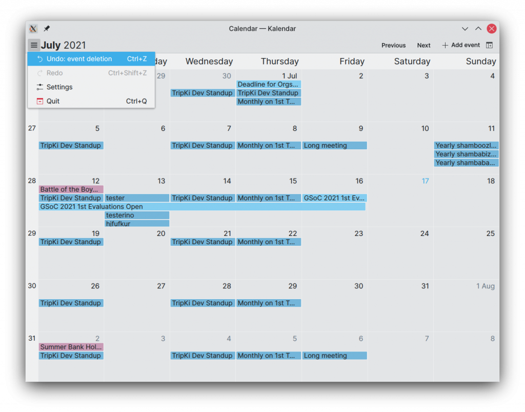
Several people have asked for some way to prevent potentially destructive actions such as event deletion and modification from being permanent. With MR !9, there is now a way to undo these changes in your calendar with simple undo/redo actions (or the shortcuts you’re used to — CTRL+Z and CTRL+SHIFT+Z). Now you can undo event creations, changes, and deletions… or redo them!

A new view for Kalendar!

Since its creation, Kalendar has supported a month view that provided you with a clean view of all events in a given month, much like a traditional calendar would.

We are now working on a new view that will be able to use alongside the month view. This view is a schedule view.

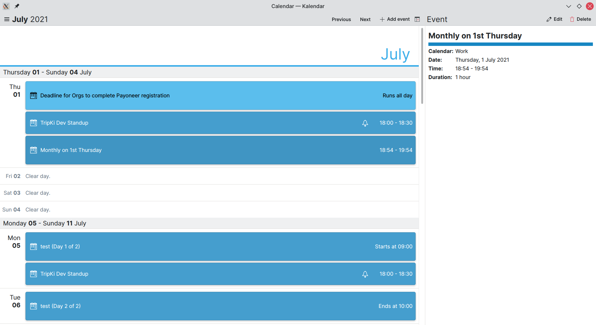
The schedule view lets you view your current and upcoming events in a simple and attractive list of cards. It opens on the current day so you can see what you need to take care of over the next 24 hours. This will be especially useful for mobile devices, where the month view might be a bit cramped.

The schedule view’s cards contain all the basic information you’ll need to know about these events. Name, time, recurrence, if the event is multi-day — you got it.

You can interact with this view as you’d expect to. Double clicking an empty day opens the event editor so you can quickly create a new event; you can also right-click on a day and create a new event from the context menu.

This view is still under development, and it will take some time to merge. Still, it is quite exciting and I couldn’t help but share on the progress that has been made!

Coming up next

The next big change we are looking forward to is adding support for more calendar items besides events — mainly journals and to-dos. This should make Kalendar a much more versatile productivity tool, though it will require some wrangling behind the scenes to get everything working well.

Is there anything you’d like to see added to Kalendar? Get in touch! I’m @clau-cambra:kde.org on Matrix.
An eventful week — Kalendar week 5 (GSoC 2021)

Last week’s MR turned into this week’s MR, and it just kept growing and growing and growing. I know I’m a mentor’s nightmare and I’m sorry Carl, I know it was a lot of changes to review…

The good news is that it was all worth it, because there have been lots of changes this week — small and big. Even better, you’ll finally be able to find the changes I went through in last week’s post on Kalendar’s master branch.

Let’s dive into the new stuff!

Editing the event editor

If you’ve been following these posts, you will have seen the event editor: an overlay sheet that lets you edit the details about an event down to a tee. Well, that overlay sheet is no more. It made sense when we had a few fields to fill, but as the capabilities of the event editor started to grow, it pretty quickly started to feel pretty cramped.

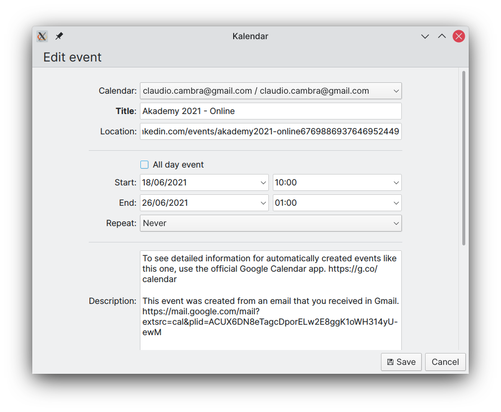
On the desktop, we now use the incredible power of windows to create a detached event editor window. So now you not only have plenty of space to punch in your next visit to your grandma’s, but you can also move it around and resize it. How revolutionary.

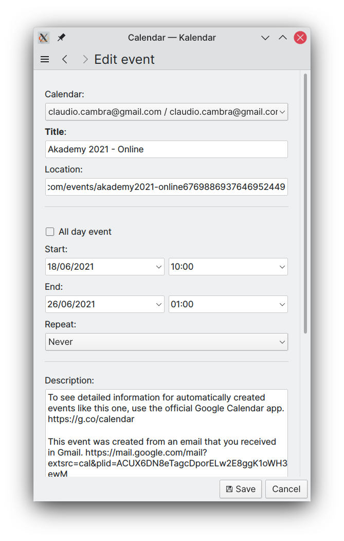
Of course, on your phone a window would be less than ideal. So if you use Kalendar in mobile mode, you’ll instead be greeted by the event editor as a page, maximising the space that the editor can have. This should let you see a lot more at once, with a lot less wasted space!

Yeeting events out of existence

Last week, deleting events was pretty low-key. You clicked delete on the dropdown and then something happened. What exactly? Who knows!

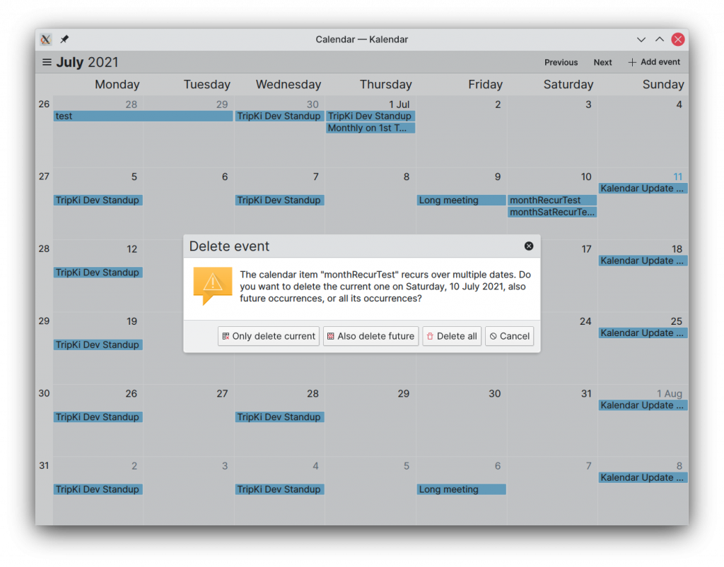
This week, if you try to delete an event, you’ll get a dialog that tells you exactly what’s going to happen. This’ll let you confirm what you’re deleting before you’re deleting it, giving you a chance to correct an oopsie. You’ll also know precisely what you’re deleting.

For recurring events, you’ll also get some handy extra options. You’ll have seen these in other calendar applications: you can choose whether to delete a specific event occurrence, all future occurrences, etc.

What’s going on?!

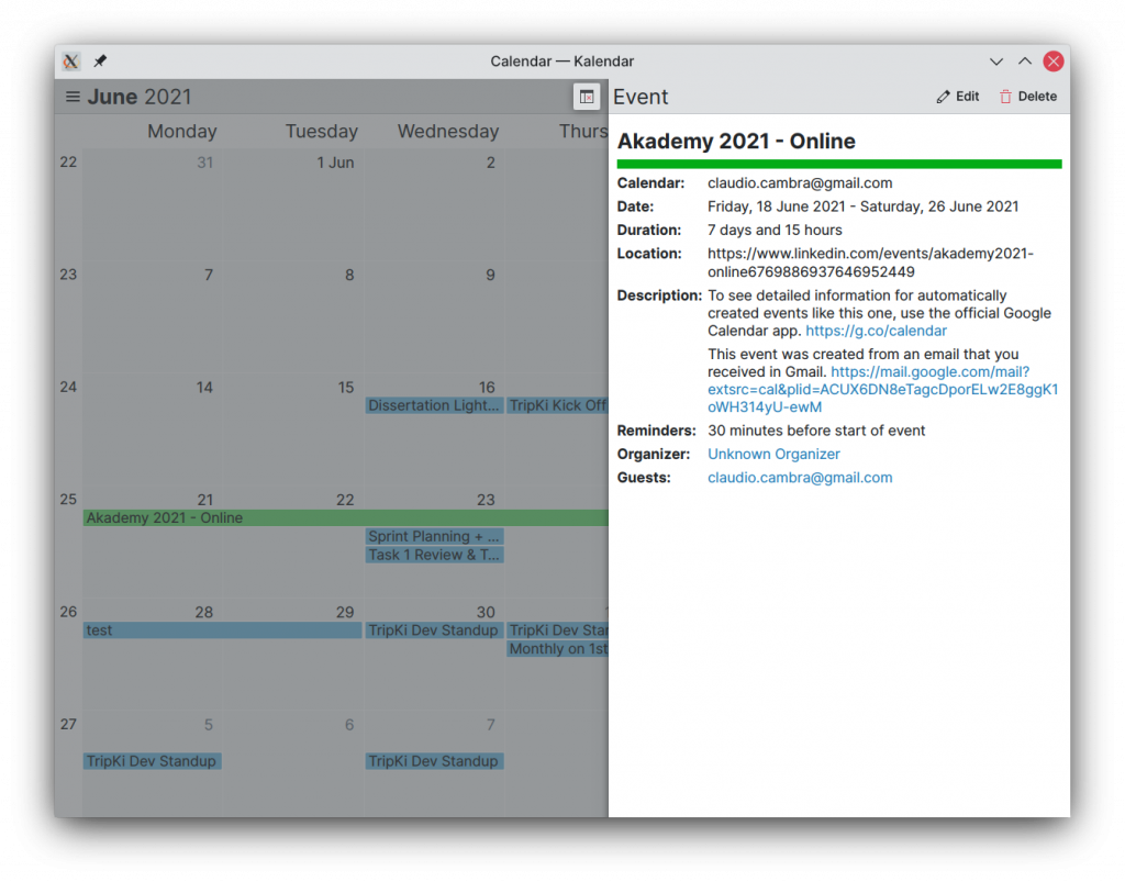
Also new this week is a better UI for viewing your events and their details. The popups have been replaced by a side-drawer that provides you with exactly what you need to know about what’s coming up: summary, description, location, and more.

On mobile, the side-drawer is an overlay drawer. This gives lets you make the most out of your phone’s vertical real estate to display as much data as possible at once.

But hey, we know, you have a great big chonkin’ display hooked up to your desktop, right? That’s why on desktop, the drawer is in fact in-line, letting you still view and interact with your calendar while it is open.

These are still under development, and they’ll get a bunch of additional useful information over the course of the next week. This includes reminder, recurrence and attendee information, clickable hyperlinks in descriptions and attendees, and icons.

More bugsplatting

The bugs continue on their never-ending march, onwards. Until the heat-death of the universe. I’m happy to say that some pretty big bugs got smashed this week, though:

  • Fixed bug where the date and time fields would show up empty in the event editor (FINALLY!!!)
  • Reminders and attendees should now always show up correctly in the event editor when editing events
  • Keyboard input in all fields – including date/time fields – works correctly, letting you edit and add events without touching your dirty mouse
  • Added warnings in the event editor for when an event has its end date set to a date before the start date. The event editor also prevents you from adding/saving an event in such a condition.
  • …and many smaller bugs too!

Coming up next

Efforts right now are being focused on getting the event info drawer up to scratch with everything you’d need to know about an event. But there’s a lot more on the horizon: other calendar items, undo/redo functionality, attachments… and new calendar views, too. Not all of that will land next week – in fact, most of it won’t! – but you can bet progress will be made. 😉

Is there anything you’d like to see added to this list? Get in touch! I’m @clau-cambra:kde.org on Matrix.