VLC macOS Interface Redesign
For the past few months I’ve been working on VLC’s native macOS interface, which has been undergoing a major overhaul in preparation for its next major release. The aim has been to improve the user experience of the media player and to push development forward in anticipation of version 4.0.
Some background
VLC has separate GUIs on Windows/Linux vs macOS. On the former two platforms, everything is built using Qt. This makes it relatively easy to code a graphical application once and have it work well on a multitude of platforms.
You can just build the Qt UI and use it on macOS too, but Qt-based applications can, by default, look a little out of place on the host system. It is certainly possible to achieve a cohesive look with the host system, but this can also mean a lot of extra work. On Apple’s OS, deeper system-level integration can also be tricky to interface with Qt components. Hence, the version of VLC users download for macOS is bespoke for Apple’s system.
For the upcoming release of 4.0, there are ongoing plans for a redesign of the desktop applications. The new designs will make them friendlier to use and nicer to look at. On both the Qt and the macOS side, this has meant a near total rewrite of the user interface. Work on the macOS UI has been done both by frequent contributors and past GSoC attendees, which pushed the redesigned application into a functional prototype state.
While the macOS version of the new VLC was capable of doing some of the basic things — playing videos/music, displaying audio tracks in your library — there were still plenty of tasks, large and small, before hitting 4.0.
Back to basics: playing audio types
VLC has always let you play music encoded in almost any format. For a while now, it has also let you easily access and manage your music library. One of the intended aims of the redesign has been to leverage VLC’s existing strengths as a media player to create a great center for your audio and video library.
In order to be a great media player, though, the user should at least be able to play their media types. In the redesigned prototype, you could play songs, but playing albums, artists, or genres was a no-go. Implementing correct playback and playlist functionality for each of these was therefore at the top of the task list.
- macosx: Play albums correctly from the collection view
- macosx: Play artists’ songs correctly from the collection view
- macosx: Play genre’s songs correctly from the collection view
Unfortunately, adding support for each audio group class quickly led to a lot of duplicated code. By later adding a new protocol and leveraging the great powers granted by polymorphism, it was possible to eliminate the majority of this duplicate code.
- macosx: Unify collection view item types
- macosx: Unify looping over mediaItems
- macosx: Clean up and simplify VLCLibraryAudioDataSource
It was also possible to easily add support for the remaining features that weren’t working for albums/artists/genres, such as the media information panel or the ability to reveal an audio item’s files in Finder.
- macosx: Enable ‘Reveal in Finder’ feature for albums, artists, and genres
- macosx: Make the Information Panel compatible with more media library item types
Thanks to these changes, all audio types and groupings work flawlessly.
Lastly, a nice touch was to stop asking users if they wanted to continue playback where it was last left off for album tracks!
Making VLC pretty
The library window is at the centre of the redesign, and though a lot of progress had been made into making it behave more like a media library, it needed a fresh coat of paint. Several of the first changes brought the design of the library window closer to the mockups, which helped make the application much more visually attractive.
While less obvious, a lot of changes were also made to small things such as margins, paddings, and sizes to make the application more visually consistent and attractive. Though they may be inconsequential by themselves, tiny changes can add up and help make a UI feel much more cohesive and polished.
- macosx: Redesign library views to fall more in line with mockups
- macosx: Make titlebar translucent
- macosx: Make collection view layouts consistent, unify setup
- macosx: Elide VLCLibraryTableCellView text contents when too long, rather than just clipping
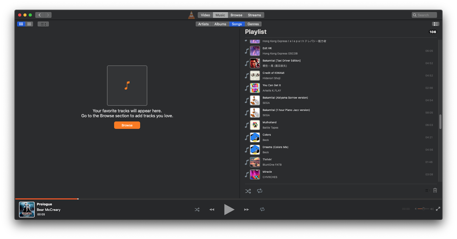
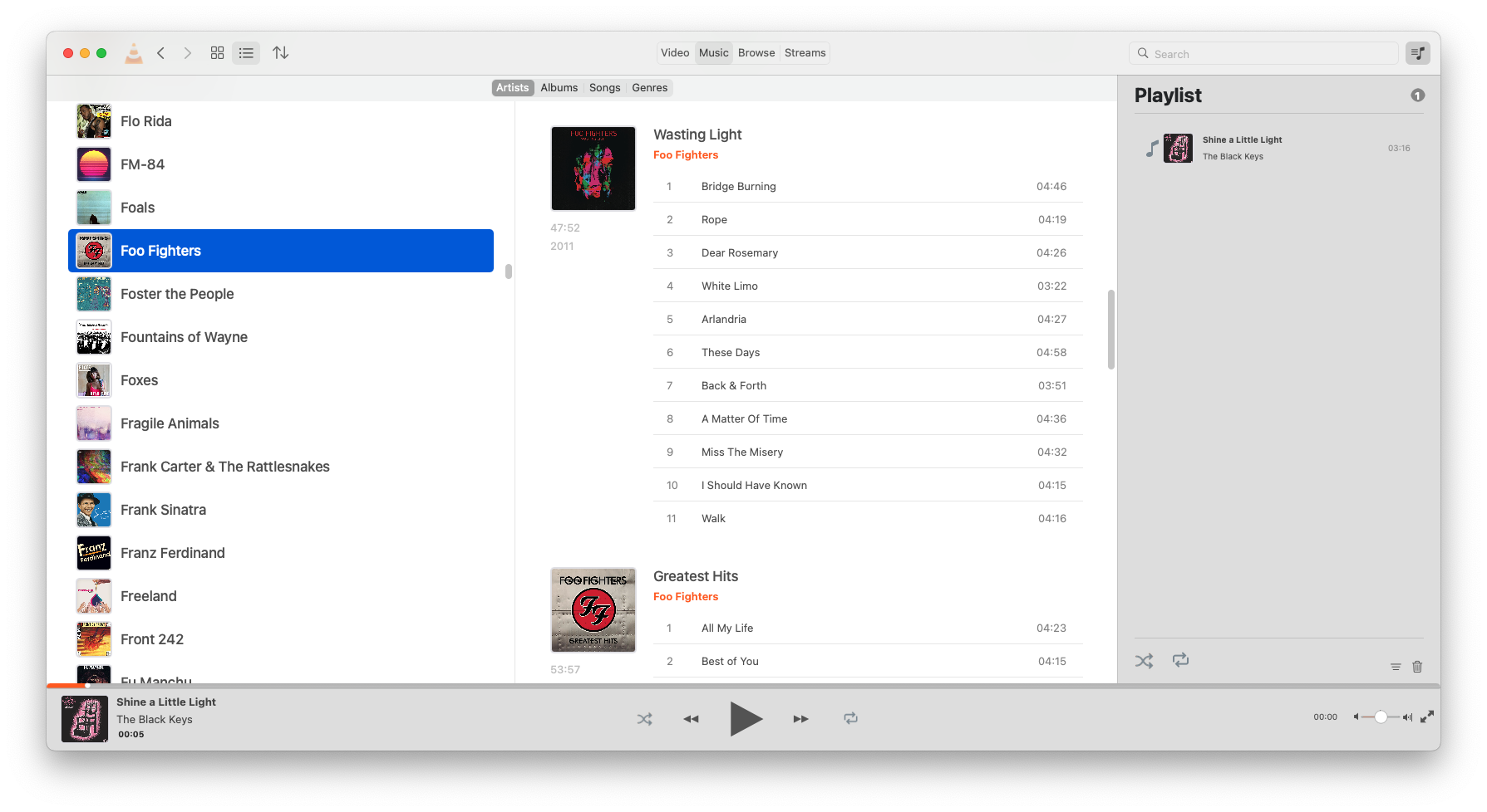
Here’s what the library window looks like now:
Navigating the library
Besides the traditional sorting and audio type switches, VLC’s new library window has some useful navigation components that make perusing the library quicker and easier.
First is a search bar. By adding a new method to the library model, input into this search bar is submitted to the media library as a search query. This filters out items that do not fit the input, saving you from endless scrolling and browsing.
Next were the forwards and backwards navigation buttons. Implementing these required the creation of a navigation stack that stores individual navigation states. Each navigation state contains details about the library window at a given point in time — the opened view, the sort order, the view mode — which can then be used by the navigation stack to set the library window to that state. A new navigation state is appended to the stack each time a navigation event occurs in the library window, and hitting the backwards or forwards button navigates the stack downwards or upwards. As expected, a new action replaces all states that are above the current position in the stack.
Thanks to this addition, you can now browse deep into your library and quickly backtrack when you get lost.
Also relevant is the addition of support for macOS’ window restoration feature, which allows applications to restore their state prior to the application being closed. This means you can now pick up right where you left off when you open VLC.
Doing more with the library
In 4.0, the idea has been to let users switch between a table view and a grid-based collection view within the media library. One is more information-dense, while the other is more approachable with big artworks. A lot of work has gone into both.
The table view
The table view is meant to be familiar and straightforward, with a list of the artists/albums/genres etc. in a panel on the left and the selected audio group’s constituent albums in a ‘selection-view’ panel on the right. While the table view worked fine, there were still improvements that could be made.
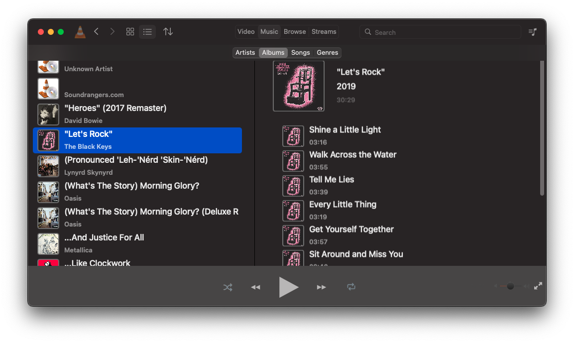
Most of the table cells in the library views use a common component which features large lettering and artwork on it, making each album or artist readable and identifiable. In the case of songs, however, these cells made album tables large and unwieldy, drastically reducing information density. The first change made here was to add a new song-specific table cell to be used in the selection view, reducing the space taken up by each cell and making the album tables more compact.
The next logical step was to redesign the album tables. Since with a list of songs space is constrained vertically, a redesigned table view which places the album artwork and details alongside the song list helps increase the number of visible songs.
Combined with the new song-specific table cells, the result is an attractive and space-efficient view of an artist’s, album’s, or genre’s songs.
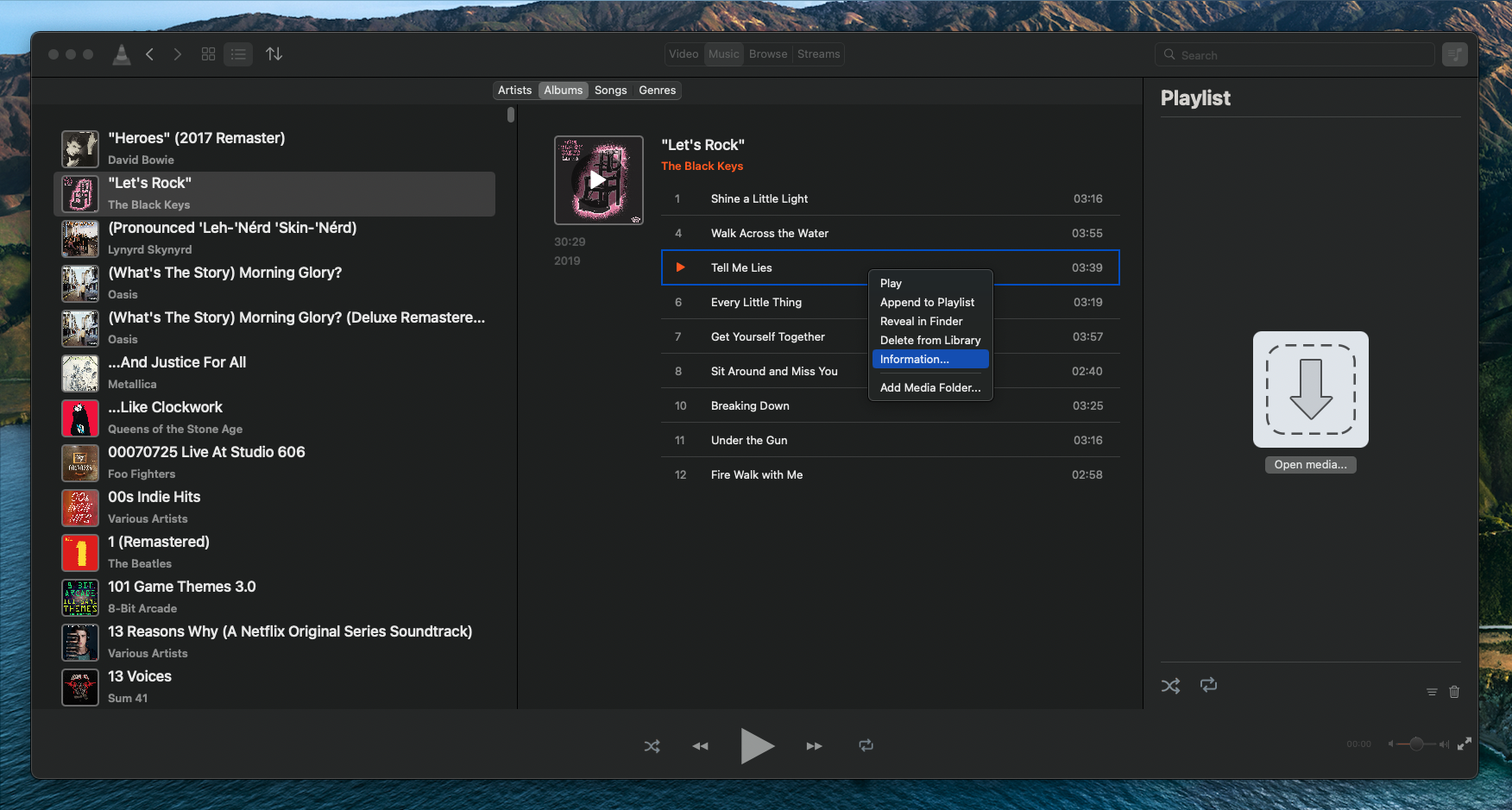
Another addition that makes the table views more pleasant to use is the addition of a context menu for all media item table cells, allowing for quick access to commonly-used actions.
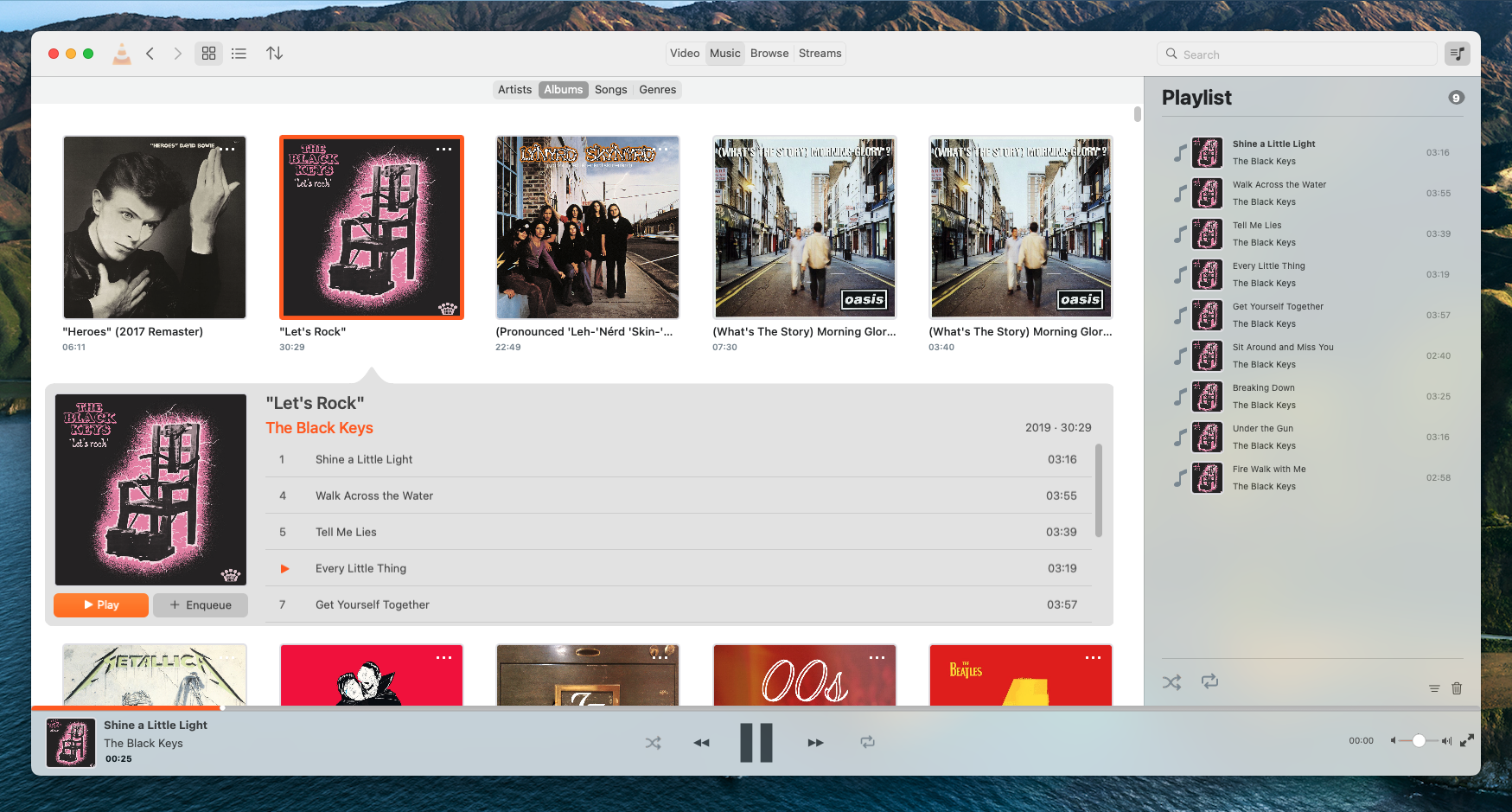
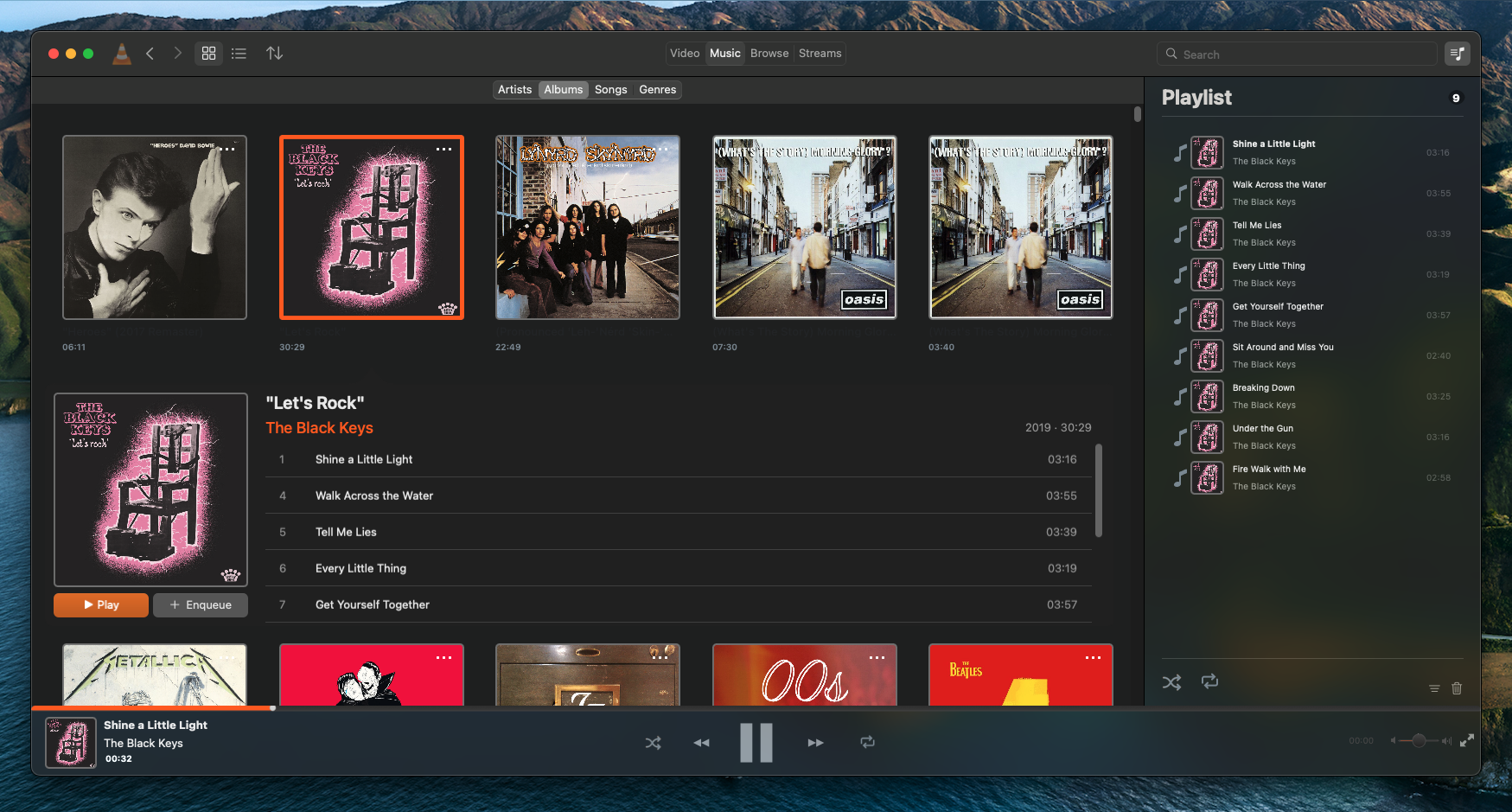
The grid view
The grid view needed more work. The biggest issue with it was that, at least at the start, there weren’t many things you could do within it. A grid of album artworks is nice to look at, but users want to be able to interact with an individual album or artist and browse through their songs.
The solution was to create a supplementary view that would appear when a user clicked on a media library item. This view slides out from underneath the selected item and displays more detail about the selected item.
The first supplementary view created provided detail for albums. This view displays the artwork prominently alongside a list of the album tracks. With the use of a custom NSCollectionViewFlowLayout, NSCollectionViewSupplementaryView, and some fancy CoreVideo animation work, it slides in and out of view very smoothly.
- macosx: Add expandable detail view to the album collection view
- macosx: Improve album supplementary view layout, add play/enqueue buttons
- macosx: Improve animation for media supplementary views
- macosx: Improve library supplementary detail view labels
- macosx: Improve library supplementary detail view backgrounds, add item indicator
- macosx: Add a highlight to library view collection view
- macosx: Make supplementary view scroll views scroll parent scroll views once at end scroll position
A second supplementary view was then added for genres and artists which shows a list of relevant albums and songs. By repurposing the work done for the table view, it was possible to do this with little additional code!
Browsing local files
If you don’t have a set media library folder, that’s okay — another new feature is the ability to browse your local filesystem from within VLC. In the “Browse” tab, VLC will display your local drives, where you can navigate through them and play supported files.
Playing with videos
There are also some new changes to the video library. The video library view is now a lot nicer to use, with the 50/50 window split being replaced instead by a continuous grid view that makes browsing your videos a less claustrophobic.
It is now also possible to temporarily close the video view and navigate the library while a video is playing. The video view can be easily reopened by playing a new video, or clicking the thumbnail in the bottom control bar.
There is still much to be done here, so watch this space!
Tweaking things, squashing bugs and improving performance
A large portion of the time dedicated to this GSoC project was spent on eliminating many of the early bugs that were present in the redesigned version of the app. From flickering album artwork, to broken library folder selection, a lot of merge requests have helped the macOS version of VLC become a far more stable and functional piece of software.
- macosx: Fix toolbar segmented buttons bug and bring design closer to mockups
- macosx: Only set placeholder image and fetch artwork when necessary, preventing constant flashing of placeholder image
- macosx: Emit the correct notifications in VLCLibraryModel
- macosx: Fix bottom control bar visual bugs
- macosx: Ensure playlist toggle button state is correctly set
- macosx: Fix the grid vs list view switching in the library view, and in transitions between library views
- macosx: Work around unresizeable library window bug
- macosx: React to more media library change events
- macosx: Fix dark mode and theme switching issues with playlist drawer
- macosx: Include NSAppearanceNameVibrantDark in dark mode detection, fixing borked labels
- macosx: Fix content insets in library audio collection view
- macosx: Fix artists in VLCLibraryModel
- macosx: Fix scroll view insets for table views
- macosx: Clear list of albums in selected group table view when switching audio library groupings
- macosx: Prevent selection of the outer cells in the audio group selection table view
- macosx: Fix and adjust album supplementary view margins and spacings
- macosx: Fix scroller insets in library views
- macosx: Retain selections after audio library data reload
- macosx: Fix the preferences’ media library folders table
- macosx: Fix layout and text elide for library collection view item labels
- macosx: Fix supplementary view arrow tip position and shape
- macosx: Fix some compile-time warnings
- macosx: Guard against crashing in frameForDisplacedAttributes of VLCLibraryCollectionViewFlowLayout
- macosx: Fix issues with initial state of library window navigation stack
Work has also gone into cleaning up code, removing unnecessary components, and speeding tasks up. This should make VLC easier to maintain and quicker to respond.
- macosx: Prevent unnecessary reloadData calls in VLCLibraryAudioDataSource
- macosx: Make VLCMediaLibraryGenre iterateMediaItems more concise
- macosx: Only dump cache and re-sort library when sort criteria has changed
- macosx: Make all library audio items use the artwork image cache
- macosx: Unify fetching in VLCLibraryDataTypes.m
- macosx: Reload audio data source more cleanly, only when needed
- macosx: Unify and refactor VLCLibraryTableCellView representation setting
- macosx: Add an internal function to VLCLibraryWindow to set current segment view
- macosx: Refactor setupVoutForWindow in VLCVideoOutputProvider
- macosx: Stop using magic numbers for segmented control segments
A personal note
Working on VLC has been super gratifying and a big learning opportunity for me. Coming from mixed Qt/C++/Objective-C++ development, I originally sought this project to put my Objective-C into more practice and to get more intimately familiar with AppKit. After 4 months of working on this project, I can now say that I have learned quite a bit, and had a lot of fun doing so. I might be one of the last few people who still enjoy working in Objective-C!
I would also like to give a big thank you to my mentors Felix Paul Kühne and Marvin Scholz for as well as Jean-Baptiste Kempf for reviewing my code, providing valuable feedback and helping me when I got stuck on specific tasks.
Looking forward to more VLC contributions! 🙂