Note: Kalendar is still under heavy development. You’re free to poke around and try it out, but it is not yet final software! If you want to contribute to its development, join us in Kalendar’s Matrix room.
This week, we have made some more UI tweaks to Kalendar, making it easier and faster to use than ever. We have also turned lots of stones and crushed lots of bugs.
Let’s get to it!
Added a window menu to Kalendar and improved existing global menu
!36: Add new in-window menu bar, improvements to global menu bar (Claudio Cambra)
Since almost the beginning, Kalendar has depended on hamburger menus to access a lot of its key functionality: undoing/redoing, switching views, accessing settings, and so on. Last week, when we introduced the new sidebar, we managed to remove most of these items from the hamburger menu and place them where you could easily and quickly find them.
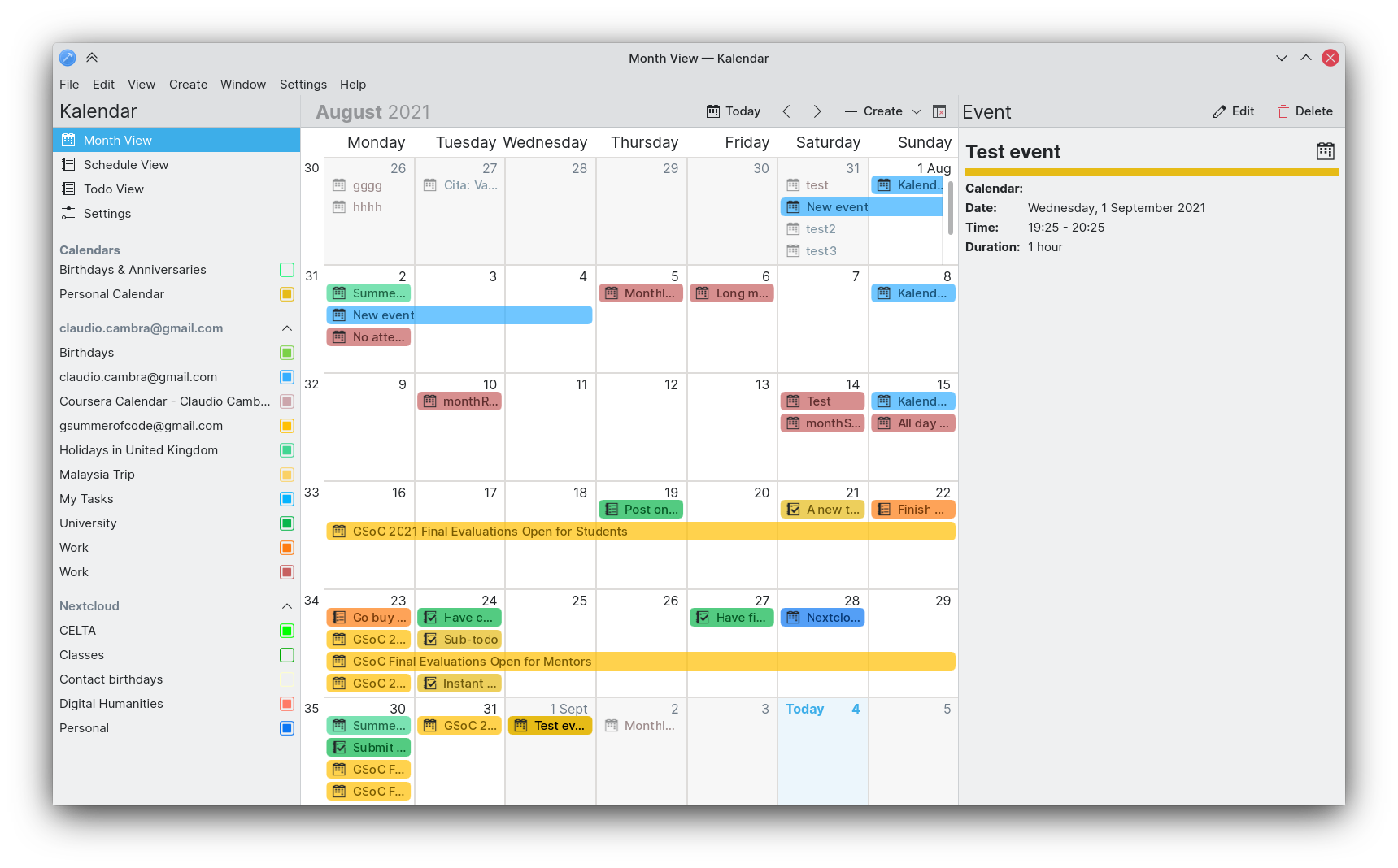
We don’t like hamburger menus because they hamper UI discoverability and they slow interaction down. So this week we got rid of them on the desktop. But don’t worry, we’ve replaced them! Kalendar now has the tried and tested menu bar, faster and clearer than the hamburger.
Carl Schwan did the lion’s share of implementing a global menu for Kalendar last week, but now we also have an in-window menu for those of you that don’t use the global menu. The global menu has been improved this week, and both the in-window and global menu have a full set of menu items that should let you quickly and more efficiently use Kalendar.
Further improvements to mobile use
!32: Rearrangements to incidence info drawer and general drawer fixes on mobile (Claudio Cambra)
!38: Make schedule view swipeable on mobile (Claudio Cambra)
Last week we introduced a new swipeable version of the month view, which made it more pleasant to use on mobile. This week, we are also adding this change to the schedule view. Much like with the month view, you can now swipe your way through the months in the schedule view!
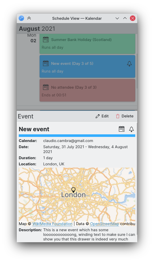
We have also turned the incidence information drawer into a bottom drawer, rather than a side drawer. This should make the action buttons far easier to reach on a phone screen, while still providing enough space to see all of an event’s or todo’s information at once.
We are also working on a navigation-focused bottom-toolbar for mobile use, which should let you more quickly swap between Kalendar’s different views.
Tidying up the sidebar
!34: Use collapsible tree views (Carl Schwan)
!39: Sort collection correctly in sidebar (Carl Schwan)
Your calendar sources in the sidebar are now collapsible, letting you hide an account’s calendars. This should make it easier to parse through your calendar list and also make it clearer as to which calendar belongs to which account. Local calendars are also now placed at the top, so they are not to be confused with remote calendars.
No todos? Here’s why
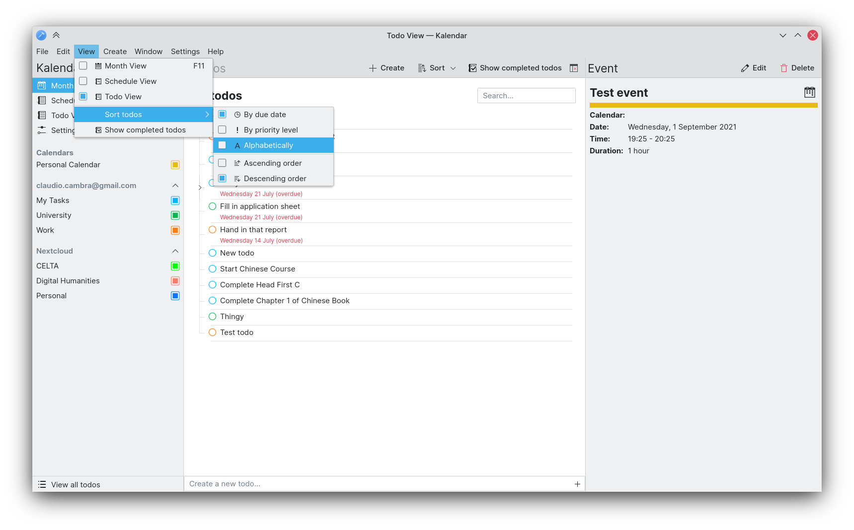
The todo view now provides some helpful messages to indicate why there are no todos to show. It can either be due to the fact there are, in fact, no todos left to complete, or because the calendar is not enable. In both of these situations, a helpful message and action is provided for you to address this.
Bug-fixes
!32: Rearrangements to incidence info drawer and general drawer fixes on mobile (Claudio Cambra)
- No more phantom todos on calendar change or searching
- Incidence info drawer now stays open after selecting a completed todo from the completed todos sheet
- Scrolling through completed todos with a mouse now doesn’t have inertia, as expected
- Global drawer now closes after making a selection when modal
- Map busy indicator in incidence info drawer no longer shows up when the location is a link
!35: Adapt window title to current view (Felipe Kinoshita)
- Window title now shows the current view’s name
!38: Make schedule view swipeable on mobile (Claudio Cambra)
- Date synchronisation between views now fixed
Commit 69aff0ce: Fixed date misalignment issues in month grid (Claudio Cambra)
- Date misalignment in month view grid now fixed
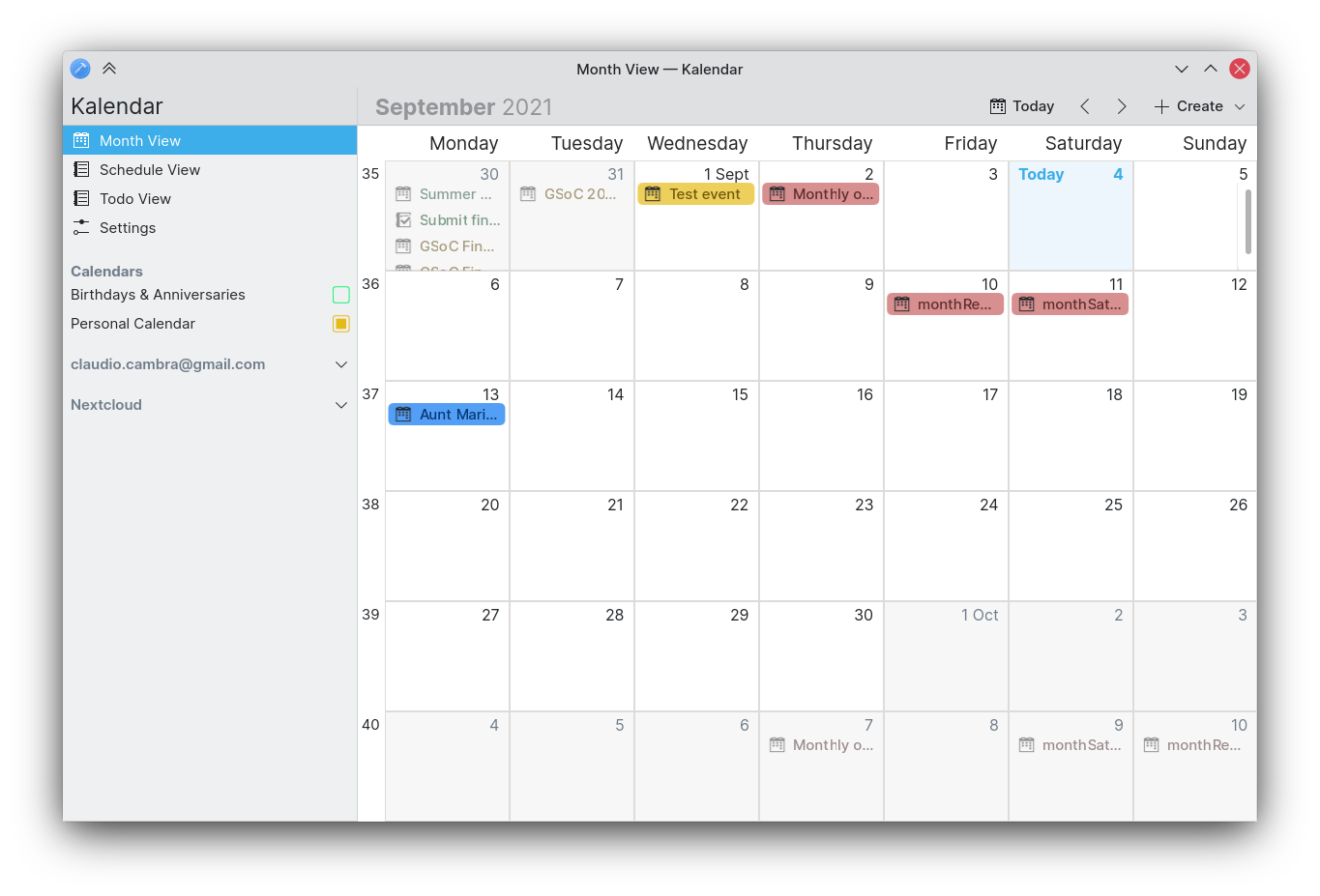
Commit 4816c94a: Fixed today button in month view (Claudio Cambra)
- Today button now fixed in month view
!37: Don’t complain about invalid dates if the event is all-day long (Boris Petrov)
- Fix inline error for all-day events
Coming up next
Everyone is asking about tag support in the todo view. We are working on it! Promise!!
Is there anything you’d like to see added to Kalendar? Get in touch! I’m @clau-cambra:kde.org on Matrix.