You might have noticed that there have been a lot of KDE releases this week, like Plasma 5.24 and Plasma Mobile Gear. Keen to hop onto this train, those of us in the Kalendar team are happy to reveal Kalendar version 1.0.
We are even happier to announce that this will be the final version of Kalendar before we will hopefully become part of KDE Gear, where Kalendar will join the rest of the KDE Application family in a 4 month release schedule, with bug fix releases in between.
A massive thank you, and much love, to everyone who has helped Kalendar reach this point! ❤️
Feel free to join us in Kalendar’s Matrix room., where we discuss Kalendar’s development, direction, and more. We are always looking for new contributors!
Our 1.0 release
We have worked hard over the past year to bring you a calendar app that you will enjoy using and that will fulfill your calendaring needs. We hope you enjoy using it as much as we have enjoyed making it. 🙂
It is now in the hands of distribution packagers to add Kalendar to their repositories. The most up-to-date and unstable version of Kalendar will continue to come from our git repository, and some users have gone ahead and started packaging builds of Kalendar coming straight from our master branch.
Git builds:
- OpenSuse has a package on OBS (KDE:Unstable:Extra)
- Fedora has two COPR packages (1) (2)
- Arch has an AUR package
- Neon has Kalendar packaged in Unstable
Kalendar will obviously still get new features, additions, and changes in line with your feedback, our ideas, and the direction in which the KDE community as a whole moves towards. With 1.0, we think we have a good application that is complete enough and stable enough for most people to use at home.
With that, lets go through what has changed since our previous release!
Massively improved stability, reliability, and predictability
A significant amount of effort has been undertaken over the past month to address Kalendar’s major bugs and to make the application as stable and easy to live with as possible. While this is not a glamorous new feature, it is the most significant reason why this release is 1.0 — we now trust it to not crash under most use-cases, and we have stamped out all critical bugs that we have found and been made aware of. You can find a full list of bug-fixes and other smaller or backend changes at the end of this post.
That’s not to say we don’t have any exciting changes…
Vastly improved event and task reminder notifications
- Determine occurrence of recurring incidences for an alarm (Volker Krause)
- Show a countdown for alarms preceding an incidence (Volker Krause)
- Don’t show start time for all day incidences (Volker Krause)
- Use geo: URIs for opening a map for an event (Volker Krause)
- Allow opening an incidence in the calendaring application (Volker Krause)
Thanks to Volker’s hard work, our event and task reminder notifications have been vastly improved since our last release.
Notifications now display event and task information much more clearly and concisely.
For example, we display different text depending on whether an incidence is a task or an event. An event reminder notification will display the start time of the event and the minutes left until the beginning of said event, letting you know how long you have until you need to be at that meeting. A task reminder, meanwhile, will let you know when that task is due, and tell you how many minutes you have left until you need to hand in that assignment.
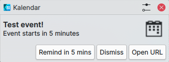
If an incidence has a URL attached to its location information, the reminder notification will provide a button with which you can quickly open your default web browser. If you happen to have geolocation data attached to your event or task, this button will open your default mapping application instead.
You can now also click on the notification itself and open the event or task inside Kalendar. Upon clicking on the notification, Kalendar will pop up with the view set to the incidence time and with the incidence opened for viewing.
Work is now well underway for our notification system to make its way into KOrganizer too, so those of you who use that application will be able to enjoy all of these changes in the coming releases!
Splashes of colour
- Add calendar color circle to calendar drop-down in incidence editor and change rectangles in calendar picker page to circle (Claudio Cambra)
- Add circle to combo box display too (Claudio Cambra)
- Added background tint to checkboxes (Claudio Cambra)
Calendar colours are one of the quickest ways to be able to differentiate one calendar from the next, and we’ve added touches of these colours throughout the application.
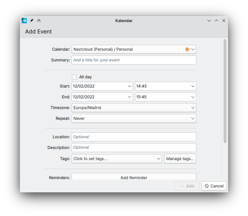
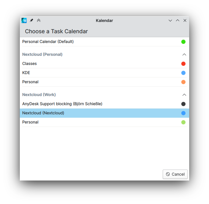
First, the incidence editor’s calendar selector now has a coloured circle that matches the selected calendar. If you’re like me and you can only really tell what calendars you’re using by colour, that should be helpful! You can also find these in the tasks view’s calendar picker, which you can invoke by adding a quick task in the ‘All tasks’ mode.

A smaller touch has been added to the circular checkboxes in the tasks view. Tasks’ checkboxes now have a subtle background colour matching the colour of the checkbox outline and fill, which makes them look quite nice.
Usability improvements
- Set better default time when converting event from allDay (Slawek Kaplonski)
- Drag and drop convert to and from all day events (Slawek Kaplonski)
- Add animation to the “Now” button in the hourly views (Slawek Kaplonski)
- Remove incidence type icons from events in month view, add event start times in incidence delegates (and due dates for todos) (Claudio Cambra)
- Add process to the icons in the task view (Carl Schwan)
- Add ability to customise and edit calendars that are also resources with context menu (Claudio Cambra)
- Add ltr to the treeview (Carl Schwan)
Thanks to Slawek, Kalendar is now smarter about what start times and due times are set by default for an incidence. New events will always have start times set to the nearest future quarter-hour, or due times in the case of tasks.
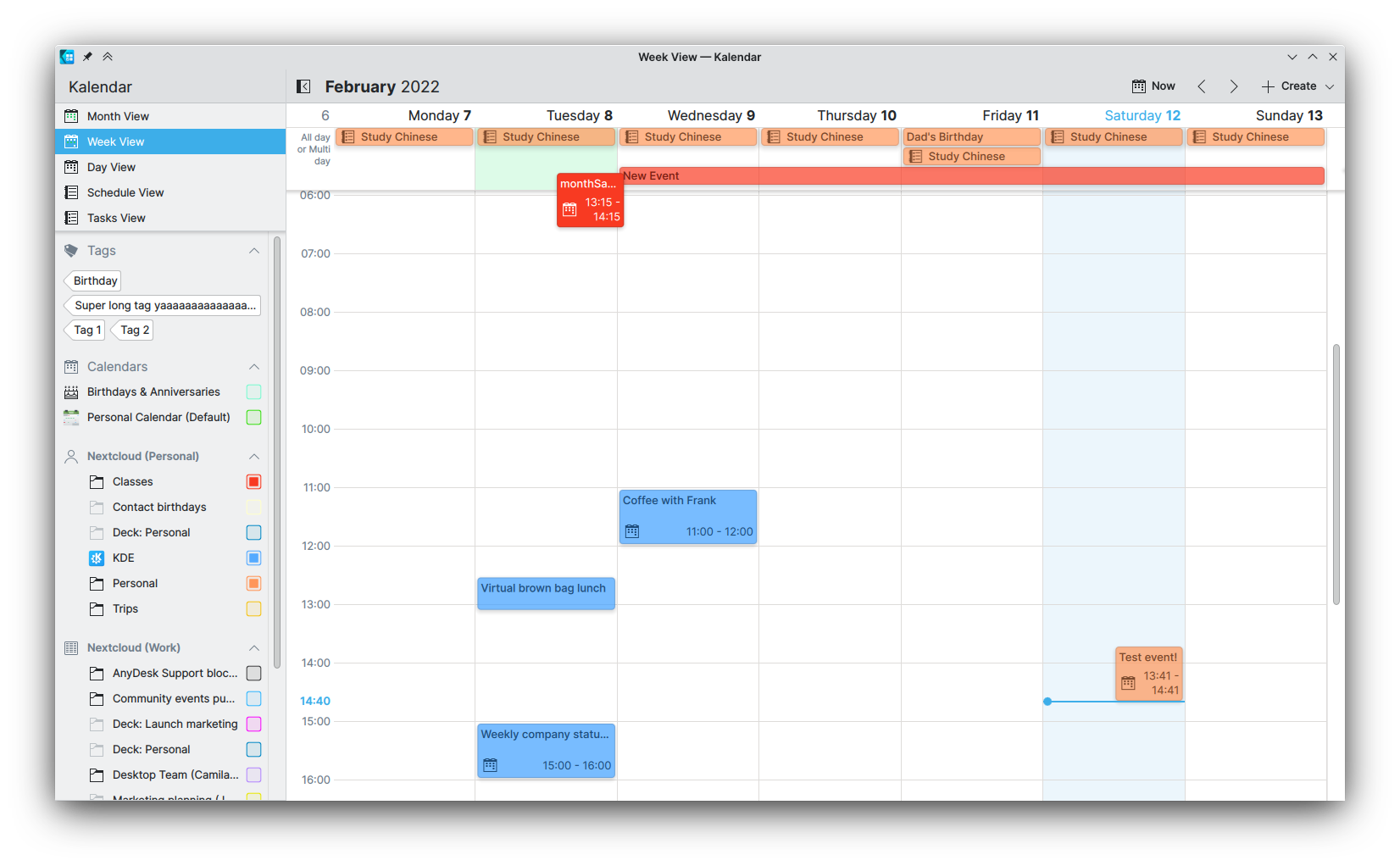
Slawek has also now enabled the option for incidences in the week, three-day, and day views to be dragged between the all-day and hourly sections, allowing you to quickly change an event from taking up the entire day to only taking up a section of said day. These views have also gained a nice animation when clicking the “Now” button, which scrolls the view down to the current time.
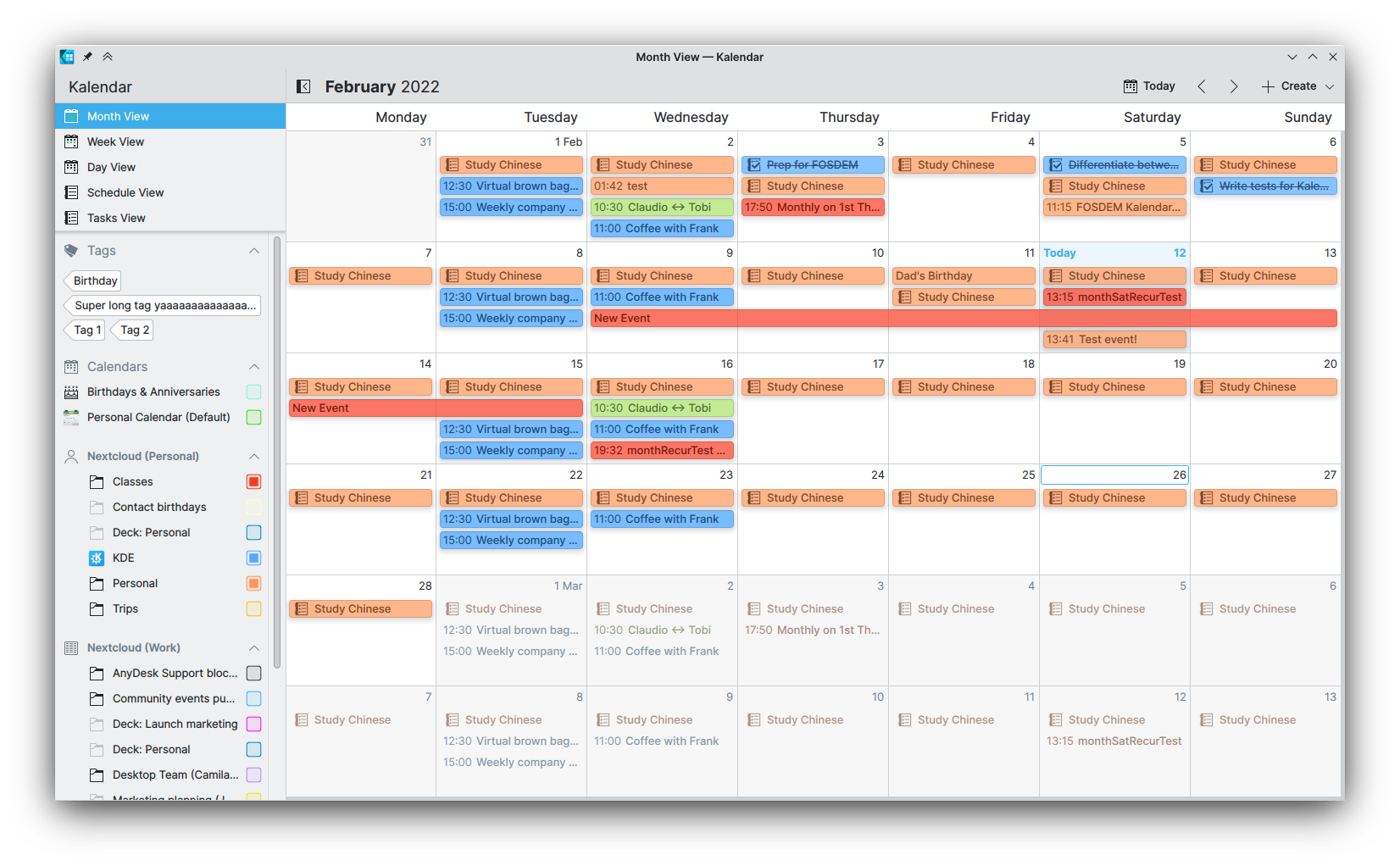
Additionally, it is now much easier to distinguish between incidence types in the month view. We have replaced redundant icons for incidence types with more useful start times for events, retaining only the type icons for tasks to make them easy to differentiate from events. Thanks to this, it is now also easier to differentiate between all-day and non all-day event types just by looking at whether or not they have a start time in the incidence label.

Tasks in the tasks view will now also display how complete they are in the circular checkboxes, by filling in the rough completion percentage. This lets you see at a glance just how much stuff you have left to do!
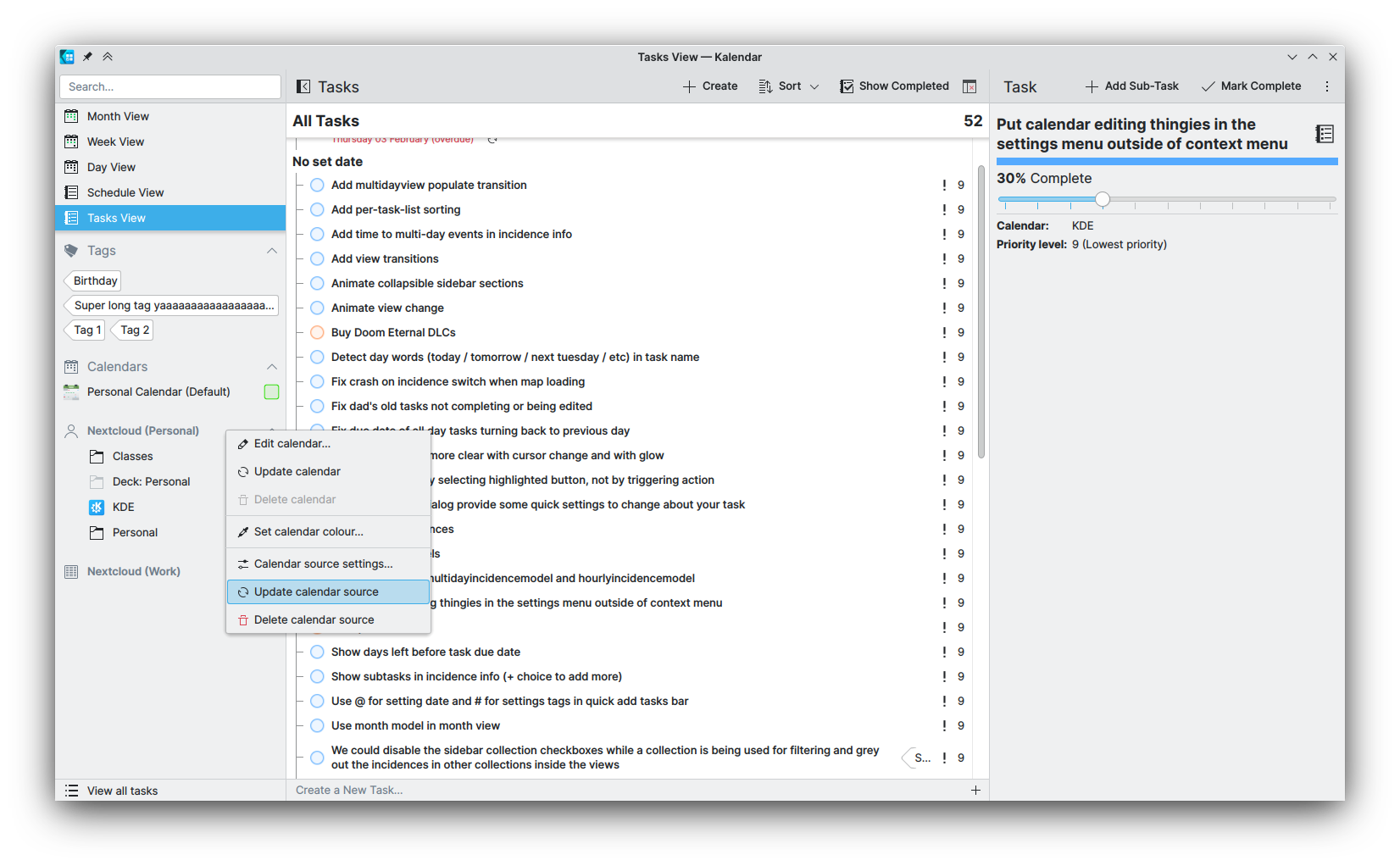
Those of you with calendar sources using calendar folders that can themselves have incidences in them are now able to customise these folders as you wish by right-clicking on them in the sidebar, much like other calendars. Additionally, this feature has been extended to calendar sources themselves, and you can now customise their names and icons, refresh them, or delete them from the sidebar.

Finally, if you have your desktop set to a language that is written right-to-left such as Arabic, Kalendar will be more usable for you as we have ensured that components such as the tasks view’s tree now correctly adapts to a right-to-left layout.
Bug-fixes, back-end and small changes
Sooooo many.
- Fix titledatebutton text (Claudio Cambra)
- Fixed month set in recurrence ‘ends on’ setting (Claudio Cambra)
- Port away from deprecated Kirigami.Heading api (Carl Schwan)
- Fix anchors inside layout warning (Carl Schwan)
- Handle undefined colors in checkboxes (Carl Schwan)
- Add qqc2-desktop-style to the dependencies (Carl Schwan)
- Make sure current date page exists before moving to it (Carl Schwan)
- Add support for unity cmake build (Laurent Montel)
- Removed vendored todo model (Carl Schwan)
- Pass kalendar version to kalendarac (Nicolas Fella)
- Fix error messages on week view load (Claudio Cambra)
- Fix errors about loader prop, time marker now appears correctly too (Claudio Cambra)
- Fix crash in todosortfilterproxymodel when lessThan func gets invalid left model index (Claudio Cambra)
- Fixed calendar title in todo view not changing color when calendar color changed (Claudio Cambra)
- Drop support for KDE PIM libs < 21.12 (Carl Schwan)
- Fix appstream stuff (Claudio Cambra)
- Fix detection of isCurrentMonth in multidayview delegate (Claudio Cambra)
- Fix drag-drop recurring events (Slawek Kaplonski)
- Add testing for IncidenceOccurrenceModel (Claudio Cambra)
- Eliminate ExtraTodoModel and incorporate needed parts into TodoSortFilterProxyModel (Claudio Cambra)
- Fix bugs, errors, and crashes with the sidebar (Claudio Cambra)
- Prevent stealing from incidencemousearea for multidayviewincidencedelegates (Claudio Cambra)
- Stop pushing day views as layer on desktop when clicking from other views (Claudio Cambra)
- Calendar sources sheet now a dialog window (Claudio Cambra)
- TodoSortFilterProxyModel bug and crash fixes (Claudio Cambra)
- Add barebones testing for todosortfilterproxymodel (Claudio Cambra)
- Week/threeday/day views now correctly start up with current time in view (Claudio Cambra)
- Fix current time markers in hourly views (Claudio Cambra)
Supporting us
Is there anything you’d like to see added to Kalendar? Get in touch! I’m @clau-cambra:kde.org on Matrix.
If you want to support Kalendar’s development, I strongly encourage you to donate to the KDE community. These donations help us keep our infrastructure running, including our GitLab instance, our websites, and more. You can donate at https://kde.org/community/donations/.
