KDE PIM in July and August

KDE PIM is the set of applications that helps you manage your email, contacts, appointments, tasks and more.

Since our last report covering KDE PIM in May and June, the PIM applications and libraries have seen over 1200 changes from almost 30 contributors. Let’s go over some of the biggest updates.

New features

Kalendar

I have been working on improvements to the calendar side of Kalendar. New changes include the addition of new and improved differentiation between all-day and not all-day events in the month view. This change makes the month view look quite different — in a good way!

Another new addition is the inclusion of a new incidence information popup in some of the calendar views. In views where horizontal space is at a premium, such as the month view or the week view, the popup lets us present the same amount of information without squishing the contents of the calendar view.
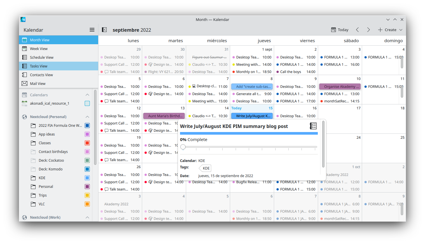
Of course, this change is optional, and can be toggled in the settings if you choose to do so.

Carl has worked hard on polishing Kalendar’s new address book feature. New additions include a context menu for contacts in the contact list containing commonly-used actions, as well as more contact management features that should better help you manage the people in your life.

We have both also worked hard on improving the overall stability of Kalendar. Lots of bugs and crashes have been fixed in the application and the common reminder daemon used by Kalendar and KOrganizer. Specifics can be found below in the bug fixes section.

During the Promo sprint in Saumur (France), Carl and I met and discussed Kalendar at length. We have big, ongoing plans for the future, which we will be discussing further at Akademy 2022!

KDE Itinerary

Volker has focused on improving Itinerary’s calendar integration. New features include supporting import and export with Akonadi calendars, and recognizing more travel-related calendar content automatically. These new features should make planning your next trip much easier.

For details see Volker’s dedicated summary post.
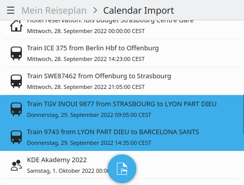
Calendar import page recognizing transport elements and allowing individual selection.

Kleopatra

Usability and accessibility was a main focus of development for Kleopatra in the last two months. Specifically:

Moreover, some new features were added:

KMail

Laurent has merged improvements to KMail’s translator support, which now uses a new translation engine. This should make translations of emails in unfamiliar languages more accurate than ever.

Another new addition is the inclusion of an embedded mail delivery notification widget in the email viewer, which should make interacting with this feature feel better integrated and easier to deal with.

You can now interact with mail delivery notification-related actions directly from the email viewer

Lastly, KMail now has a new plugin allowing you to manage the Akonadi database within KMail.

KOrganizer

Glen has worked on KOrganizer’s drag-and drop capabilities. The month view now lets users drag events, todos, and more out of KOrganizer. These items can then be dropped into other places, such as KMail’s email composer window, where they can be used to send event information.

This feature is now available in KOrganizer’s Month, Agenda, and Todo views.

Bug fixes and compatibility improvements

Each of the PIM apps have also had many bug fixes that should make them more stable and usable. Additionally, we have also been hard at working preparing for Qt6 and making changes to ensure compatibility.

KAlarm

Kalendar

Kalendar/KOrganizer reminder service

Kleopatra

KMail

Fix Bug 456578 recipient auto-completion does not work in master git snapshots
Fix bug 448674: Spam false-positive, because link’s href & text capitalization 
mismatch
Fix 395711: External images not loaded by default if message was opened in a 
separate window

Kontact

Fix bug 457241: When the user uses the `New To-do…` menu item, the to-do is created in the system time zone instead of the “floating” time zone ().

Help us make Kontact even better!

Check out some of our open junior jobs! They are simple, mostly programming-focused tasks, but they don’t require any deep knowledge or understanding of Kontact, so anyone can work on them. Feel free to pick any task from the list, then get in touch with us! We’ll be happy to guide you and answer all your questions. Read more here…

Pushing VLC forward on macOS (Google Summer of Code 2022)

VLC macOS Interface Redesign 

For the past few months I’ve been working on VLC’s native macOS interface, which has been undergoing a major overhaul in preparation for its next major release. The aim has been to improve the user experience of the media player and to push development forward in anticipation of version 4.0.

Some background

VLC has separate GUIs on Windows/Linux vs macOS. On the former two platforms, everything is built using Qt. This makes it relatively easy to code a graphical application once and have it work well on a multitude of platforms.

You can just build the Qt UI and use it on macOS too, but Qt-based applications can, by default, look a little out of place on the host system. It is certainly possible to achieve a cohesive look with the host system, but this can also mean a lot of extra work. On Apple’s OS, deeper system-level integration can also be tricky to interface with Qt components. Hence, the version of VLC users download for macOS is bespoke for Apple’s system.

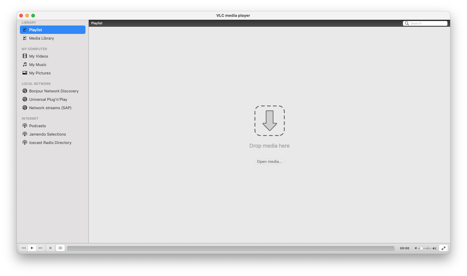
VLC 3.0.16, the latest stable release for macOS

For the upcoming release of 4.0, there are ongoing plans for a redesign of the desktop applications. The new designs will make them friendlier to use and nicer to look at. On both the Qt and the macOS side, this has meant a near total rewrite of the user interface. Work on the macOS UI has been done both by frequent contributors and past GSoC attendees, which pushed the redesigned application into a functional prototype state.

While the macOS version of the new VLC was capable of doing some of the basic things — playing videos/music, displaying audio tracks in your library — there were still plenty of tasks, large and small, before hitting 4.0.

Back to basics: playing audio types

VLC has always let you play music encoded in almost any format. For a while now, it has also let you easily access and manage your music library. One of the intended aims of the redesign has been to leverage VLC’s existing strengths as a media player to create a great center for your audio and video library.

In order to be a great media player, though, the user should at least be able to play their media types. In the redesigned prototype, you could play songs, but playing albums, artists, or genres was a no-go. Implementing correct playback and playlist functionality for each of these was therefore at the top of the task list.

Unfortunately, adding support for each audio group class quickly led to a lot of duplicated code. By later adding a new protocol and leveraging the great powers granted by polymorphism, it was possible to eliminate the majority of this duplicate code. 

It was also possible to easily add support for the remaining features that weren’t working for albums/artists/genres, such as the media information panel or the ability to reveal an audio item’s files in Finder.

Showing the information panel for an album and displaying its files in finder

Thanks to these changes, all audio types and groupings work flawlessly.

Lastly, a nice touch was to stop asking users if they wanted to continue playback where it was last left off for album tracks!

Making VLC pretty

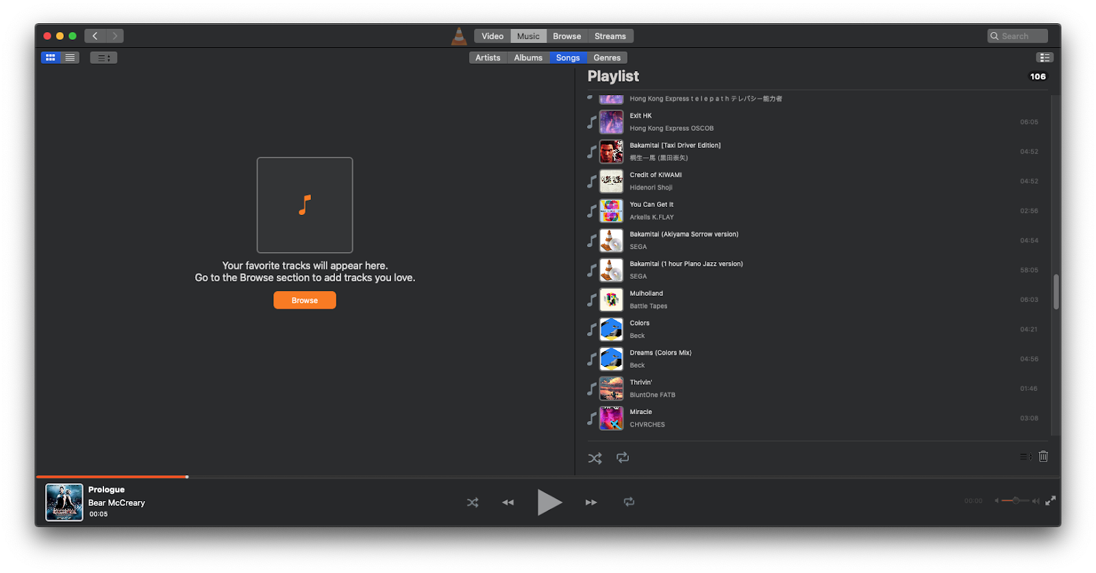
macOS VLC 4.0 in April 2022

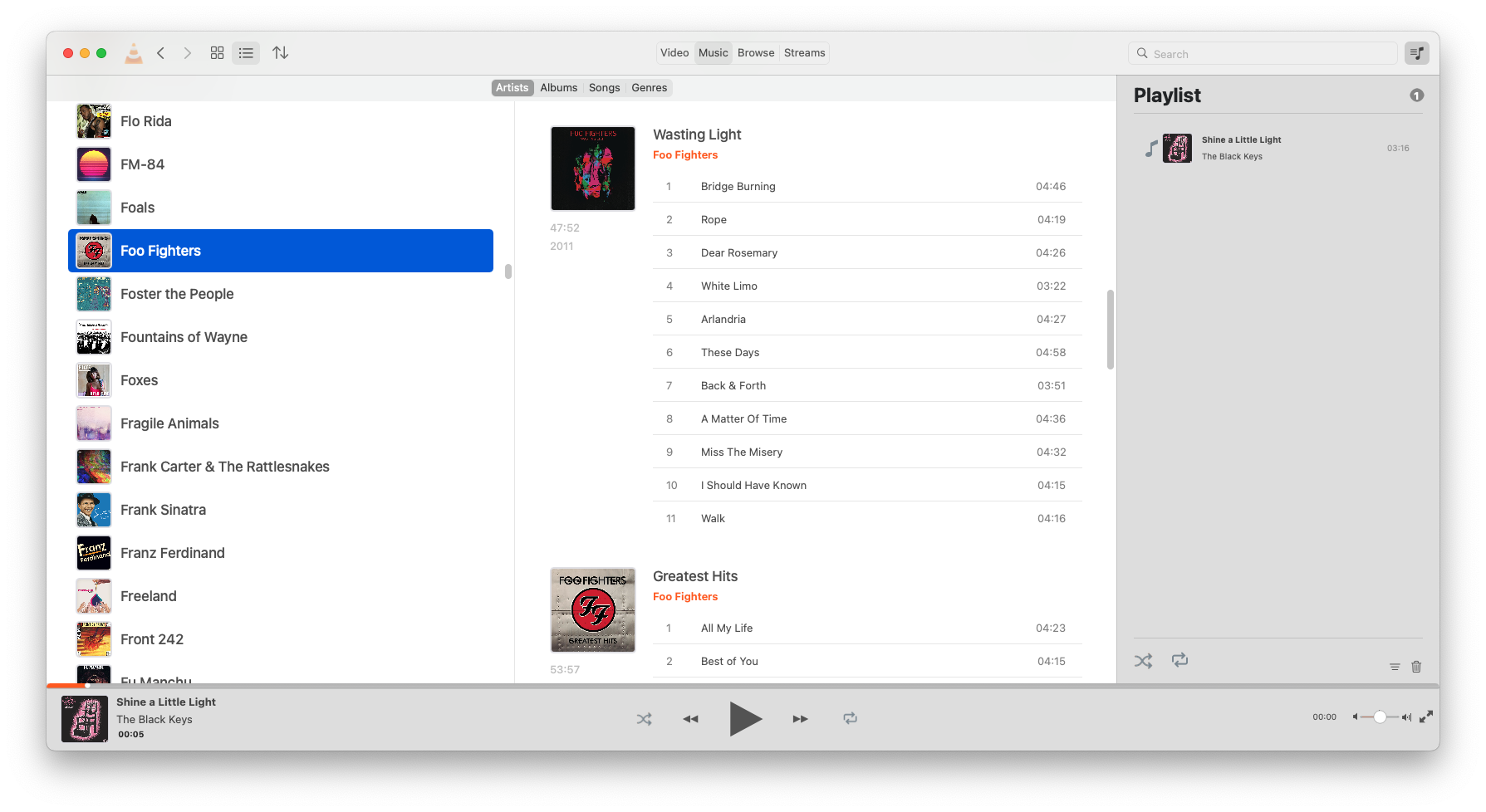
The library window is at the centre of the redesign, and though a lot of progress had been made into making it behave more like a media library, it needed a fresh coat of paint. Several of the first changes brought the design of the library window closer to the mockups, which helped make the application much more visually attractive.

While less obvious, a lot of changes were also made to small things such as margins, paddings, and sizes to make the application more visually consistent and attractive. Though they may be inconsequential by themselves, tiny changes can add up and help make a UI feel much more cohesive and polished.

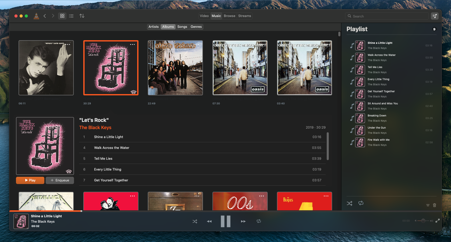
Here’s what the library window looks like now:

Current state of macOS VLC 4.0 in light mode (September 2022)
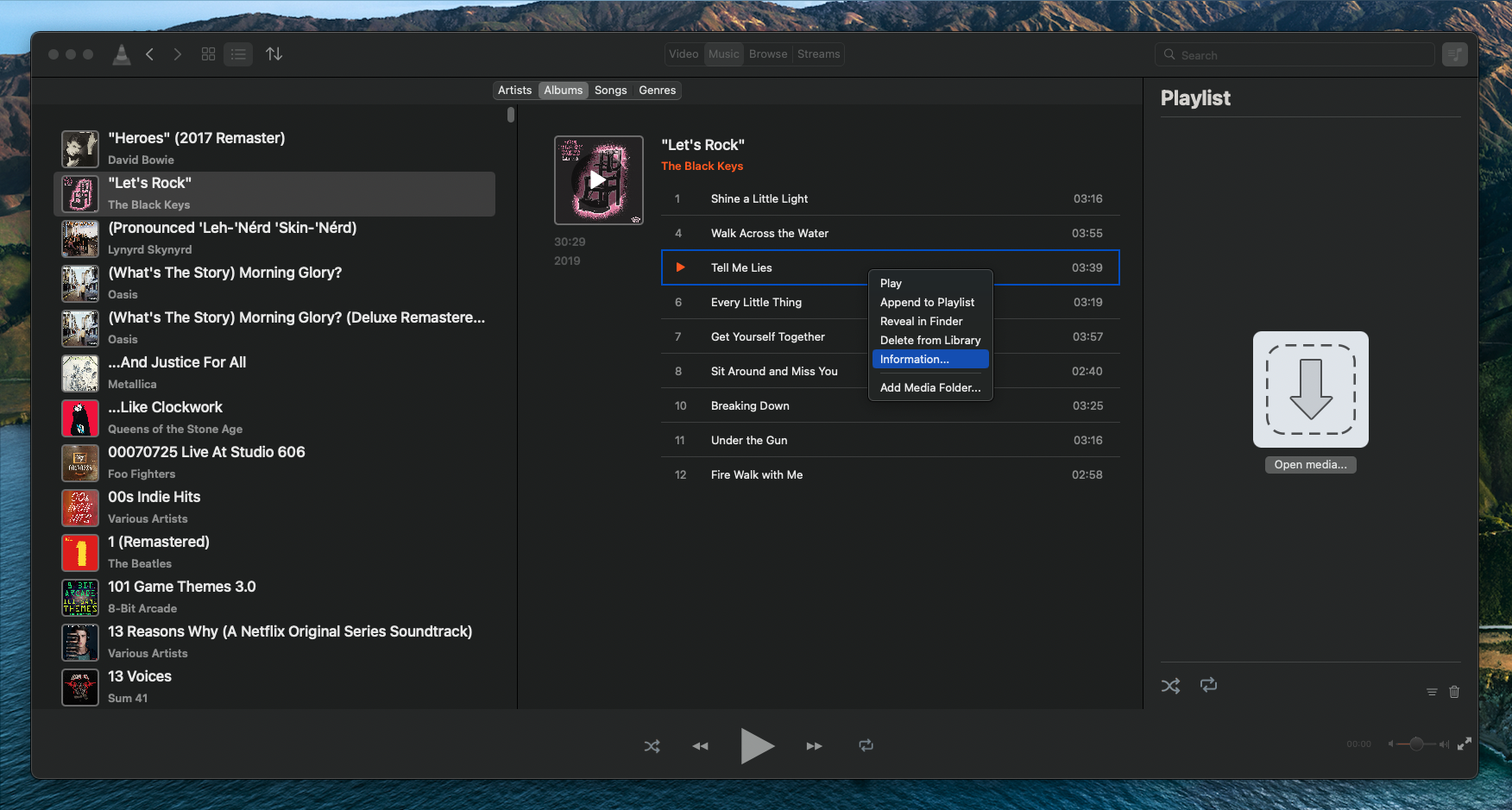
Current state of macOS VLC 4.0 in dark mode (September 2022)

Navigating the library

Besides the traditional sorting and audio type switches, VLC’s new library window has some useful navigation components that make perusing the library quicker and easier.

First is a search bar. By adding a new method to the library model, input into this search bar is submitted to the media library as a search query. This filters out items that do not fit the input, saving you from endless scrolling and browsing.

Searching for “A horse with no name”

Next were the forwards and backwards navigation buttons. Implementing these required the creation of a navigation stack that stores individual navigation states. Each navigation state contains details about the library window at a given point in time — the opened view, the sort order, the view mode — which can then be used by the navigation stack to set the library window to that state. A new navigation state is appended to the stack each time a navigation event occurs in the library window, and hitting the backwards or forwards button navigates the stack downwards or upwards. As expected, a new action replaces all states that are above the current position in the stack.

Thanks to this addition, you can now browse deep into your library and quickly backtrack when you get lost.

Navigating backwards and forwards through the library

Also relevant is the addition of support for macOS’ window restoration feature, which allows applications to restore their state prior to the application being closed. This means you can now pick up right where you left off when you open VLC.

The last-opened view is re-opened when VLC is opened again

Doing more with the library

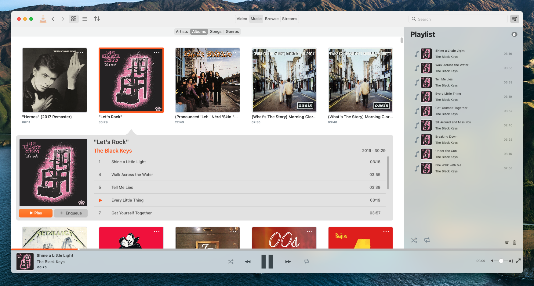
In 4.0, the idea has been to let users switch between a table view and a grid-based collection view within the media library. One is more information-dense, while the other is more approachable with big artworks. A lot of work has gone into both.

The table view

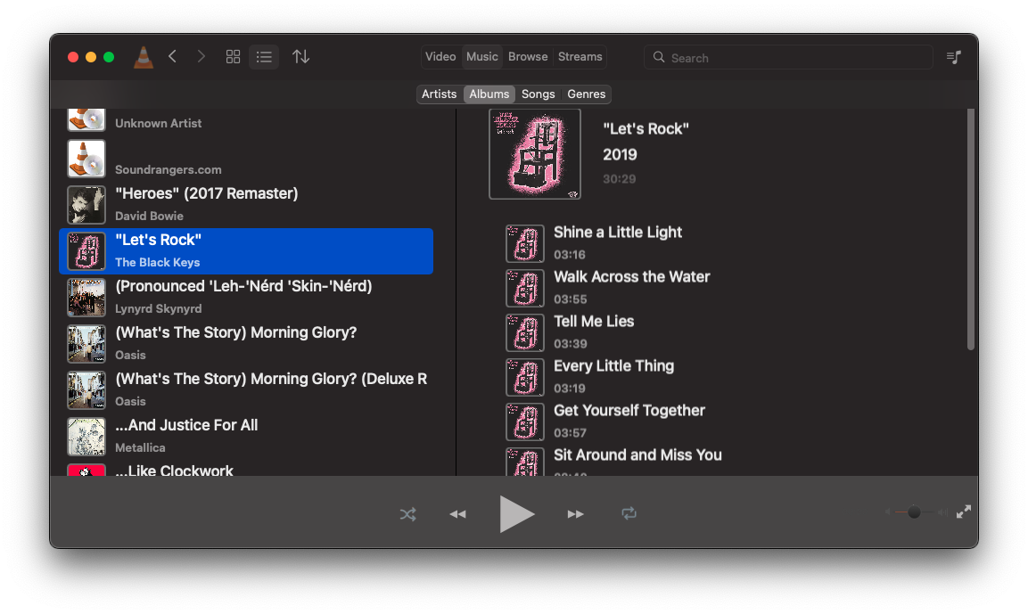
The table view is meant to be familiar and straightforward, with a list of the artists/albums/genres etc. in a panel on the left and the selected audio group’s constituent albums in a ‘selection-view’ panel on the right. While the table view worked fine, there were still improvements that could be made.

The table view prior to changes

Most of the table cells in the library views use a common component which features large lettering and artwork on it, making each album or artist readable and identifiable. In the case of songs, however, these cells made album tables large and unwieldy, drastically reducing information density. The first change made here was to add a new song-specific table cell to be used in the selection view, reducing the space taken up by each cell and making the album tables more compact.

The next logical step was to redesign the album tables. Since with a list of songs space is constrained vertically, a redesigned table view which places the album artwork and details alongside the song list helps increase the number of visible songs.

Combined with the new song-specific table cells, the result is an attractive and space-efficient view of an artist’s, album’s, or genre’s songs.

The “artists” view showing the redesigned selection view and smaller song cells

Another addition that makes the table views more pleasant to use is the addition of a context menu for all media item table cells, allowing for quick access to commonly-used actions.

The context menu provides some useful actions for media items

The grid view

The grid view needed more work. The biggest issue with it was that, at least at the start, there weren’t many things you could do within it. A grid of album artworks is nice to look at, but users want to be able to interact with an individual album or artist and browse through their songs.

The solution was to create a supplementary view that would appear when a user clicked on a media library item. This view slides out from underneath the selected item and displays more detail about the selected item.

The first supplementary view created provided detail for albums. This view displays the artwork prominently alongside a list of the album tracks. With the use of a custom NSCollectionViewFlowLayout, NSCollectionViewSupplementaryView, and some fancy CoreVideo animation work, it slides in and out of view very smoothly.

Clicking on an album toggles a collapsible supplementary view that shows its tracks

A second supplementary view was then added for genres and artists which shows a list of relevant albums and songs. By repurposing the work done for the table view, it was possible to do this with little additional code!

A similar supplementary view can also be found for genres and artists

Browsing local files

If you don’t have a set media library folder, that’s okay — another new feature is the ability to browse your local filesystem from within VLC. In the “Browse” tab, VLC will display your local drives, where you can navigate through them and play supported files.

Browsing files is now easy to do through the “Browse” tab. Ignore the thumbnails!

Playing with videos

There are also some new changes to the video library. The video library view is now a lot nicer to use, with the 50/50 window split being replaced instead by a continuous grid view that makes browsing your videos a less claustrophobic.

A single continuous video library view with recent videos and all your videos in one place

It is now also possible to temporarily close the video view and navigate the library while a video is playing. The video view can be easily reopened by playing a new video, or clicking the thumbnail in the bottom control bar.

Temporarily dismiss videos to go back to your library

There is still much to be done here, so watch this space!

Tweaking things, squashing bugs and improving performance

A large portion of the time dedicated to this GSoC project was spent on eliminating many of the early bugs that were present in the redesigned version of the app. From flickering album artwork, to broken library folder selection, a lot of merge requests have helped the macOS version of VLC become a far more stable and functional piece of software.

Work has also gone into cleaning up code, removing unnecessary components, and speeding tasks up. This should make VLC easier to maintain and quicker to respond.

A personal note

Working on VLC has been super gratifying and a big learning opportunity for me. Coming from mixed Qt/C++/Objective-C++ development, I originally sought this project to put my Objective-C into more practice and to get more intimately familiar with AppKit. After 4 months of working on this project, I can now say that I have learned quite a bit, and had a lot of fun doing so. I might be one of the last few people who still enjoy working in Objective-C!

I would also like to give a big thank you to my mentors Felix Paul Kühne and Marvin Scholz for as well as Jean-Baptiste Kempf for reviewing my code, providing valuable feedback and helping me when I got stuck on specific tasks.

Looking forward to more VLC contributions! 🙂