Last week’s MR turned into this week’s MR, and it just kept growing and growing and growing. I know I’m a mentor’s nightmare and I’m sorry Carl, I know it was a lot of changes to review…
The good news is that it was all worth it, because there have been lots of changes this week — small and big. Even better, you’ll finally be able to find the changes I went through in last week’s post on Kalendar’s master branch.
Let’s dive into the new stuff!
Editing the event editor
If you’ve been following these posts, you will have seen the event editor: an overlay sheet that lets you edit the details about an event down to a tee. Well, that overlay sheet is no more. It made sense when we had a few fields to fill, but as the capabilities of the event editor started to grow, it pretty quickly started to feel pretty cramped.
On the desktop, we now use the incredible power of windows to create a detached event editor window. So now you not only have plenty of space to punch in your next visit to your grandma’s, but you can also move it around and resize it. How revolutionary.
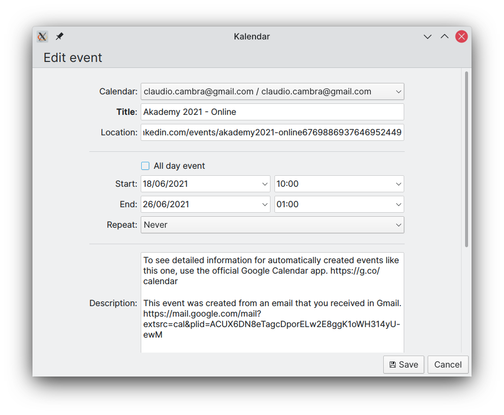
Of course, on your phone a window would be less than ideal. So if you use Kalendar in mobile mode, you’ll instead be greeted by the event editor as a page, maximising the space that the editor can have. This should let you see a lot more at once, with a lot less wasted space!
Yeeting events out of existence
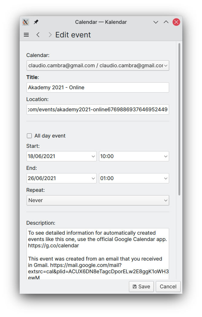
Last week, deleting events was pretty low-key. You clicked delete on the dropdown and then something happened. What exactly? Who knows!
This week, if you try to delete an event, you’ll get a dialog that tells you exactly what’s going to happen. This’ll let you confirm what you’re deleting before you’re deleting it, giving you a chance to correct an oopsie. You’ll also know precisely what you’re deleting.
For recurring events, you’ll also get some handy extra options. You’ll have seen these in other calendar applications: you can choose whether to delete a specific event occurrence, all future occurrences, etc.
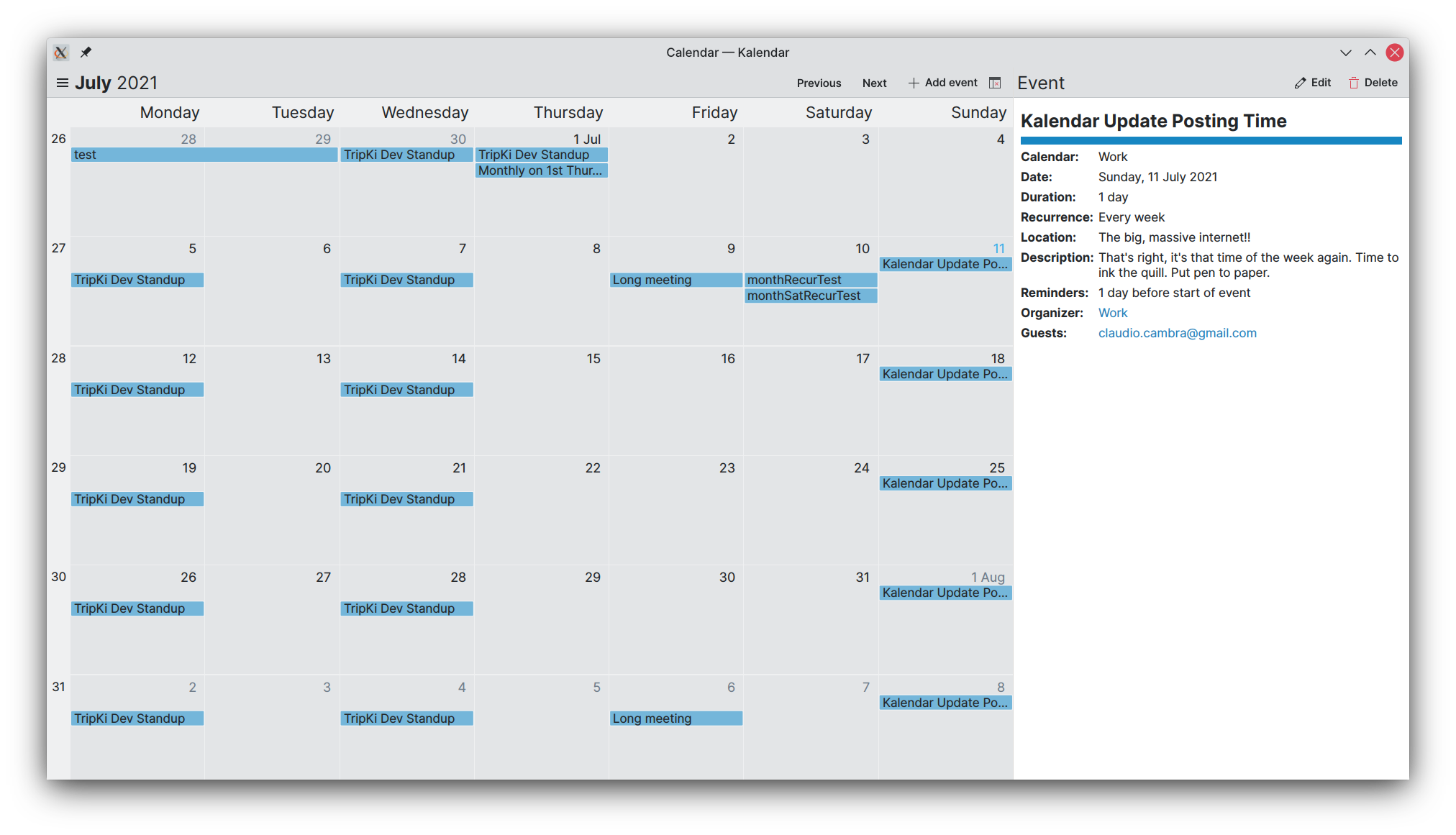
What’s going on?!
Also new this week is a better UI for viewing your events and their details. The popups have been replaced by a side-drawer that provides you with exactly what you need to know about what’s coming up: summary, description, location, and more.
On mobile, the side-drawer is an overlay drawer. This gives lets you make the most out of your phone’s vertical real estate to display as much data as possible at once.
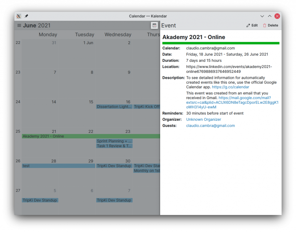
But hey, we know, you have a great big chonkin’ display hooked up to your desktop, right? That’s why on desktop, the drawer is in fact in-line, letting you still view and interact with your calendar while it is open.
These are still under development, and they’ll get a bunch of additional useful information over the course of the next week. This includes reminder, recurrence and attendee information, clickable hyperlinks in descriptions and attendees, and icons.
More bugsplatting
The bugs continue on their never-ending march, onwards. Until the heat-death of the universe. I’m happy to say that some pretty big bugs got smashed this week, though:
- Fixed bug where the date and time fields would show up empty in the event editor (FINALLY!!!)
- Reminders and attendees should now always show up correctly in the event editor when editing events
- Keyboard input in all fields – including date/time fields – works correctly, letting you edit and add events without touching your dirty mouse
- Added warnings in the event editor for when an event has its end date set to a date before the start date. The event editor also prevents you from adding/saving an event in such a condition.
- …and many smaller bugs too!
Coming up next
Efforts right now are being focused on getting the event info drawer up to scratch with everything you’d need to know about an event. But there’s a lot more on the horizon: other calendar items, undo/redo functionality, attachments… and new calendar views, too. Not all of that will land next week – in fact, most of it won’t! – but you can bet progress will be made. 😉
Is there anything you’d like to see added to this list? Get in touch! I’m @clau-cambra:kde.org on Matrix.
> you can choose whether to delete a specific event occurrence, all future occurrences, etc.
I heard Nextcloud or the Apple calendar has some trashbin for (accidentially) deleted events. Would you like to add such a feature? 🙂
Undo and redo functionality is coming very very soon, so at the very least that should let you easily roll back any accidental deletions 🙂
A trashbin for deleted events is certainly doable too, and I’ll look into it. Thank you for your suggestion!
It’s coming up great! Can’t wait for more views, I need “agenda view” with all event’s descriptions shown for a day/week.
Also colours/ in dark mode need work but that’s a low priority issue I guess.
Creating new views is high up on the list of priorities, and I hope there’ll be something to show over the next few weeks. An agenda/event list view is the first new view I’d like to get to work on too.
I’ll take a look at the colours in dark mode and see what we can fix up. Thank you!
This is the very first Kirigami-based application I have seen so far which looks good on mobile as well as in desktop mode. It does not look like it was designed for mobile-only and is only being resized for use on the desktop. Instead, it feels more like a traditional QWidget application but is simple and clean. What I would really love would be a map inside the event view if the location is filled with a valid address or some GPS coordinates. (see my mockup https://phabricator.kde.org/M154) And some kind of tag support (if possible with this backend) to mark special days or things that happened during this day. Keep up the good work.
Thank you for the kind words! 🙂
We’re focusing on nailing the basics, getting all basic functionality and getting it to support a few new views too. Having said that, your mockup looks really cool and it is definitely feasible. Thank you for your suggestion — we’ll try to implement it down the road!
Lovely looking work! A couple of UX suggestions:
1. If there is space in a square, then please display the entire length of the title using extra lines, rather than cutting it off with an ellipses (…).
2. If an event is multi day and continues past the day displayed in the right column to the next day, please style the colored background of the title with an arrow to indicate that the event continues past that day (ie > shape on the right, rather than just ] ). If an event is displayed on the left hand column and is a continuation of the previous day, please indicate with a < shape target than just [.
3. If the location is a URL, please display it like one (ie blue with underline) and make it clickable, with an "Edit" button. If it's a physical location, please display on a map. If the location isn't entered, please show an empty text box (like now) with a location crosshair/pin to the right so the user can choose either to paste a location, or tap to bring up a map and choose one.
4. The calendar name seems to show twice, when it only needs to show once?
Thank you for your suggestions! Regarding point number 4, that can happen when you create an event and invite guests — the organizer is presented as your calendar rather than yourself. Thank you for pointing it out 🙂