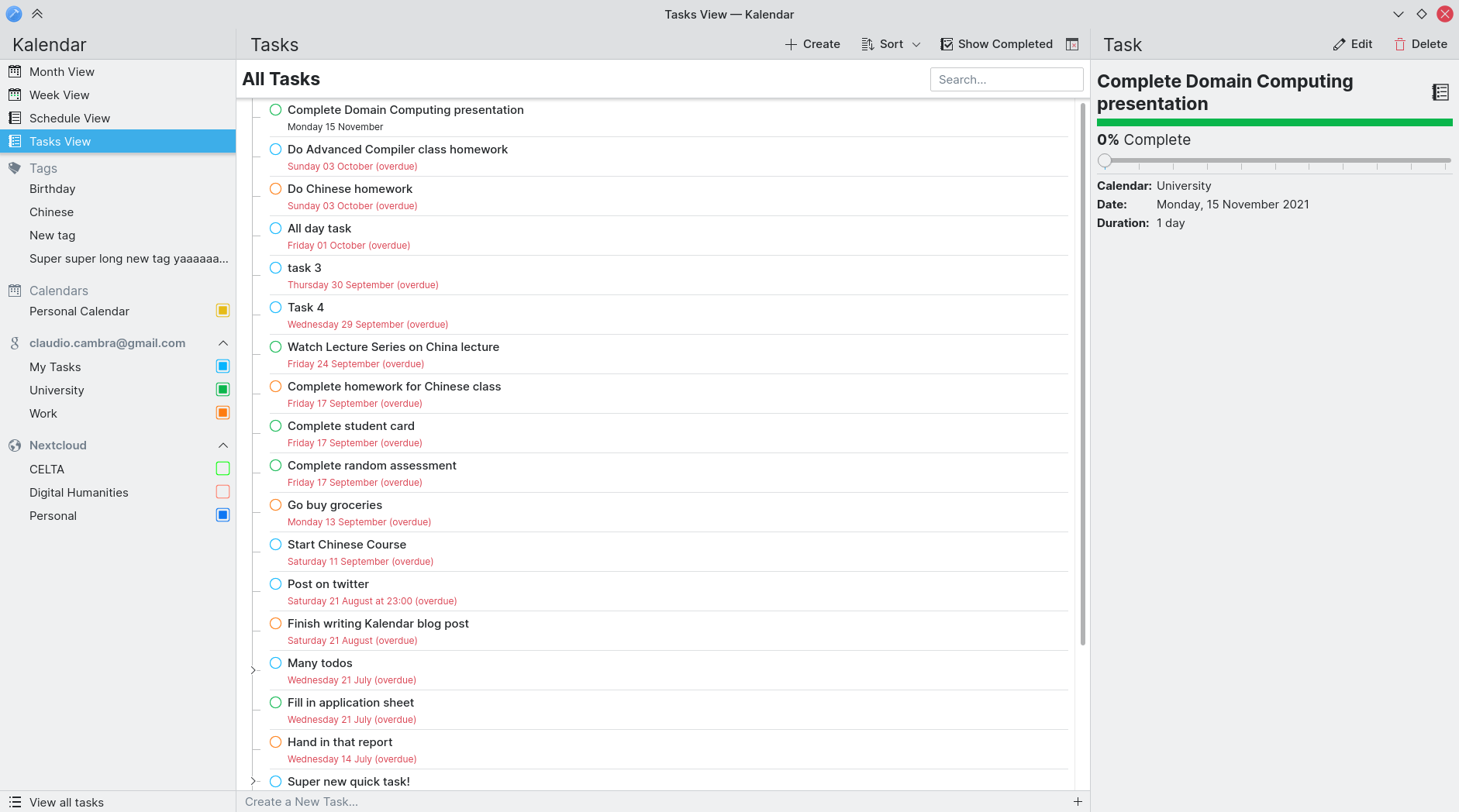
In our last week of KDE Review, we have been focused on fixing as many bugs — big and small — as we have been able to. Thank you to everyone who has reported bugs, and thank you even more if you have helped in fixing them!
Besides bug-fixes, we also have some pretty nifty usability improvements in store that should make Kalendar more intuitive, more user-friendly, and more pleasant to use than ever!
Note: Kalendar is still under heavy development. You’re free to poke around and try it out, but it is not yet final software! If you want to contribute to its development, join us in Kalendar’s Matrix room.
Our progress on KDE review
We have continued fixing bugs and making improvements during this week of KDE Review. This Sunday, KDE Review will be over, and (hopefully!) we will have passed! From then on, we will be able to start using KDE’s infrastructure to create actual releases. Exciting!
More exciting is the fact that we will be sharing more details about a beta very, very soon…
But first, this week’s improvements!
The sidebar is now collapsible
!129: Make it possible to collapse the sidebar (Felipe Kinoshita)
Commit 95d6429b: Sidebar collapsed-ness now remembered by Kalendar (Claudio Cambra)
If you don’t need to access your tags and calendars very often, you might find that the sidebar is an unnecessary use of the application window’s horizontal space. Or, maybe you would like to have Kalendar in a small window and find that the sidebar is too wide to see the current calendar view.
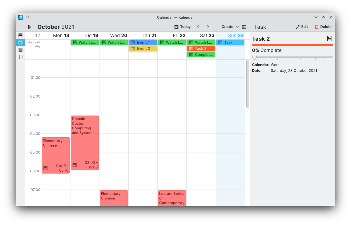
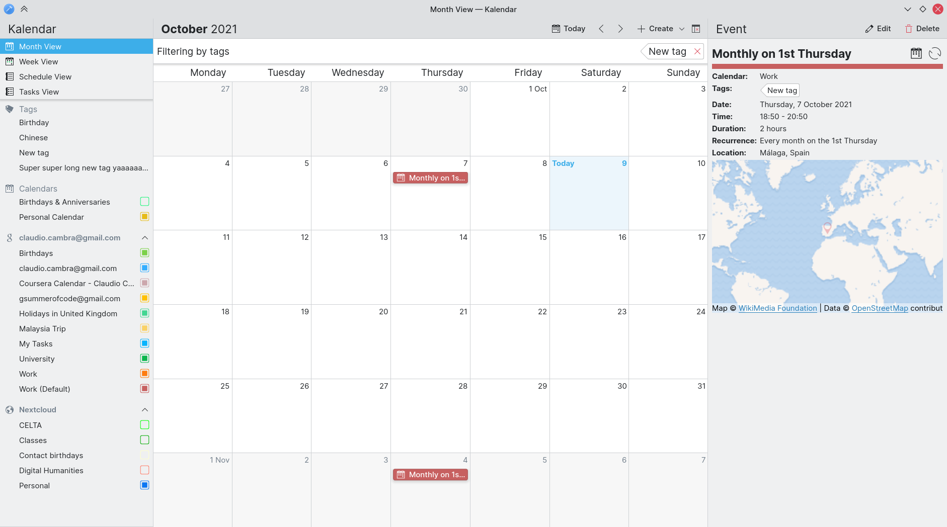
That’s why this week we have added a new feature: the sidebar is now collapsible into a thin strip. This thin strip only shows the buttons to switch views, meaning that you can retain access to your most needed actions while taking up the least horizontal space possible.
Kalendar also makes sure to remember which state you put the sidebar in, saving you from having to collapse the sidebar every single time you open up the app.
Note that this only affects the desktop mode; on mobile, the drawer still works as usual.
Improving the week view’s multi and all day view header
!135: Make week view all day header auto-adjust height to incidences and enable manual change of this view’s height (Claudio Cambra)
The week view’s multi and all day view has seen a significant improvement in how it handles its height. Whereas before the header’s size was consistent regardless of the number of incidences it had to show, it now automatically adjusts its height to that of the lines of incidences it shows.
Additionally, you can now click on the bottom edge of the header and drag to vertically resize this header, letting you set this header’s height as you please. A handy little ‘Reset’ button appears in the bottom-left corner when you do so, letting you return it to automatic height.
Making incidence editing/creation easier, faster and more intuitive
!130: Remember the last collection used when adding an incidence (Claudio Cambra)
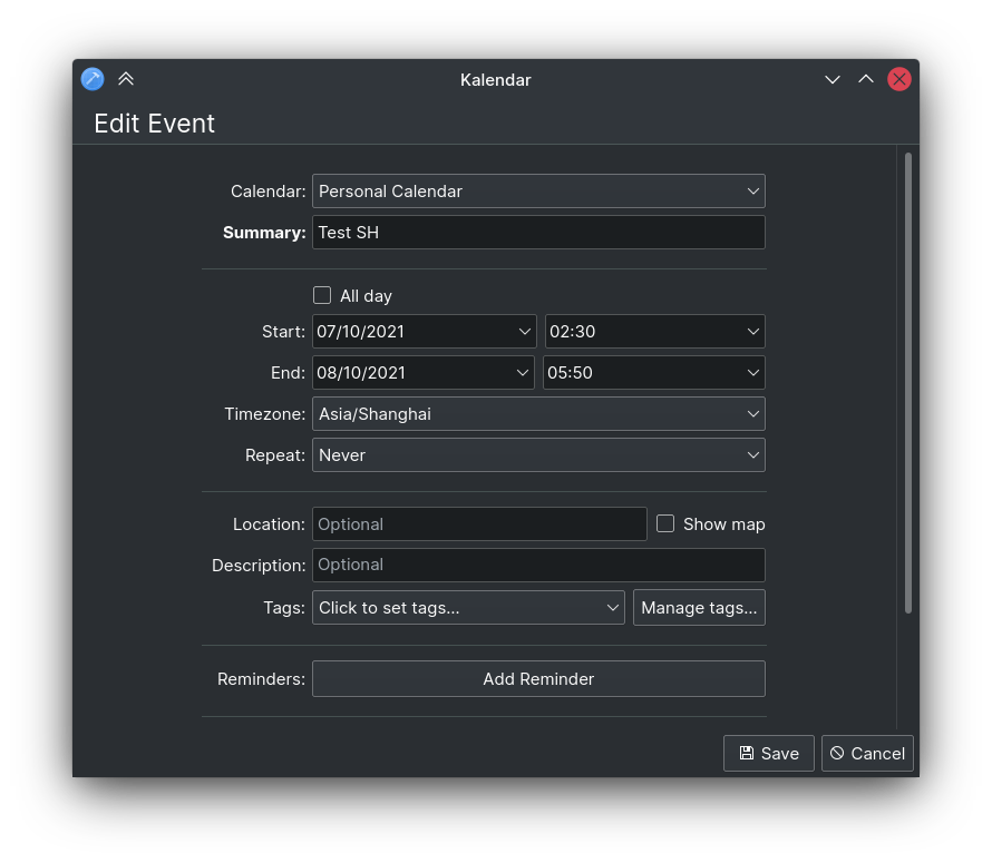
Commit 1bb8bfd3: Setting an incidence start now makes the incidence end follow it (Claudio Cambra)
Several changes have been merged this week that improve the process of creating and editing incidences.
The first is that Kalendar now remembers the last calendar to which you added an incidence. This means that when you go ahead and add a new task or event, the incidence editor will automatically be set to the last calendar you added an incidence too. This should hopefully save you from having to pick your desired calendar when creating new tasks and events. Kalendar also differentiates between task and event calendars, meaning you won’t, for example, accidentally add an event to your last used task calendar — your last used event calendar will be pre-selected.
We have also reworked the way that time selection works for incidences. Before, start and end times were selected completely independently. This often lead to warnings about end times preceding start times, even though you hadn’t even had a chance to select an end time. Now, changing the start time of an incidence will automatically move the end time too, saving you from accidental errors. It should also make it easier to change the time of an event if you, for example, selected the wrong date, since upon changing the start date the end date will be changed too. The end date and time is always changed in accordance to the prior difference between start and end time, so if you had selected an incidence to start at 4 and end at 5, if you change the start time to 2 the incidence will now end at 3.
Improving the time picker on desktop
!131: Time pickers now respond to mouse scroll, making them more intuitive to use on desktop (Claudio Cambra)
Another time-related improvement relates to the time picker, used to select times in the incidence editor. This component can now be used with the mouse scroll wheel — meaning if you preferred to use the picker rather than type into the time field, this will now be a lot quicker and easier.
Date navigation in the menu bars
!128: Add a go menu to window and global menus (Claudio Cambra)
The menu bars now have a new menu: the ‘Go’ menu. This menu contains several entries that should make date navigation more accessible.
We have put the standard ‘Backwards’ and ‘Forwards’ actions here, as you would expect, which moves the different date views forwards or backwards one screen — whether this is a month in the month and schedule views, or a week in the week view. Also included is an action which lets you go back to today.
Additionally, we have added an action that brings up the date changer popup. We realised it’s not immediately obvious that the views’ date title is a button that brings up the date changer. The new ‘To Date…’ action in the ‘Go’ menu provides a more discoverable way to bring up the date changer, making Kalendar slightly more usable.
Pressing escape now dismisses dialogs and overlay elements
!122: Pressing Escape now closes dialog windows, overlay sheets, and incidence info (in that order) (Claudio Cambra)
Power users always request quicker ways to do things — to do things, open things, and close things. Well, now we’re making closing things a lot quicker: the Escape key now closes dialog windows, overlay sheets, and drawers. So you can quickly dismiss an incidence, or the incidence editor, or the delete confirmation sheet.
Use real windows on desktop for completed tasks and for picking a quick task’s calendar
!132: Use real window instead of OverlaySheet for tasks (Carl Schwan)
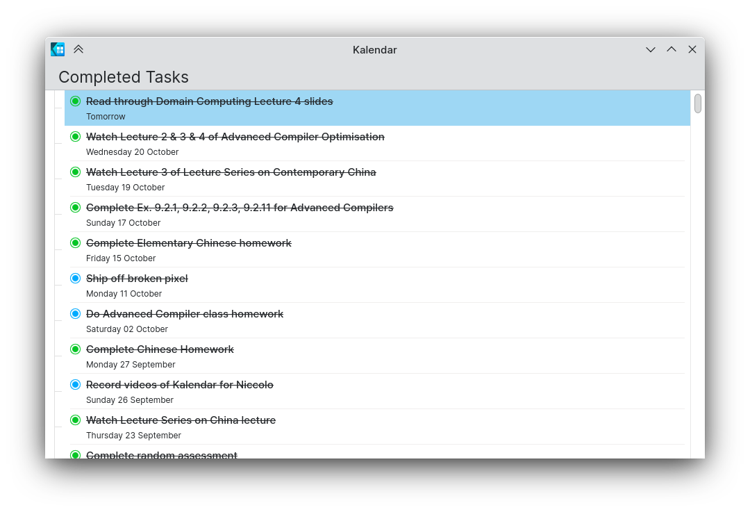
In the tasks view, opening the completed tasks on the desktop now brings up a separate window instead of an integrated overlay sheet. This should make this window more manipulable on the desktop, while retaining the sheet on mobile.
This also applies to the calendar selection dialog invoked when adding a quick task in the tasks view.
Improved link handling in the incidence information drawer
!125: Display hovered link in the bottom left (Carl Schwan)
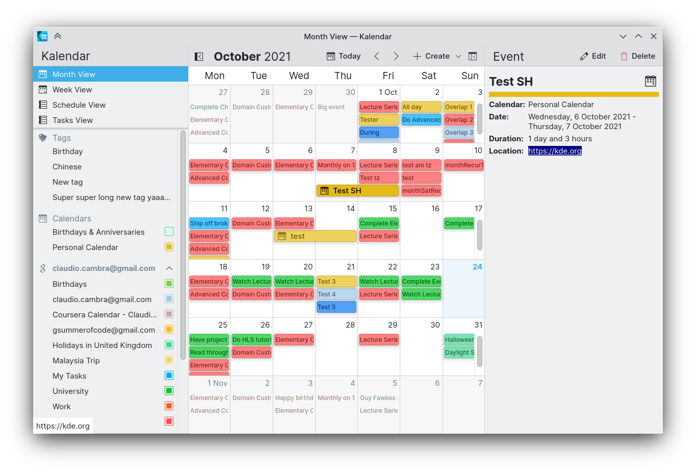
Links are now easier to handle than they were before. When you hover above a link in the incidence information drawer — whether this is an attendee’s email address, a website in the description, or the URL for a meeting — you can now see the link’s URL in the bottom-left of the Kalendar window, just like you would in your browser.
Additionally, you can now drag-click and highlight (and then copy and paste) links too.
Bug-fixes and other changes
Commit b851709e: Fix typo in CMakeLists (Fabian Vogt)
Commit a19114fa: Fix multiple top-level definitions of enum Roles breaking ODR (Fabian Vogt)
- Fixed backend typos and breakage due to typos in CMakeLists and badly defined Enum
Commit 7b48c205: Fixed touch on mobile, broken by deselectormousearea (Claudio Cambra)
- Fixed view navigation and incidence selection on mobile
Commit c5213a06: Capitalization fixes (Justin Zobel)
- Capitalisation of labels in settings now match rest of app
Commit 374f3920: Fix menu layout consistency (Justin Zobel)
- Menu bar toggle is now above configure button in both hamburger and menu bar menus
Commit 60f68793: Deboldened Summary label in incidence editor (Claudio Cambra)
- Deboldened the ‘Summary’ label in the incidence editor. This prevents borkage in the formatting of this label after pressing ‘Alt’ key.
Commit 5d94e5c0: Weekdays fixed in date picker (Claudio Cambra)
- Week day labels now appear in the date picker everywhere
Commit a3b95a7b: Week view incidence squares now clip and font becomes small when space restricted (Claudio Cambra)
- Incidences in the week view now have small labels instead of having text clipping through the rectangle
Commit ae746ce5: Fixed touch scroll on weekview (Claudio Cambra)
- Week view vertical scroll now works correctly on mobile
Commit 56321a1d: Fixed hour label misalignment in different locales (Claudio Cambra)
- Week view should now start from 00:00 regardless of what time locale is set on the system
Commit 5489bb9c: Fixed crashing when switching views and about page open (Claudio Cambra)
- Switching views when the about page is open should no longer cause Kalendar to crash
Commit 69665e7b: Fixed week view incidence delegate binding loop for property isTinyHeight (Claudio Cambra)
Commit e187993a: Fixed TodoTreeView todoItemContents width property binding loop (Claudio Cambra)
- Fixed binding loops, which would create masses of warnings in console output
Commit 5f1b9216: Fixed alignment of labels in tasks without occurrence details in tasks view (Claudio Cambra)
- Labels in the tasks view should now be vertically centred when there is no detail about due times or recurrence
Commit 17527867: Make “Month View Settings” separator consistent with other separators (Felipe Kinoshita)
- Separator for ‘Month View Settings’ section in view settings now consistent with other section separators
Commit a23778c3: Remove unused “getCurrentView” function (Felipe Kinoshita)
- Removed an unused function in sidebar code
Commit b36f1274: Fixed sidebar behaviour on desktop when not widescreen (Claudio Cambra)
Commit 248a22e6: Fixed super glitchy sidebar collapse behaviour on window resize (Claudio Cambra)
Commit 9d99eb41: Fixed drawer on mobile when wide (Claudio Cambra)
- A battery of fixes for the newly merged collapsible sidebar. Long story short: glitches fixed, behaviour is as you would expect across different devices and window sizes.
Coming up next
Is there anything you’d like to see added to Kalendar? Get in touch! I’m @clau-cambra:kde.org on Matrix.
