Massive new features: a new week view, KCommandBar, and more — Kalendar devlog 17

Note: Kalendar is still under heavy development. You’re free to poke around and try it out, but it is not yet final software! If you want to contribute to its development, join us in Kalendar’s Matrix room.

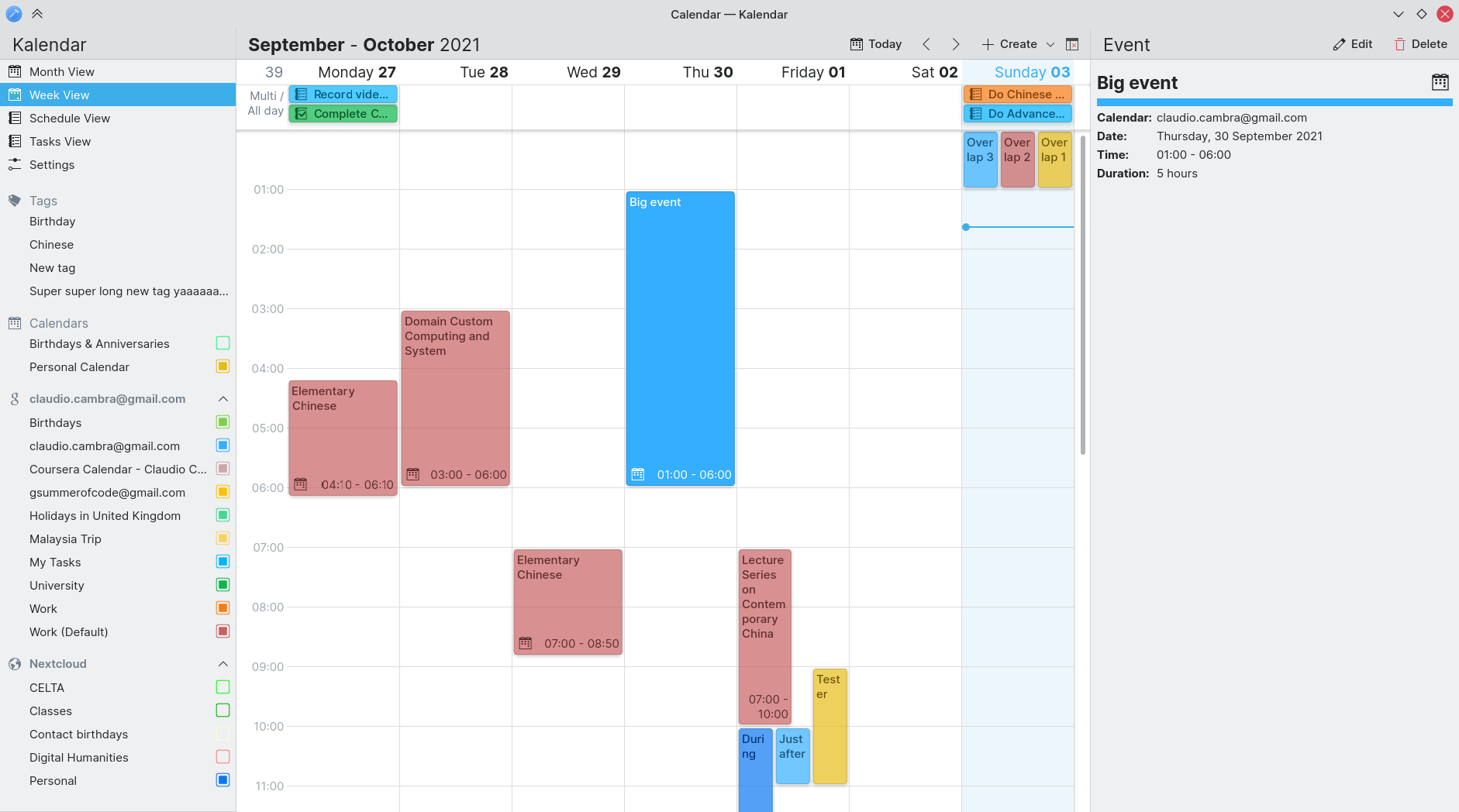
Up until now, Kalendar has allowed you to view your events on a day-by-day basis through both the month view and the schedule view. This week, we are introducing the week view, which gives you a more detailed perspective of your incidences.

Another big new feature: we have reimplemented the KCommandBar in QML. What does this mean? Well, those of you who are power users will be able to leverage the same Command Bar you have enjoyed using in other KDE apps in Kalendar too.

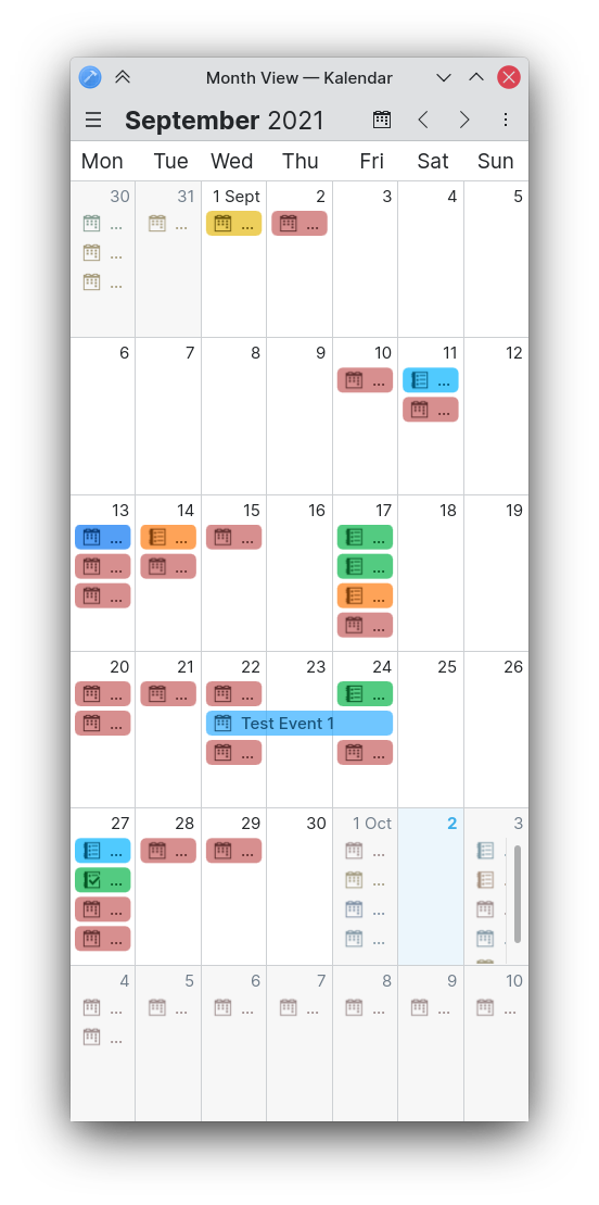
Lastly, we have some improvements for the month view on mobile that should make it far better to view your incidences.

Let’s get on with it!

Adding a new week view

!80: Add a week view to Kalendar (Claudio Cambra)

The new week view provides an hour-by-hour, day-by-day overview of your calendar’s incidences. We have focused on preserving the same aesthetics as in the rest of Kalendar, and ensuring it is as simple to view and as fast to use as the rest of the app.
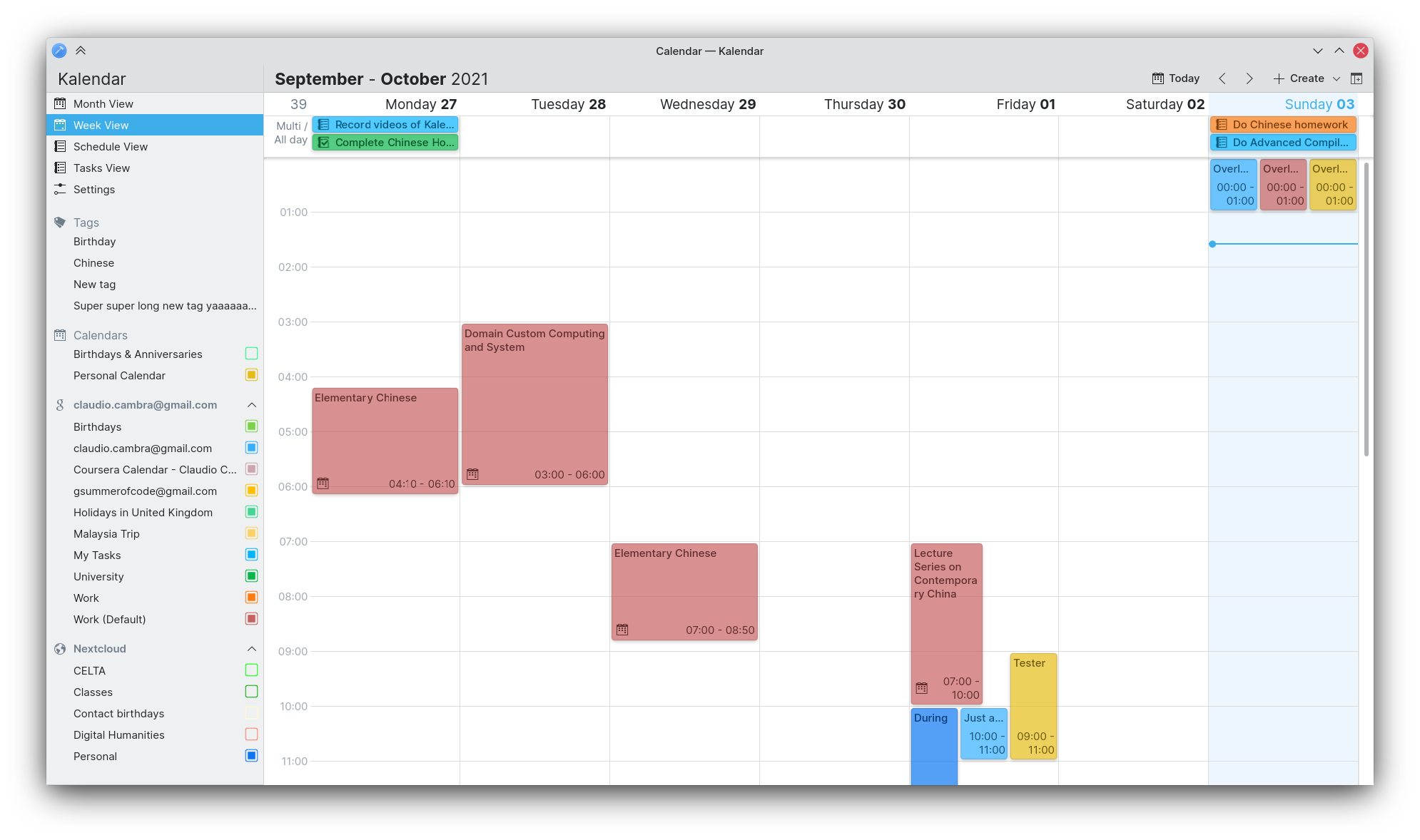
When using the week view, you will be able to see your incidences positioned according to the day they occur and the hours during which they take place. All-day and multi-day events are placed in a small view at the top of the week-view, which displays incidences in the same way as the month view. This clears up your week view so that you can focus on the incidences with the most specific start and end times.

The current time is marked with a line, and the present day is highlighted. You can navigate through weeks forwards and backwards, as well as by using the date changer popup as you would expect to do in any of Kalendar’s views.
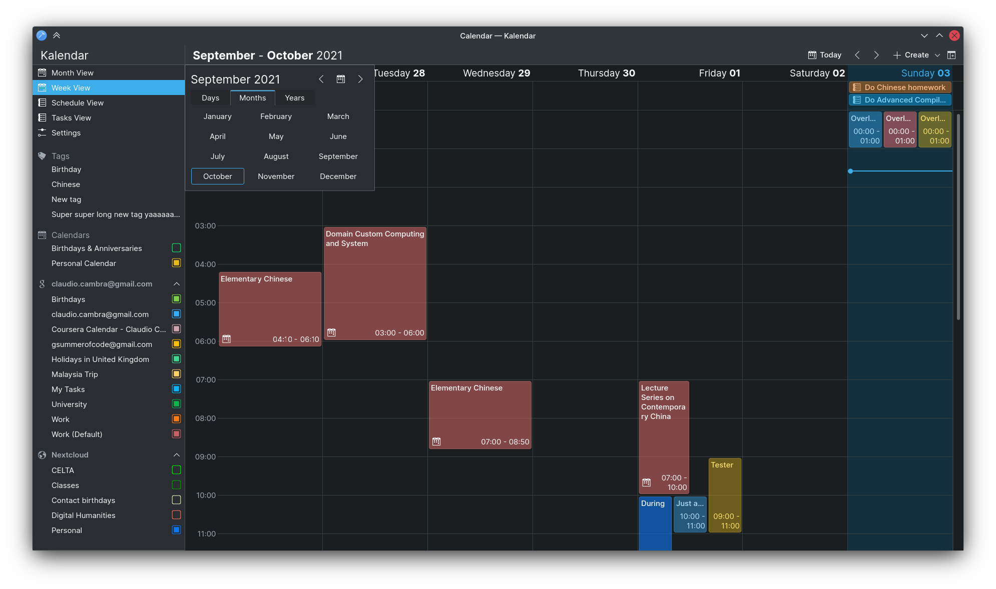
This view is a brand new addition, so bugs are to be expected! If you decide to take Kalendar’s in-development version for a spin and find any bugs, please report them 🙂

Re-implement KCommandBar in QML and include in Kalendar

!79: Implement kcommandbar in QML (Carl Schwan)

If you are a power user of some other KDE apps, you might have used KCommandBar — a KRunner-like popup that lets you quickly search for and trigger actions within the application you are using.
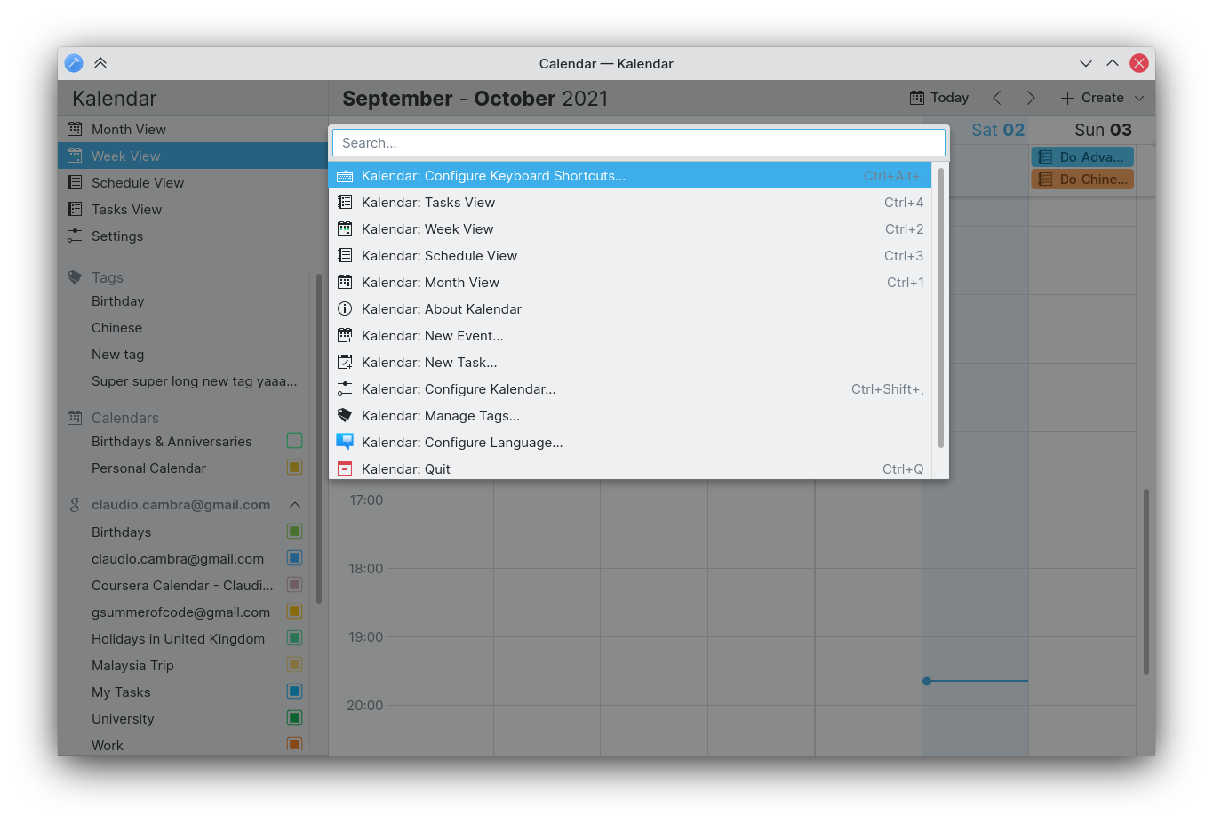
This week, we have reimplemented this component in QML and included it in Kalendar. Our KCommandBar can be invoked with the key combination CTRL+ALT+i, and you can immediately invoke Kalendar’s actions such as creating events, sorting todos, or switching views.

Making the month view more readable

!81: Improve readability of month view incidences in mobile/horizontally constricted environments (Claudio Cambra)

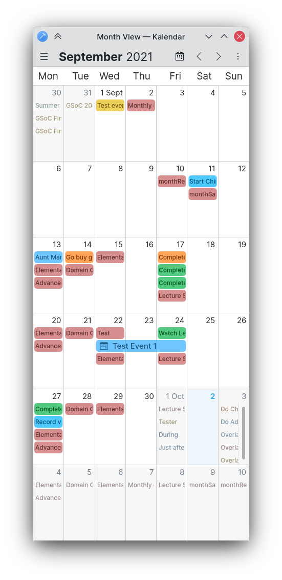
We have changed the displaying of incidences in the month view to be more readable when there isn’t much horizontal space. Now, when incidence lines are narrow, they will not elide, will feature smaller text, and will have less padding to ensure that their names are always visible. This will be a particularly helpful change on mobile.
Improving visual and interactive consistency

!82: Separate multi day view incidence delegate into own component (Claudio Cambra)
Commit b4744ad9: Separated incidence background onto own component and added glow in dark mode (Claudio Cambra)
!83: Improve calendar selector in task view (Carl Schwan)

We have unified several components that have been used across the different views, including the incidence lines presented in the week and month views as well as the backgrounds of incidences in the month, week, and schedule views. The result is improved visual consistency now, as well as future consistency if any changes are made. Incidences in the month view, for example, now feature subtle shadows just like in the week and schedule views.
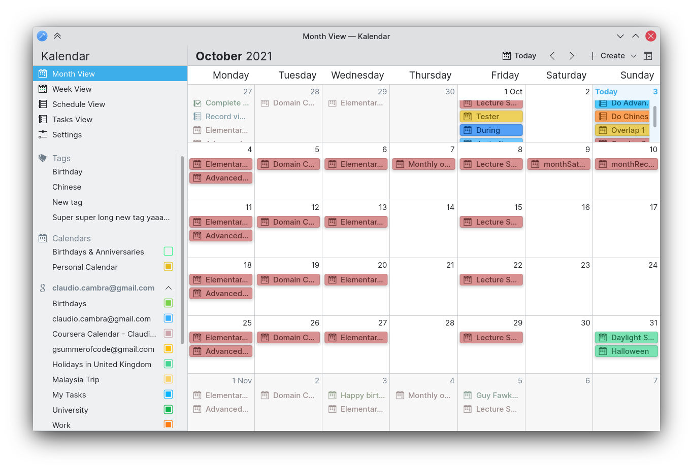
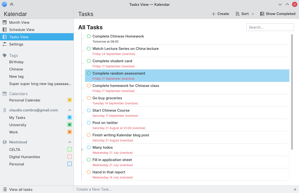
Additionally, the calendar picker that is invoked when you add a task using the quick-add field in the task view now works in the same way as the sidebar’s calendar list.

image

Toggle-able menu bar: finally here!

!41: Make Menubar toggleable (Felipe Kinoshita)

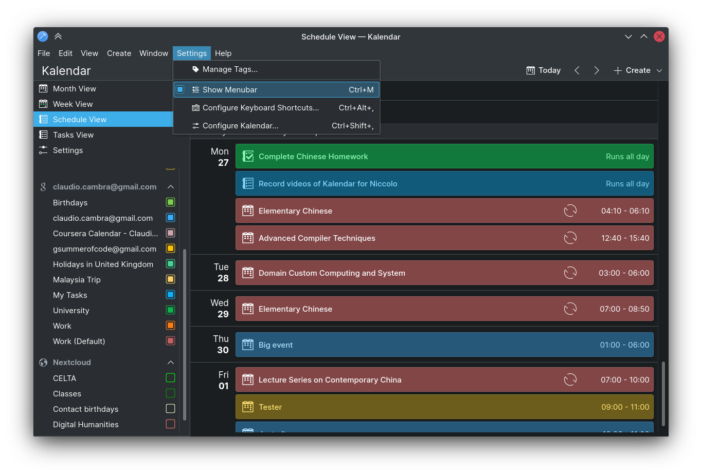
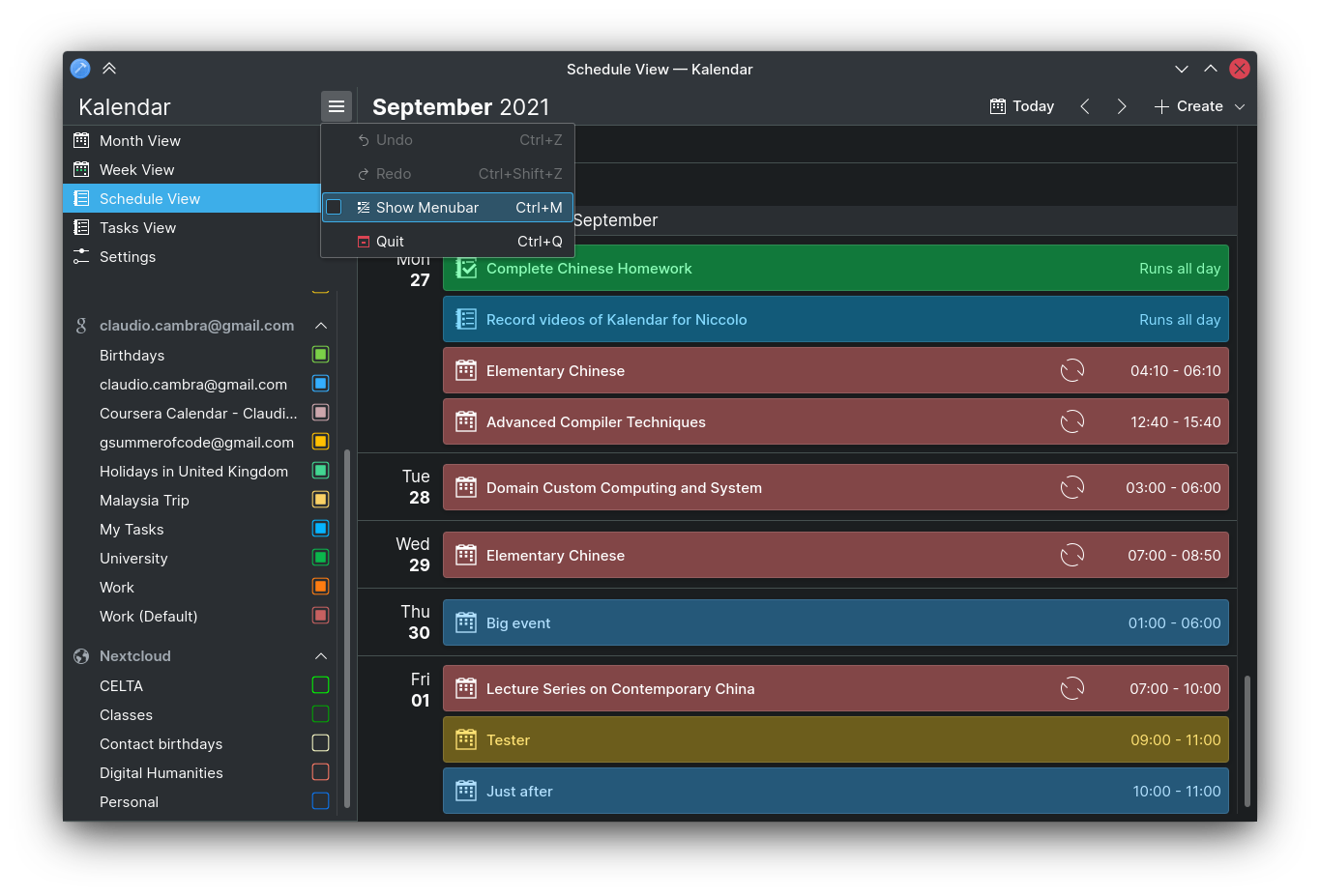
We showed off our toggle-able menubar a few weeks ago, but little bugs have kept this from being merged. Up until now! Those of you who would like to switch between a hamburger menu or a menu bar can now do so from either thanks to a check-able “Show menubar” action. If you use a global menu, neither of these components will appear.

Bug-fixes and other changes

Commit d0b610b5: Make it compile with new akonadi includes (Laurent Montel)

  • Kalendar now shows incidences correctly when using most up-to-date versions of Akonadi (e.g. from kdesrc-build)

Commit 4e42c4d5: Fixed schedule view not defaulting to current day (Claudio Cambra)

  • Schedule view now once again opens up to current day when not explicitly moved to different month

Commit 0b3e512e: Fixed collection picker in all tasks page quick add field (Claudio Cambra)

  • When adding a task from the quick-add textfield and in the ‘All Tasks’ page, the collection picker presented to let you select what calendar this task will be put into once again presents calendars correctly

Commit ada0e9c7: Fixed incidence radius in week view incidences (Claudio Cambra)

  • Incidences’ corners in the week view now have the correct radius instead of sharp corners

Commit 81431239: Fixed separator size not taking into account the horizontal scrollbar width (Claudio Cambra)

  • The background separator in the week view’s alll day/multi day events header no longer extends beyond this view, removing the ugly gray background to the right of incidences

Commit 55f72978: Fixed list view dragging on week view elements (Claudio Cambra)

  • Scrolling in the week view now works correctly in mobile, with dragging anywhere scrolling vertically the entire page and not just select items

Coming up next

Some big new features this week mean that next week will inevitably be full of bug-fixes, so expect lots of those. There are several smaller features that we still want to implement from our feature-list, so expect some of those too.

Is there anything you’d like to see added to Kalendar? Get in touch! I’m @clau-cambra:kde.org on Matrix.
Turbocharging Kalendar — Kalendar devlog 16

Note: Kalendar is still under heavy development. You’re free to poke around and try it out, but it is not yet final software! If you want to contribute to its development, join us in Kalendar’s Matrix room.

This week, we have focused on one thing: speed. From UI additions to under-the-hood improvements, Kalendar is now quicker to use and faster to act than ever!

Big optimisations to Kalendar

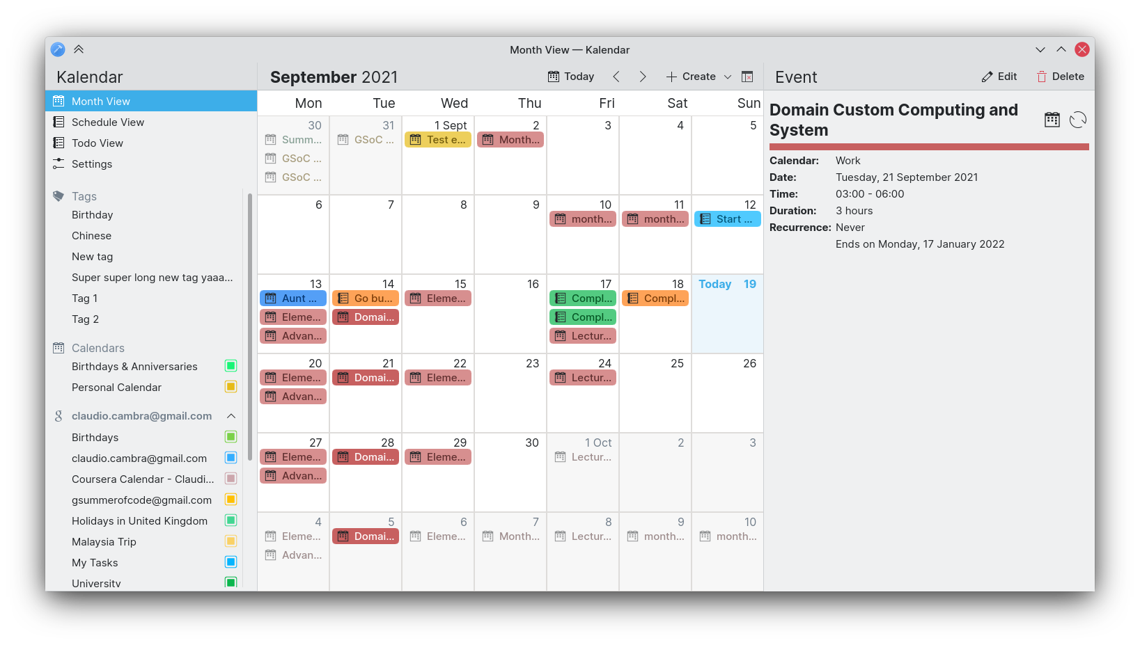
!71: Optimise the monthview and schedule view (Claudio Cambra)

A lot of this week has been spent profiling Kalendar, finding hotspots, and minimising them. As a result, lots of tweaks now help Kalendar perform better, particularly when using the month and schedule views. By limiting the number of view resets each second, using less resource-intensive components, and eliminating cruft, Kalendar is now significantly faster.

These improvements can be felt on every start up and on every month switch, and should be particularly noticeable on lower-power machines and especially the Pinephone. With this update, Kalendar is much smoother on this device (though we will keep optimising!)

Change dates more quickly with the new date changer

!69: Add a date change popup (Claudio Cambra)

Also new this week is a date changer popup, which you can bring up by clicking on the date title in the month and schedule view. This popup contains a month, year, and decade view that should help you select a date far more quickly than by scrolling through each month. The popup can be close by simply clicking/tapping anywhere else.

UI improvements on mobile

!74: Move mobile sidebar handles to toolbar (Devin Lin)
!76: Use NavigationTabBar component (Devin Lin)

Thanks to new contributions by Devin Lin, Kalendar is now a little better to use on mobile: the sidebar handle is in the toolbar, moving it out of the way of the app contents. Kalendar now uses the freshly-baked Kirigami NavigationTabBar component, also made by Devin, which should ensure that Kalendar’s bottom nav bar behaves the same way as other Kirigami apps’.

image

Todos are now Tasks

!75: Replace ‘todo’ strings in the UI with ‘task’ (Claudio Cambra)

After a (lively!) discussion on this proposed change, Kalendar has replaced its wording for tasks from ‘todo’ to ‘task’, and all of these words variations. This change only affects the user interface, and not the back-end classes and their existing names — I suppose you will care more about the former than the latter 🙂

Bug-fixes and other changes

!78: Add “About Kalendar” action to global/in-window menu (Felipe Kinoshita)

  • Added an ‘About Kalendar’ button to the global and in-window menu, in keeping with other KDE apps

!77: Don’t keep the settings action highlighted (Felipe Kinoshita)

  • The ‘settings’ entry on the sidebar no longer stays highlighted after exiting settings

!73: Fix colouring of icons meant to be coloured (Claudio Cambra)

  • Icons now have correct colours across Kalendar, instead of just being white regardless of set colour

!72: Bump KF5 requirement to 5.86 (Elias Probst)

  • Compiling Kalendar now requires you to have KFrameworks 5.86, meaning you will not be able to use Kalendar on a system where it will not function properly

!70: Add shortcut to quit action in the in-window menubar (Felipe Kinoshita)

  • Quit action shortcut is now working regardless of the menubar being used (or if a menu bar is being used at all)

Commit e26d93ff: Fixed duration strings (Claudio Cambra)

  • Duration strings for all-day events are now correct (shown in incidence info drawer/sidebar)

Commit 027107a6: Fixed recurrence strings (Claudio Cambra)

  • Recurrence strings for weekly recurrence now appear correctly (shown in incidence info drawer/sidebar)

Coming up next

The week view is coming!

Is there anything you’d like to see added to Kalendar? Get in touch! I’m @clau-cambra:kde.org on Matrix.
New tag management capabilities, usability improvements, and a bunch of fixes — Kalendar devlog 15

Note: Kalendar is still under heavy development. You’re free to poke around and try it out, but it is not yet final software! If you want to contribute to its development, join us in Kalendar’s Matrix room.

This week, we have once again included a big number of little UI changes that should make Kalendar easier to use and prettier to look at than ever.

Building upon our tag work from last week, we have also made tags far more feature complete this week. Let’s take a look!

Introducing tag assignment, improving tag management, and better displaying of tags

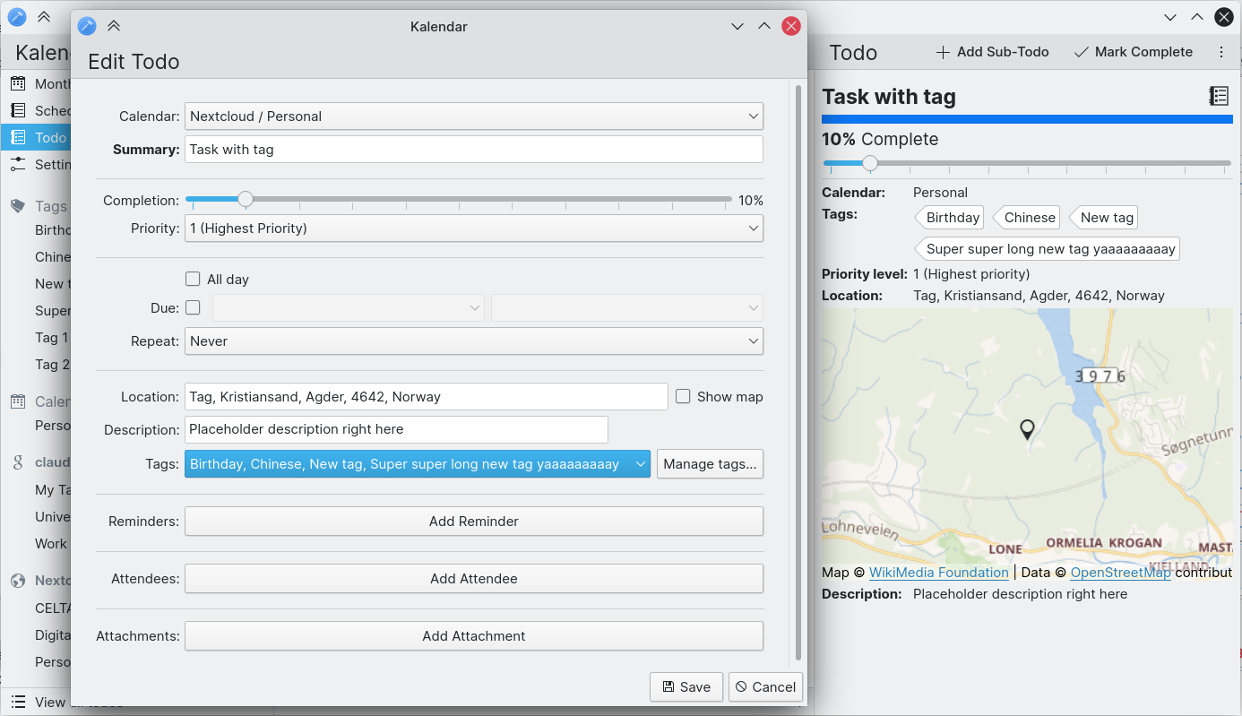
!55: Show incidence tags/categories in incidence info drawer (Claudio Cambra)
!59: Add ability to set an incidence’s tags in the incidence editor (Claudio Cambra)
!61: Use Koko’s tags to show incidence tags (Claudio Cambra)
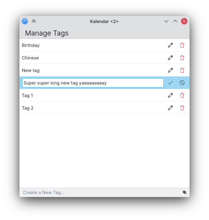
!67: Add a new tag manager UI (Claudio Cambra)

Lots of changes to tags have taken place this week!

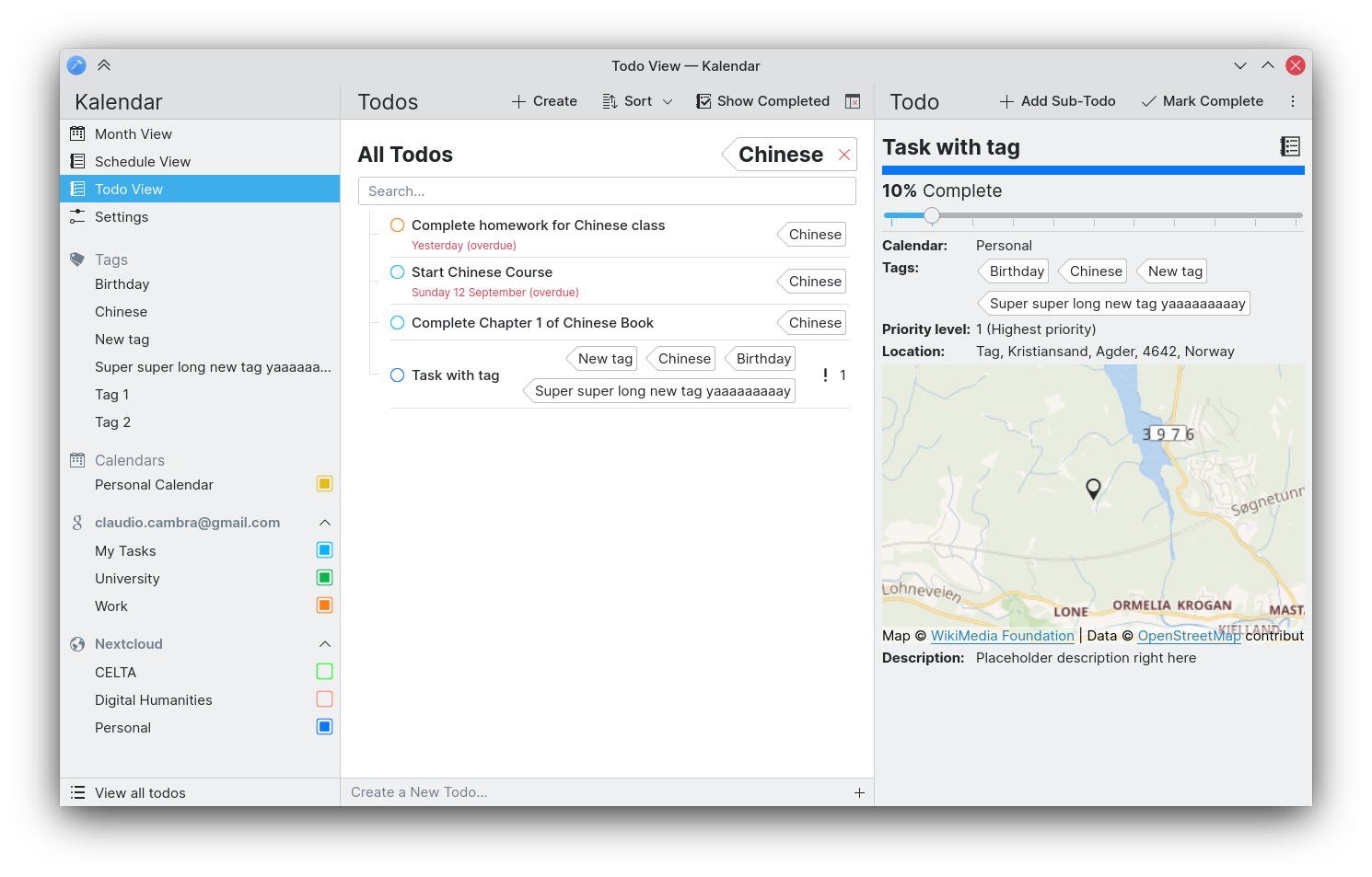
First, you can expect to see tags wherever they may be relevant. The incidence information drawer, for instance, now shows an incidence’s tags. The incidence editor now also displays an incidence’s tags, letting you set an incidence’s tags as you please.

The way tags are presented has also been changed. Rather than showing them as normal strings, tags are now presented in a nice ‘tag’ component courtesy of the Koko team. This helps make tags visually distinct from other characteristics of an incidence wherever they are shown, and make them look very pretty too!

Lastly, we are also introducing a tag manager page that lets you modify, delete, and create tags quickly and easily. This tag manager is accessible either through Kalendar’s global/window/hamburger menus or directly though the incidence editor if needed.

Usability improvements galore!

!54: Remember last-opened view (Felipe Kinoshita)
!58: Assign Left/Right arrow key to change the current month (Felipe Kinoshita)
!63: Add scrollview to todo page for better desktop scrolling (Claudio Cambra)
!65: Add configure keyboard shortcuts action to in-window menubar (Felipe Kinoshita)

Good news: if the default view is not your favourite view, you no longer have to switch to your preferred view every time you open Kalendar. This should make it quicker for you to get on with your calendaring needs!

The todo view also now uses a scrollview, which should make scrolling feel far more natural with a mouse while retaining inertia and other touch-focused scroll features when using on mobile.

You can also now use the left and right keyboard keys in order to easily switch between the months in the month and schedule view.

Lastly, you can now expect to use the same keyboard shortcut for setting up your keyboard shortcuts as in other KDE apps, no matter what menu you are using.

Tweaking and improving visuals

!52: Make all title headers’ padding consistent (Felipe Kinoshita)
!62: Tweak spacing and layout in sidebar and todo view (Claudio Cambra)
!64: Improve month grid border drawing method and make width customisable (Claudio Cambra)
!66: Add more top margin between the day indicator and the incidence list (Felipe Kinoshita)

As some of you have pointed out, padding and spacing have been at times inconsistent across Kalendar. This week we have made some efforts to improve consistency on these fronts. All title headers now have consistent padding regardless of the page, drawer, or sidebar on which they appear, making everything look more cohesive. We have also tweaked the spacing and alignment of elements in the sidebar, which makes everything look more cohesive here too.

The sidebar also features some different text sizes and icons to make everything more glanceable and to make the hierarchy of elements more clear.

We have also tweaked the padding between the day headers in the month grid cells and the incidences in order to make each cell feel a little bit less cramped.

Finally, we have also improved the drawing method for month grid cell borders, which can now be customised in Kalendar’s settings.

image

Bug-fixes, UI tweaks and performance improvements

!56: Fixed displaying of time-related info for todos in todo view (Claudio Cambra)

  • When opening todos in the todo view, the incidence information drawer now displays end times correctly without superfluous hyphen

!57: New TagManager and tag model fixes (Claudio Cambra)

  • Sidebar now displays all tags, eliminating duplicates

!60: Make IncidenceWrapper inherit IncidenceObserver (Claudio Cambra)

  • This helps propagate updates to incidences across Kalendar, meaning that changing an incidence in the incidence editor will automatically update said incidence in an open incidence information drawer

!62: Tweak spacing and layout in sidebar and todo view (Claudio Cambra)

  • Fixed enabling of undo/redo

Commit a7dee26d: Fixed visibility of end date combo when all day checkbox ticked (Claudio Cambra)

  • End date combo box now visible when all day checkbox is checked in the incidence editor

Coming up next

So tags are fully here. Kinda. We still want to make tag filtering work in all views, not just the todo view. And what about that week view? Hmmm… 😉

Is there anything you’d like to see added to Kalendar? Get in touch! I’m @clau-cambra:kde.org on Matrix.