Note: Kalendar is still under heavy development. You’re free to poke around and try it out, but it is not yet final software! If you want to contribute to its development, join us in Kalendar’s Matrix room.
This week, we have once again included a big number of little UI changes that should make Kalendar easier to use and prettier to look at than ever.
Building upon our tag work from last week, we have also made tags far more feature complete this week. Let’s take a look!
Introducing tag assignment, improving tag management, and better displaying of tags
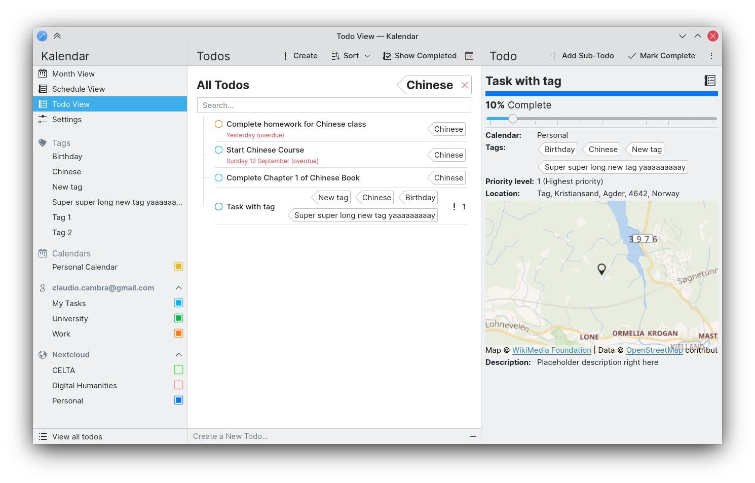
!55: Show incidence tags/categories in incidence info drawer (Claudio Cambra)
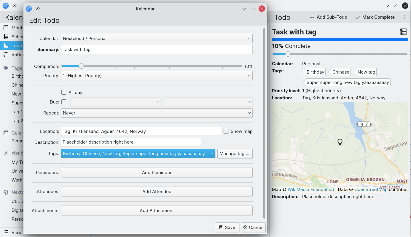
!59: Add ability to set an incidence’s tags in the incidence editor (Claudio Cambra)
!61: Use Koko’s tags to show incidence tags (Claudio Cambra)
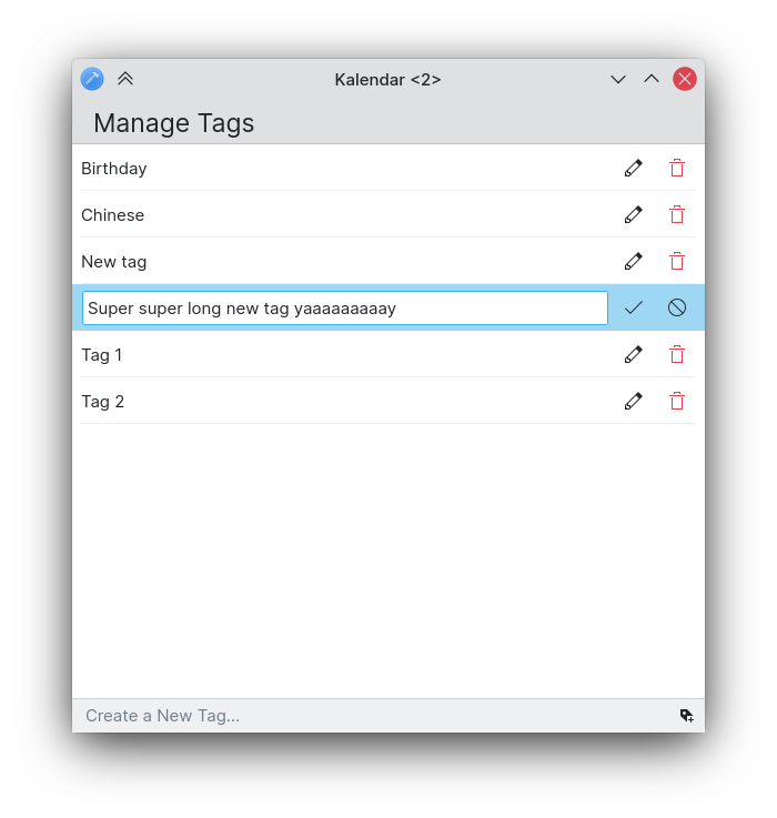
!67: Add a new tag manager UI (Claudio Cambra)
Lots of changes to tags have taken place this week!
First, you can expect to see tags wherever they may be relevant. The incidence information drawer, for instance, now shows an incidence’s tags. The incidence editor now also displays an incidence’s tags, letting you set an incidence’s tags as you please.

The way tags are presented has also been changed. Rather than showing them as normal strings, tags are now presented in a nice ‘tag’ component courtesy of the Koko team. This helps make tags visually distinct from other characteristics of an incidence wherever they are shown, and make them look very pretty too!

Lastly, we are also introducing a tag manager page that lets you modify, delete, and create tags quickly and easily. This tag manager is accessible either through Kalendar’s global/window/hamburger menus or directly though the incidence editor if needed.

Usability improvements galore!
!54: Remember last-opened view (Felipe Kinoshita)
!58: Assign Left/Right arrow key to change the current month (Felipe Kinoshita)
!63: Add scrollview to todo page for better desktop scrolling (Claudio Cambra)
!65: Add configure keyboard shortcuts action to in-window menubar (Felipe Kinoshita)
Good news: if the default view is not your favourite view, you no longer have to switch to your preferred view every time you open Kalendar. This should make it quicker for you to get on with your calendaring needs!
The todo view also now uses a scrollview, which should make scrolling feel far more natural with a mouse while retaining inertia and other touch-focused scroll features when using on mobile.
You can also now use the left and right keyboard keys in order to easily switch between the months in the month and schedule view.
Lastly, you can now expect to use the same keyboard shortcut for setting up your keyboard shortcuts as in other KDE apps, no matter what menu you are using.
Tweaking and improving visuals
!52: Make all title headers’ padding consistent (Felipe Kinoshita)
!62: Tweak spacing and layout in sidebar and todo view (Claudio Cambra)
!64: Improve month grid border drawing method and make width customisable (Claudio Cambra)
!66: Add more top margin between the day indicator and the incidence list (Felipe Kinoshita)
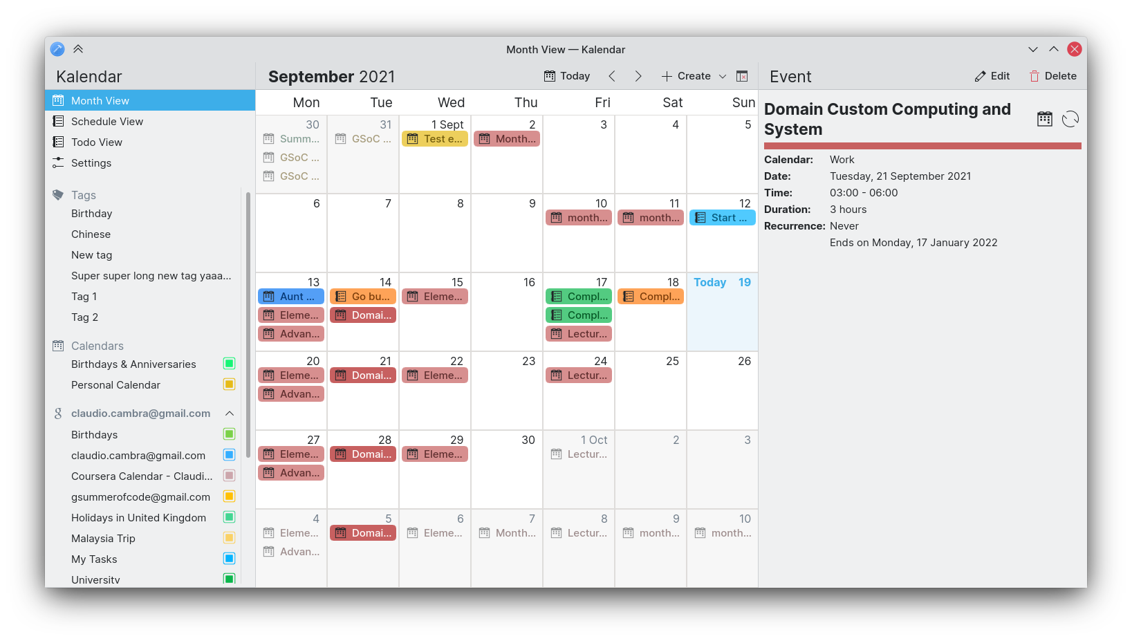
As some of you have pointed out, padding and spacing have been at times inconsistent across Kalendar. This week we have made some efforts to improve consistency on these fronts. All title headers now have consistent padding regardless of the page, drawer, or sidebar on which they appear, making everything look more cohesive. We have also tweaked the spacing and alignment of elements in the sidebar, which makes everything look more cohesive here too.
The sidebar also features some different text sizes and icons to make everything more glanceable and to make the hierarchy of elements more clear.

We have also tweaked the padding between the day headers in the month grid cells and the incidences in order to make each cell feel a little bit less cramped.
Finally, we have also improved the drawing method for month grid cell borders, which can now be customised in Kalendar’s settings.

Bug-fixes, UI tweaks and performance improvements
!56: Fixed displaying of time-related info for todos in todo view (Claudio Cambra)
- When opening todos in the todo view, the incidence information drawer now displays end times correctly without superfluous hyphen
!57: New TagManager and tag model fixes (Claudio Cambra)
- Sidebar now displays all tags, eliminating duplicates
!60: Make IncidenceWrapper inherit IncidenceObserver (Claudio Cambra)
- This helps propagate updates to incidences across Kalendar, meaning that changing an incidence in the incidence editor will automatically update said incidence in an open incidence information drawer
!62: Tweak spacing and layout in sidebar and todo view (Claudio Cambra)
- Fixed enabling of undo/redo
Commit a7dee26d: Fixed visibility of end date combo when all day checkbox ticked (Claudio Cambra)
- End date combo box now visible when all day checkbox is checked in the incidence editor
Coming up next
So tags are fully here. Kinda. We still want to make tag filtering work in all views, not just the todo view. And what about that week view? Hmmm… 😉
Is there anything you’d like to see added to Kalendar? Get in touch! I’m @clau-cambra:kde.org on Matrix.
Good Work,
I would make the Description area way bigger at the input field. What I love is if you search and get no result you can add a new entry with the search input field. So you can check if you already have an todo/calender entry and make a new one. All in one.
good luck
Kalendar is looking better and better by the week, great work!
Would it be possible to insert an additional search field as a line below the Tags on the left, either statically or appearing once the list would create a scroll bar? A minimum of five visual tags (for small windows) and a variable maximum for the height of the window would be handy. If shortening of the list won’t work, they may be best below the calendars as calendars tend to be more finite in numbers.
Also, triggering a context menu (right click / long hold) on “Tags” and allowing sorting tags by name, popularity (count/amount), creation/modification time could make them effective too.
The sidebar is still quite unfinished, we have plans to allow you to sort/filter through tags and calendars in more ways!
In regard to the scroll behaviour on the sidebar — it is the way it currently is for simplicity’s sake, though I agree for smaller windows it is not optimal. We will keep testing! 🙂
Screenshots are looking like a great piece of software since I couln’t use it yet. So, does location field support gps position entry (lat, lon coordinates) not addresses as location? Or choosing a point from the map?
Anyhow both options may not yield a proper solution if address and gps position fields aren’t separated. (Imagine that maybe some addresses are not correct or not entered yet into the map server ie openstreetmap for the whole world..)
I can describe this as text address for human reading and gps position for locating.
Thank you for your efforts.