Tag filtering, better navigation and lots of little UI tweaks — Kalendar devlog 14

Note: Kalendar is still under heavy development. You’re free to poke around and try it out, but it is not yet final software! If you want to contribute to its development, join us in Kalendar’s Matrix room.

This week, we have done lots of small tweaks to Kalendar and are introducing a big, new, highly requested feature by many of you.

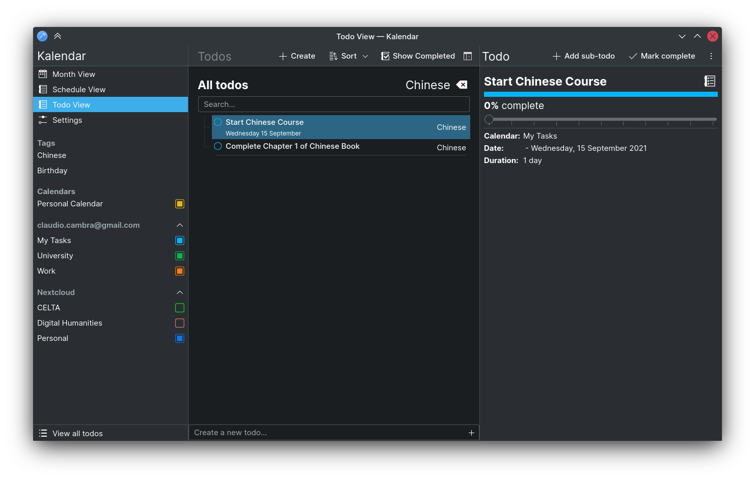
Added displaying of todo tags and filtering todos by tags in the Todo View

!51: Add tag filtering and displaying capabilities for todos in Kalendar (Claudio Cambra)

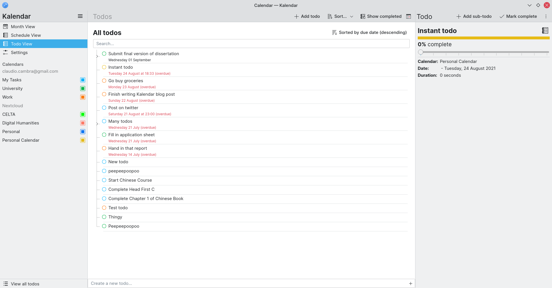
Tags! Kalendar now has some tag capabilities for the todo view. Kalendar displays todo tags from calendar services that support tagging, placing them to the right of the todo item in the list view. All synchronised tags are displayed in the sidebar, above calendars, and in the todo view clicking on them will filter todos to those that have the selected tag.

As before, tag filtering can also be filtered by todo calendar. The currently selected tag can be seen at the top right of the todo view page, and the currently selected filtering tag can be removed by clicking the ‘clear’ button to its right.

Tag support as a whole is still a work in progress: Kalendar still does not support assigning tags to a todo or creating new tags. This will be added soon!

Improvements to navigation

!50: Add bottom toolbar on mobile (Felipe Kinoshita)
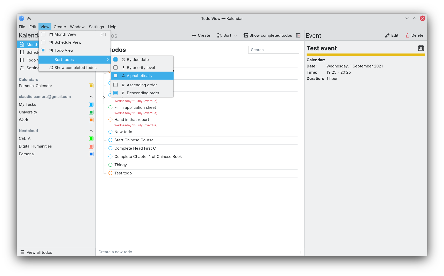
!48: Give view actions better default shortcuts (Felipe Kinoshita)
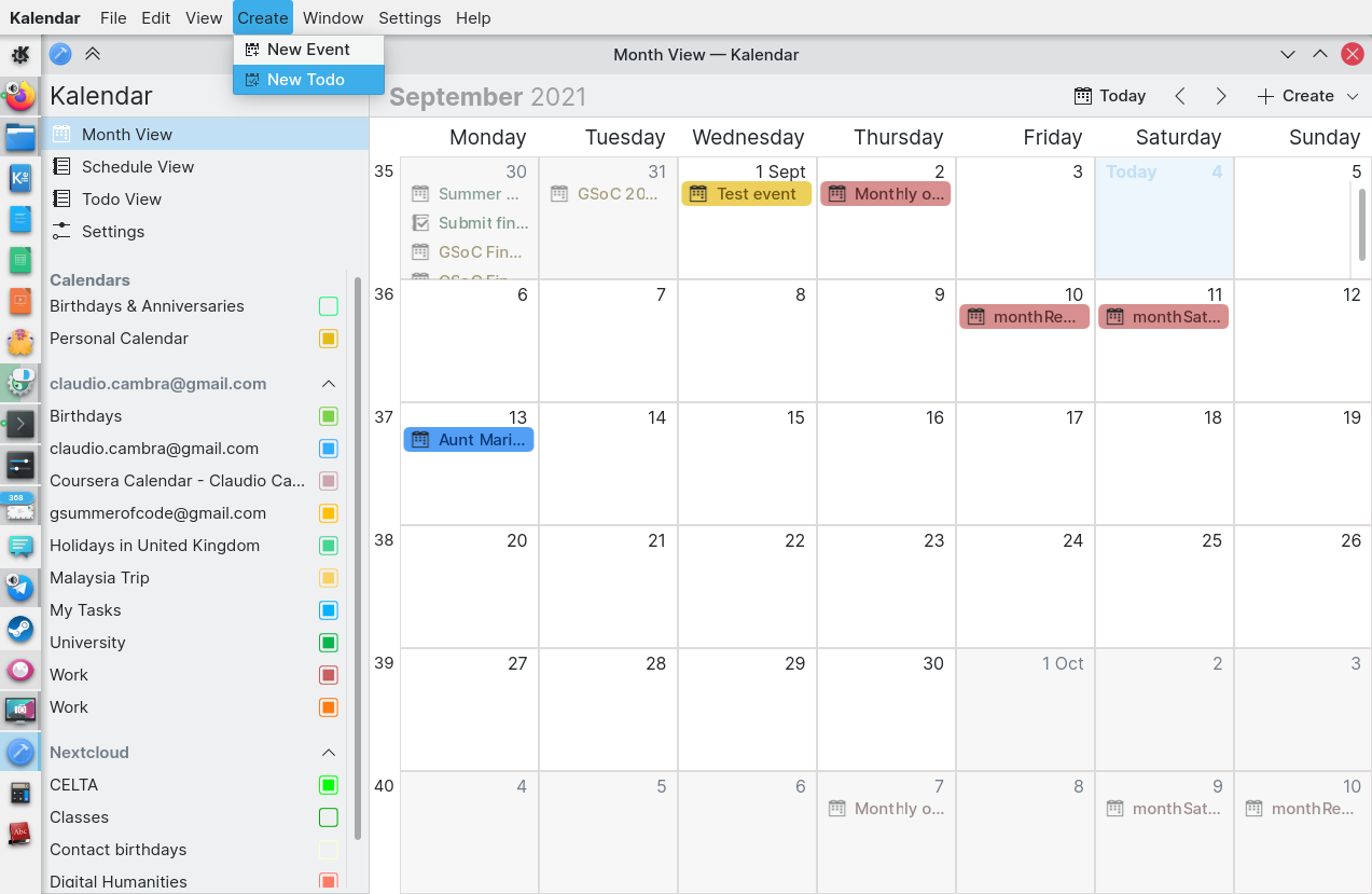
!41: Make Menubar toggleable (Felipe Kinoshita)

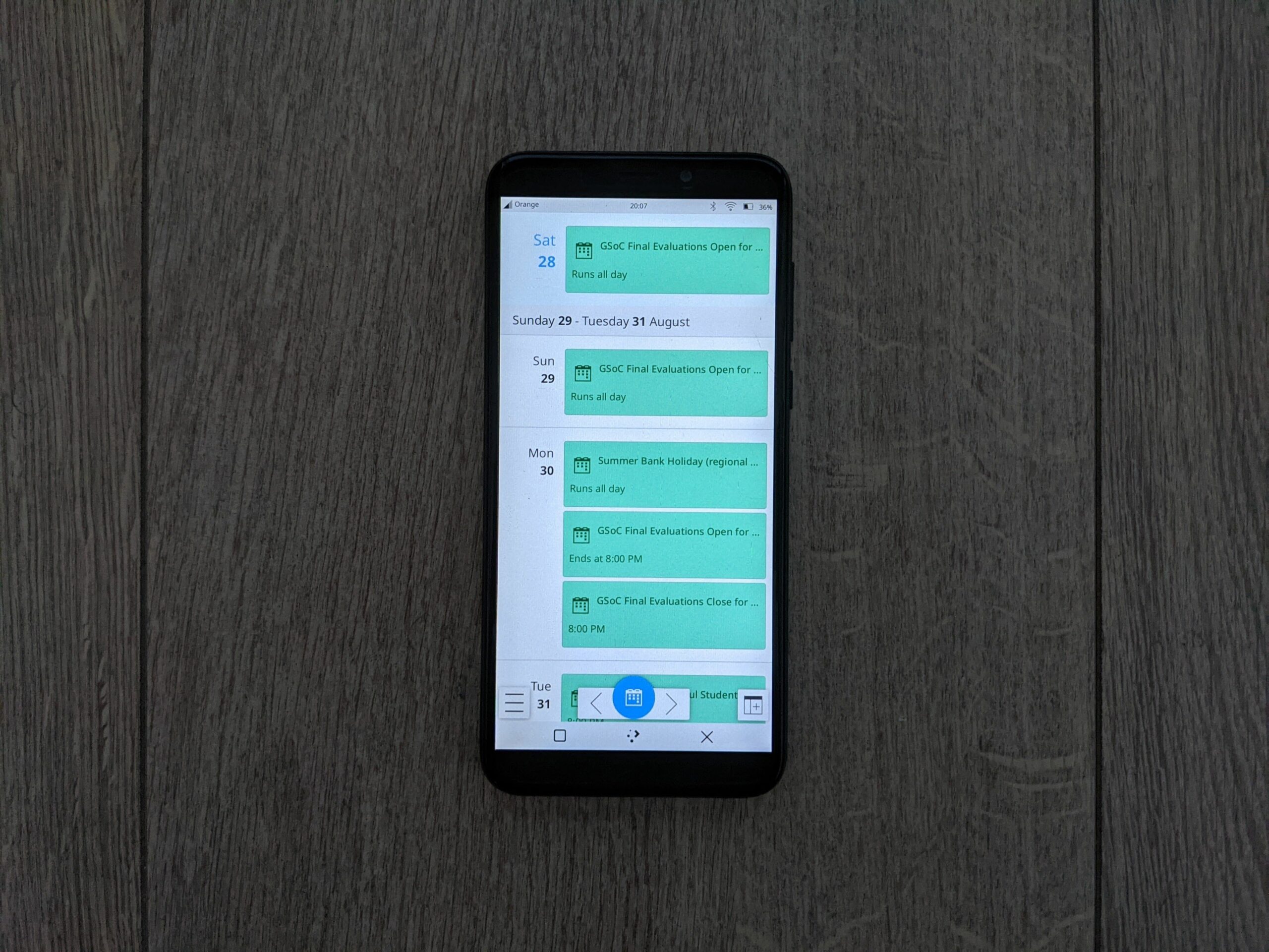
Kalendar now features a bottom toolbar for changing views in mobile mode. This allows you to more quickly and visible change views in the app!

Screenshot_20210910_220202

On the desktop, we have now added fast new shortcuts for switching between different views:

  • CTRL + 1: Month view
  • CTRL + 2: Schedule view
  • CTRL + 3: Todo view

In the month and schedule view, the mouse back and forward buttons (usually on the side of your mouse) now let you go backwards and forwards a month.

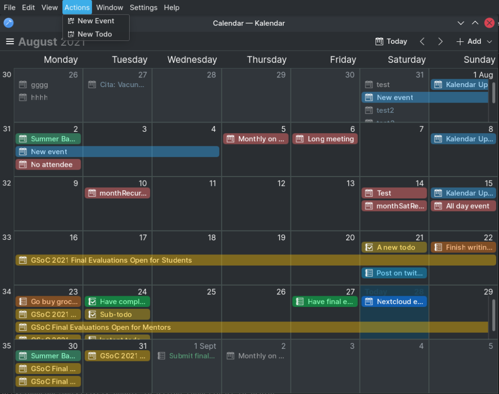
Lastly, for those of you who prefer not to have a menu bar and instead like the hamburger, the menu bar is now toggle-able and is replaced by a hamburger when hidden.

Bug-fixes, UI tweaks and performance improvements

!48: Captalize create actions correctly (Felipe Kinoshita)

  • Create actions now capitalised correctly,a s per the KDE HIG

!46: Make the “Calendars” header a bit bigger and remove it’s boldness (Felipe Kinoshita)

  • “Calendars” header now slightly larger and not bold
new

!45: Placeholder messages and helpful actions for the todo view (Claudio Cambra)

  • Significant optimisations to IncidenceMouseArea component, which should improve performance across Kalendar

!44: Stop using devicePixelRatio (Felipe Kinoshita)

  • DevicePixelRatio now not used after deprecation

!42: Make sidebar aware of the current view (Felipe Kinoshita)

  • Sidebar now aware of current view and highlights list items accordingly

!40: Add missing icons to Global and Window menu (Felipe Kinoshita)

  • Global and window menus now contain all icons

Coming up next

Tag support is here, but not fully. We are going to keep working on this: next up is creating new tags and assigning them to todos.

Is there anything you’d like to see added to Kalendar? Get in touch! I’m @clau-cambra:kde.org on Matrix.
Killing the dreaded hamburger menu — Kalendar devlog 13

Note: Kalendar is still under heavy development. You’re free to poke around and try it out, but it is not yet final software! If you want to contribute to its development, join us in Kalendar’s Matrix room.

This week, we have made some more UI tweaks to Kalendar, making it easier and faster to use than ever. We have also turned lots of stones and crushed lots of bugs.

Let’s get to it!

Added a window menu to Kalendar and improved existing global menu

!36: Add new in-window menu bar, improvements to global menu bar (Claudio Cambra)

Since almost the beginning, Kalendar has depended on hamburger menus to access a lot of its key functionality: undoing/redoing, switching views, accessing settings, and so on. Last week, when we introduced the new sidebar, we managed to remove most of these items from the hamburger menu and place them where you could easily and quickly find them.

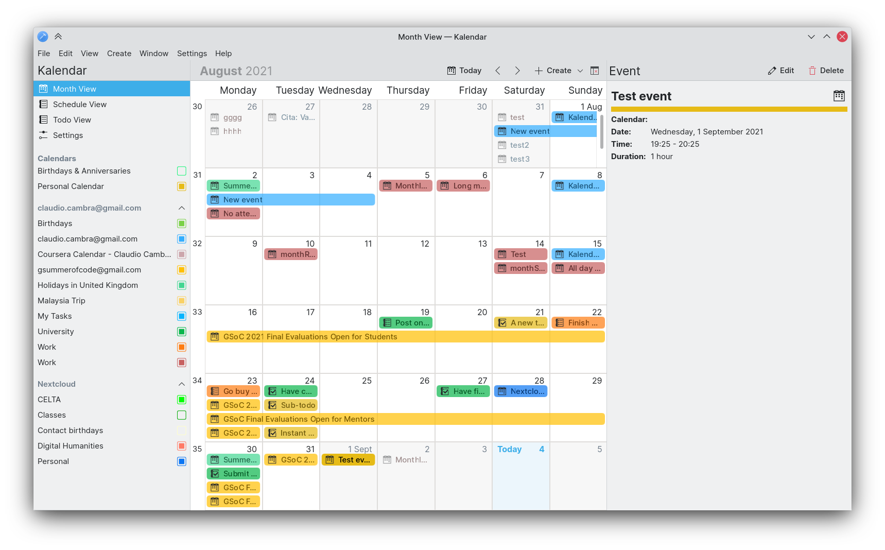
We don’t like hamburger menus because they hamper UI discoverability and they slow interaction down. So this week we got rid of them on the desktop. But don’t worry, we’ve replaced them! Kalendar now has the tried and tested menu bar, faster and clearer than the hamburger.

Carl Schwan did the lion’s share of implementing a global menu for Kalendar last week, but now we also have an in-window menu for those of you that don’t use the global menu. The global menu has been improved this week, and both the in-window and global menu have a full set of menu items that should let you quickly and more efficiently use Kalendar.

Further improvements to mobile use

!32: Rearrangements to incidence info drawer and general drawer fixes on mobile (Claudio Cambra)
!38: Make schedule view swipeable on mobile (Claudio Cambra)

Last week we introduced a new swipeable version of the month view, which made it more pleasant to use on mobile. This week, we are also adding this change to the schedule view. Much like with the month view, you can now swipe your way through the months in the schedule view!

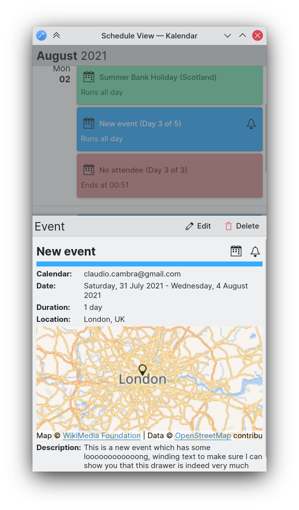
We have also turned the incidence information drawer into a bottom drawer, rather than a side drawer. This should make the action buttons far easier to reach on a phone screen, while still providing enough space to see all of an event’s or todo’s information at once.

We are also working on a navigation-focused bottom-toolbar for mobile use, which should let you more quickly swap between Kalendar’s different views.

Tidying up the sidebar

!34: Use collapsible tree views (Carl Schwan)
!39: Sort collection correctly in sidebar (Carl Schwan)

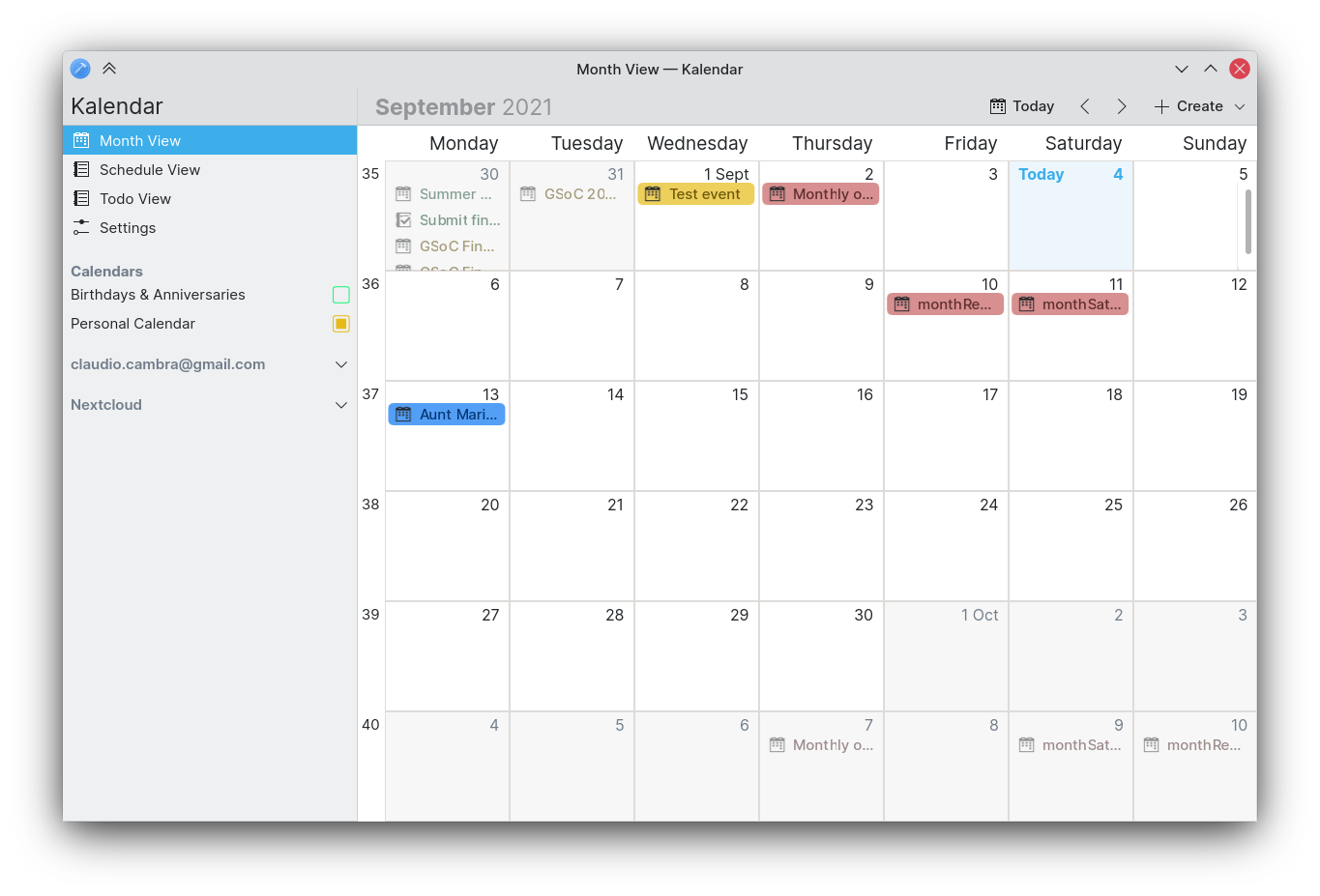
Your calendar sources in the sidebar are now collapsible, letting you hide an account’s calendars. This should make it easier to parse through your calendar list and also make it clearer as to which calendar belongs to which account. Local calendars are also now placed at the top, so they are not to be confused with remote calendars.

No todos? Here’s why

The todo view now provides some helpful messages to indicate why there are no todos to show. It can either be due to the fact there are, in fact, no todos left to complete, or because the calendar is not enable. In both of these situations, a helpful message and action is provided for you to address this.

Bug-fixes

!32: Rearrangements to incidence info drawer and general drawer fixes on mobile (Claudio Cambra)

  • No more phantom todos on calendar change or searching
  • Incidence info drawer now stays open after selecting a completed todo from the completed todos sheet
  • Scrolling through completed todos with a mouse now doesn’t have inertia, as expected
  • Global drawer now closes after making a selection when modal
  • Map busy indicator in incidence info drawer no longer shows up when the location is a link

!35: Adapt window title to current view (Felipe Kinoshita)

  • Window title now shows the current views’ name

!38: Make schedule view swipeable on mobile (Claudio Cambra)

  • Date synchronisation between views now fixed

Commit 69aff0ce: Fixed date misalignment issues in month grid (Claudio Cambra)

  • Date misalignment in month view grid now fixed

Commit 4816c94a: Fixed today button in month view (Claudio Cambra)

  • Today button now fixed in month view

!37: Don’t complain about invalid dates if the event is all-day long (Boris Petrov)

  • Fix inline error for all-day events

Coming up next

Everyone is asking about tag support in the todo view. We are working on it! Promise!!

Is there anything you’d like to see added to Kalendar? Get in touch! I’m @clau-cambra:kde.org on Matrix.
Checking events and ticking todos on your Pinephone — Kalendar devlog 12

Note: Kalendar is still under heavy development. You’re free to poke around and try it out, but it is not yet final software! If you want to contribute to its development, join us in Kalendar’s Matrix room.

This week, we have added a host of improvements to Kalendar that should make using it on a touchscreen a significantly nicer experience. To demonstrate, we are going to show Kalendar running on the Pinephone!

We also have a number of usability improvements on the desktop, additions to the todo view, and some performance improvements. Here we go!

Improving usability of touchscreens

!27: Mobile touch fixes and improvements (Claudio Cambra)
!29: Turn month view into a PathView (Claudio Cambra)

After briefly trying out Kalendar on the Pinephone over the course of the week, we found the experience finicky. This week, then, we have a couple of fixes. I’ll let this video do most of the talking:

A significant improvement to the interaction areas for incidences should improve navigation on a touch screen.

A bigger change is the implementation of the Month View as a PathView. Put simply, this lets us put several month grids on a path that you can swipe through. This has two effects: you can swipe through months on a touchscreen in a pretty intuitive manner, and on the desktop you also get nice animations!

Improving our use of space on the desktop

!25: Add simple global menu (Carl Schwan)
!31: Add sidebar to Kalendar (Felipe Kinoshita)

If you use Plasma’s global menu, you’ll be pleased to hear that we have added support for it this week! You will now be able to use a slickly-integrated menu for all your needs while using Kalendar. This menu has all the typical actions you will frequently use: adding new events/todos, undo/redo, etc.

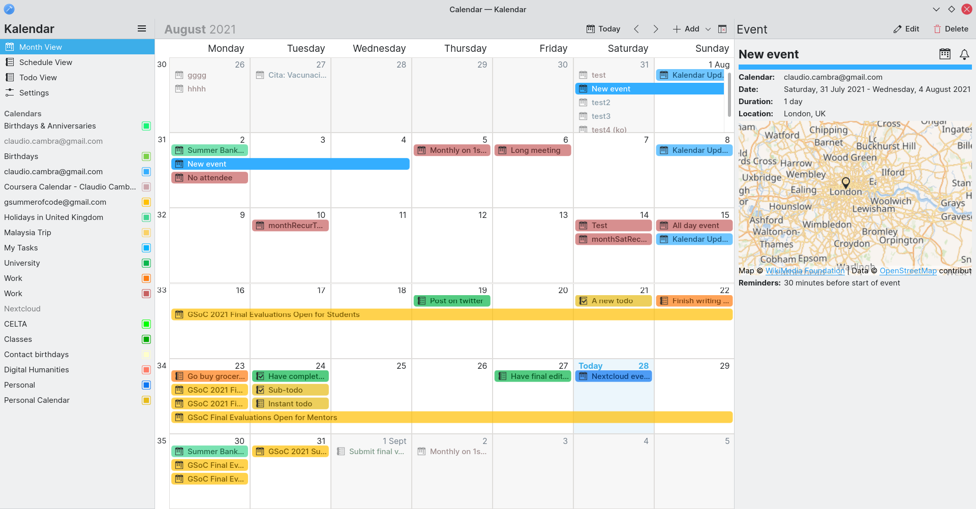
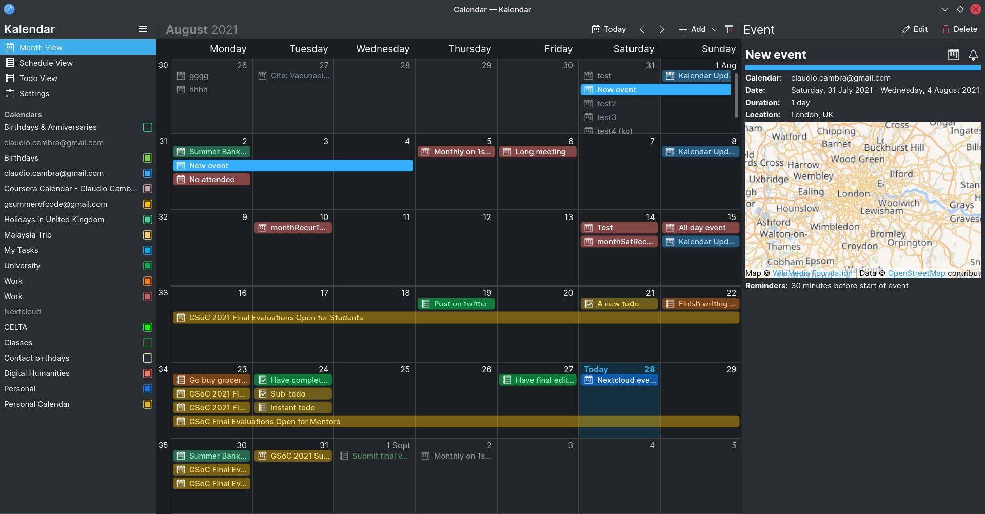
We have also included a new left sidebar that will make navigation and interaction significantly easier, especially on the desktop. This sidebar gives you actions to quickly access each of Kalendar’s views and to filter your calendars, making use of the ample space on your desktop screen to make things more accessible. Its behaviour also changes depending on the view you are currently in: in the month and schedule views, it presents you with all your calendars and lets you enable/disable them; in the todo view, you are simply presented with your todo calendars which you can not only enable/disable, but also click on to access only the todos in said calendar.

Making todos faster and more powerful

!21: Add a specialised todo view to Kalendar (Claudio Cambra)
!24: Add more and better ways to add todos (and subtodos) (Claudio Cambra)

Last week we added a new todo view that let you easily and quickly access your todos. This week we have added some new features that will make this view even more useful.

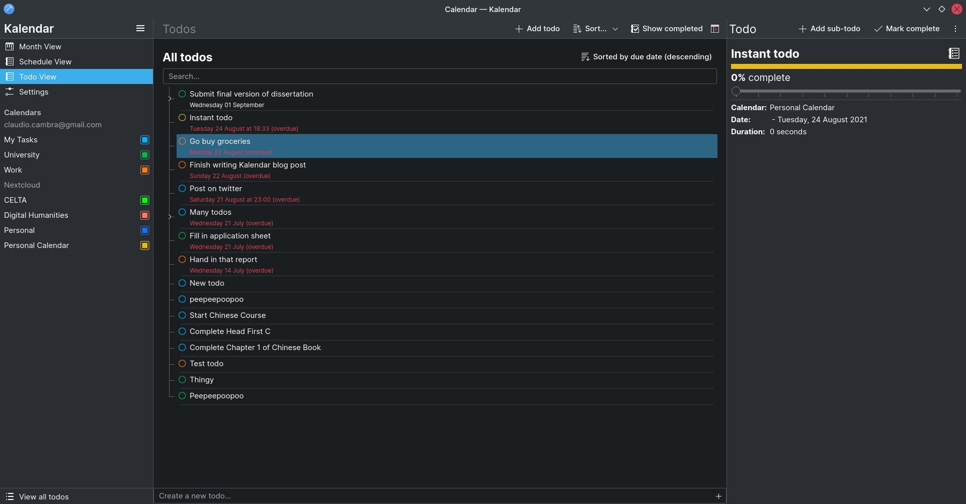
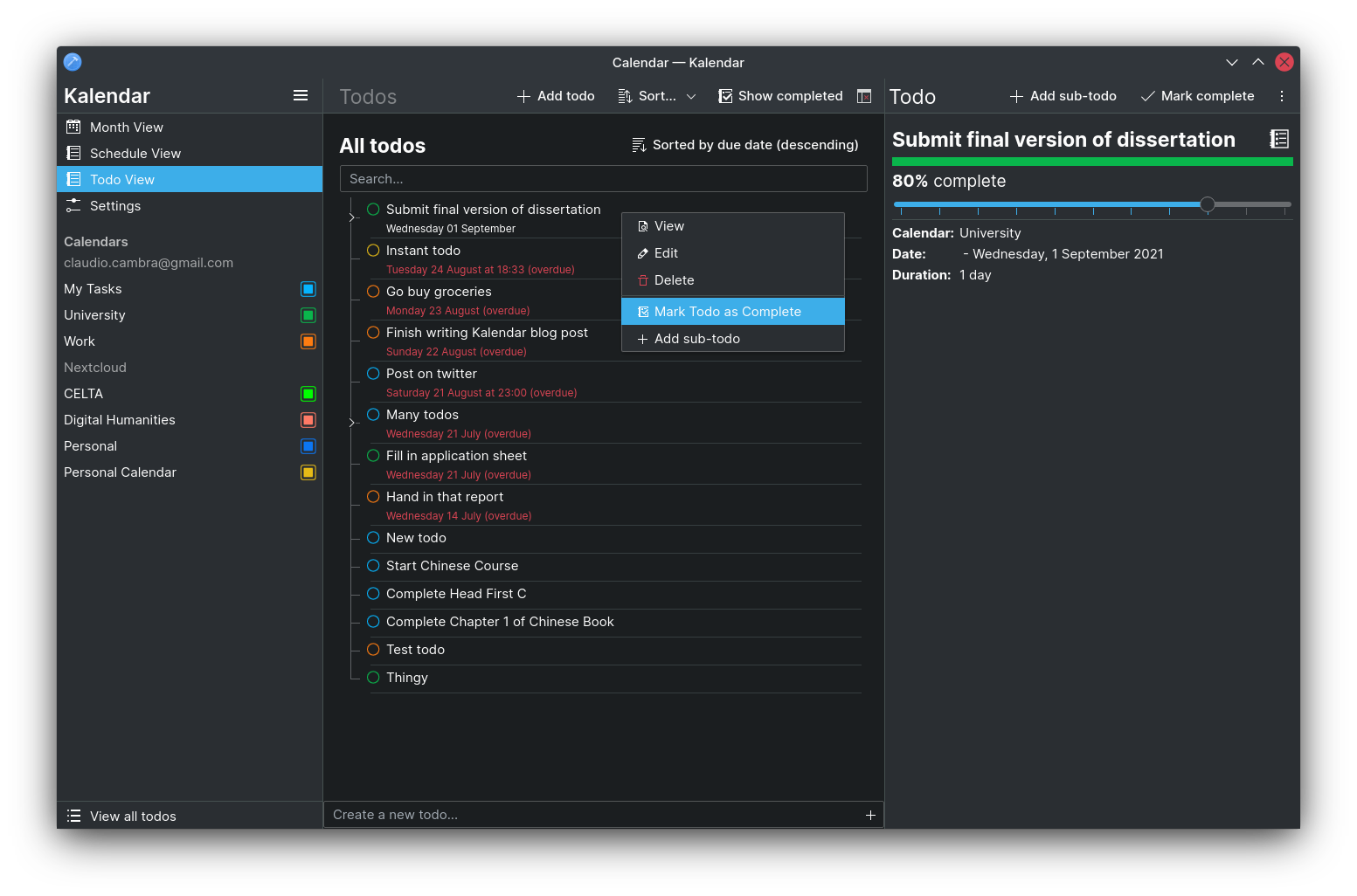
For one, you can now add sub-todos in a variety of different ways. First, you can do this through the incidence information drawer, which shows a convenient ‘Add sub-todo’ button now when viewing a todo. Additionally, you can also right-click (or hold tap) on a todo and then select ‘Add sub-todo’ from the popup menu.

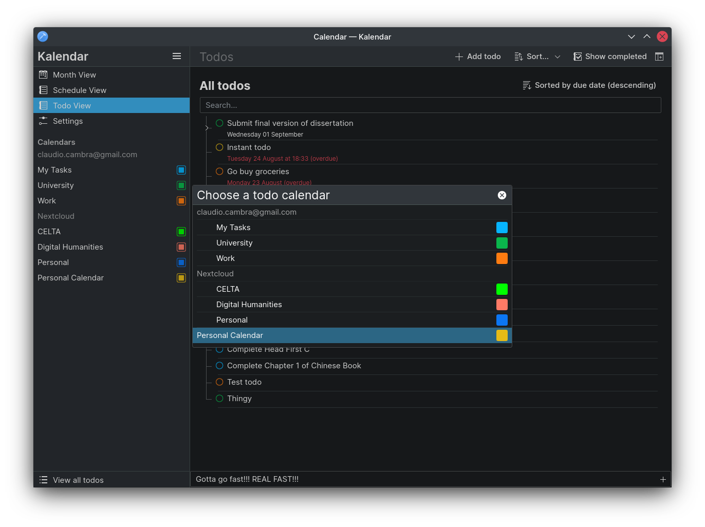
There is also now a quick-add todo text field. This lets you just write in the name of your new todo and add it instantly to the todo calendar of your choice, saving you time and effort! When viewing all your todos, you will be prompted for the todo calendar you’d like to add your todo to; when you’re already looking at a particular todo calendar, it will just get added to this one.

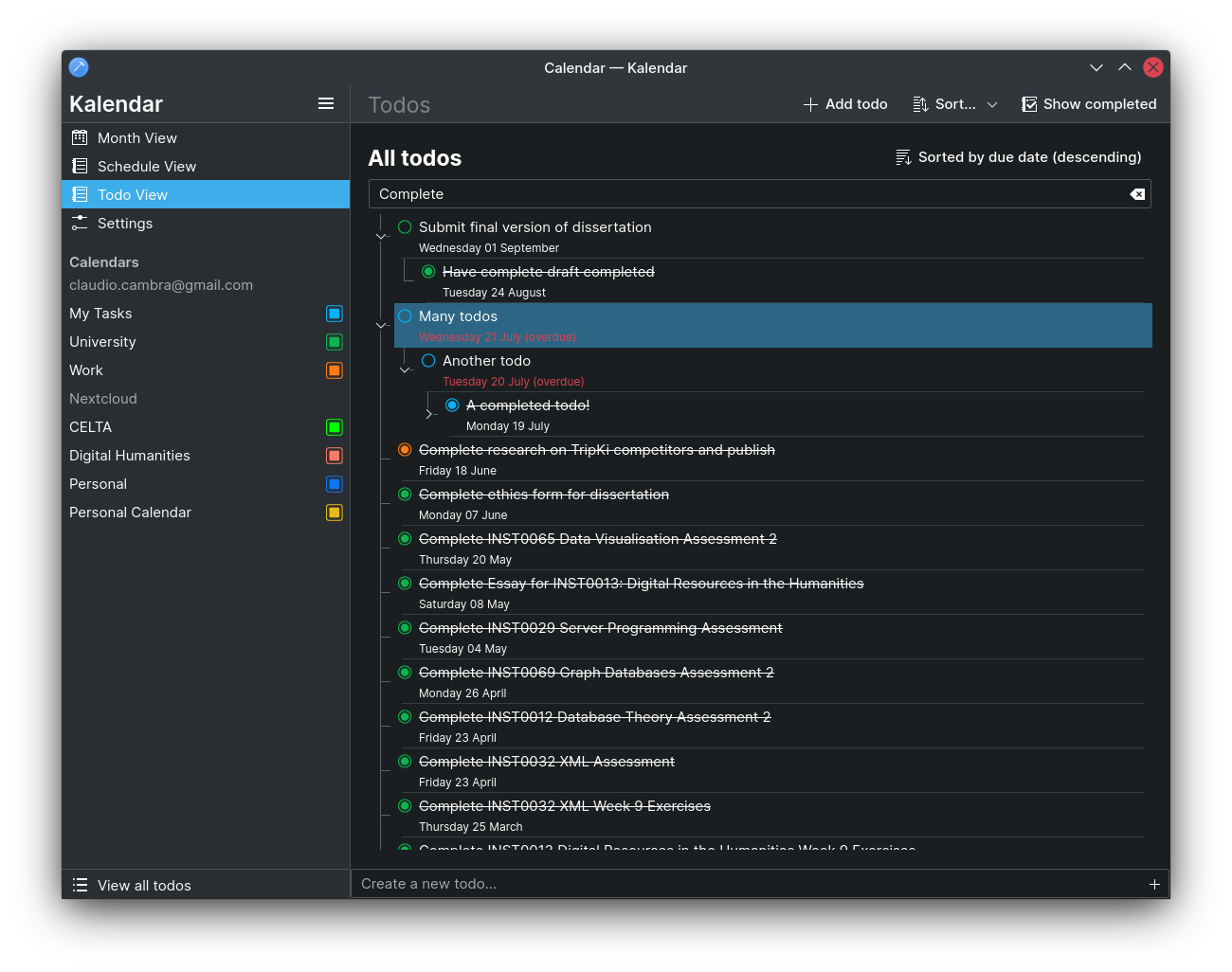
Lastly, we have also introduced a new search bar that lets you quickly search through all of your todos to find the right one.

Bug-fixes and performance improvements

!21: Add a specialised todo view to Kalendar (Claudio Cambra)

  • Incidence info drawer button now longer overlaps with actions in toolbar (Claudio Cambra)

!Simplify and moderately accelerate IncidenceOccurrenceModel’s updateFromSource()

  • Kalendar is now slightly faster at loading incidences

Coming up next

Now that the month view is swipeable, we want to give the schedule view the same treatment and make it a much nicer experience on mobile. We have also received numerous requests for tag support in the todo view, and we will be working on that too. There are more things in wait too 😉

Is there anything you’d like to see added to Kalendar? Get in touch! I’m @clau-cambra:kde.org on Matrix.