Big fixes, more customisation, many improvements — Kalendar week 10 (GSoC 2021)

Over the past week, work has focused on three things: stability, tweaks, and options. Once again, all of your feedback has been valuable and it has driven many of the additions and changes you all have asked about over the past few weeks.

There’s a lot to get through, so let’s get started!

Making maps even more useful

!15: Add opt-in location maps to Kalendar
!16: Also consider existing geo coordinates for positioning the map

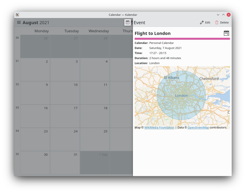
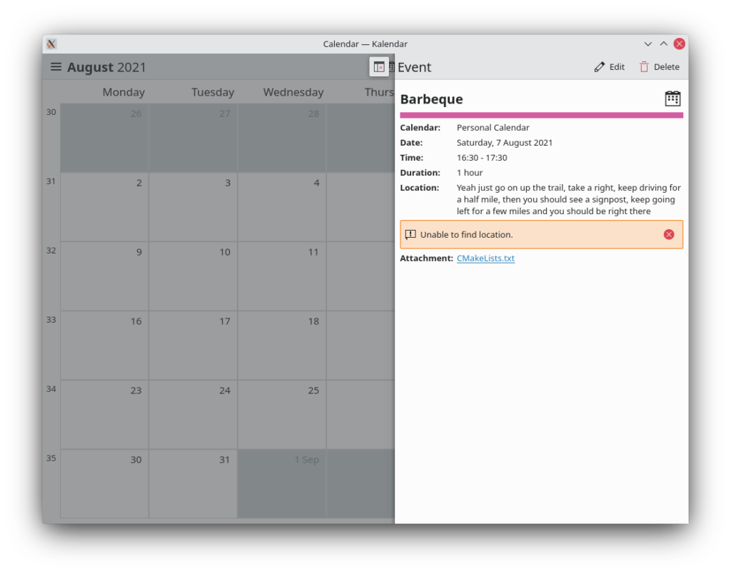
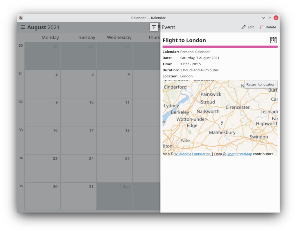
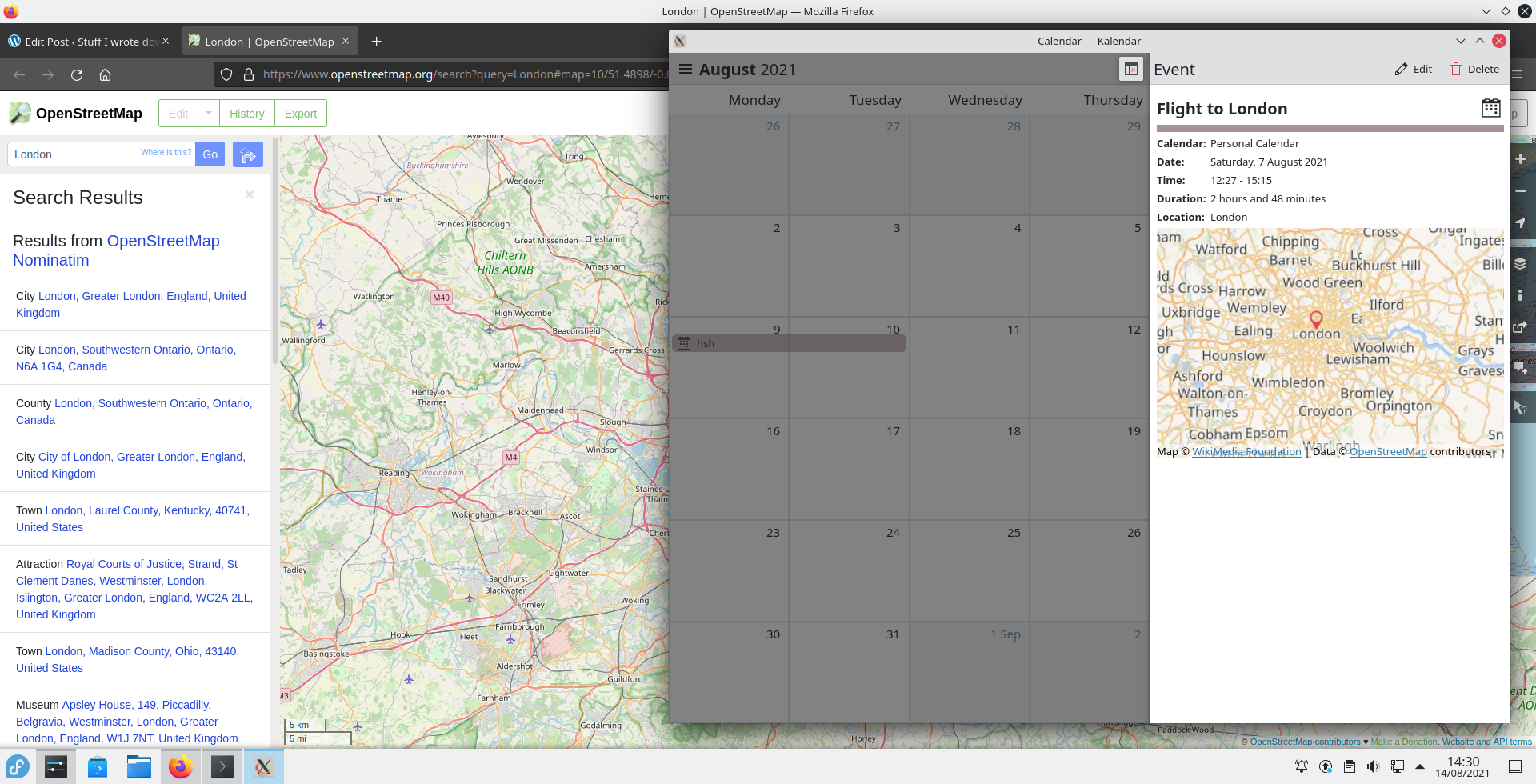
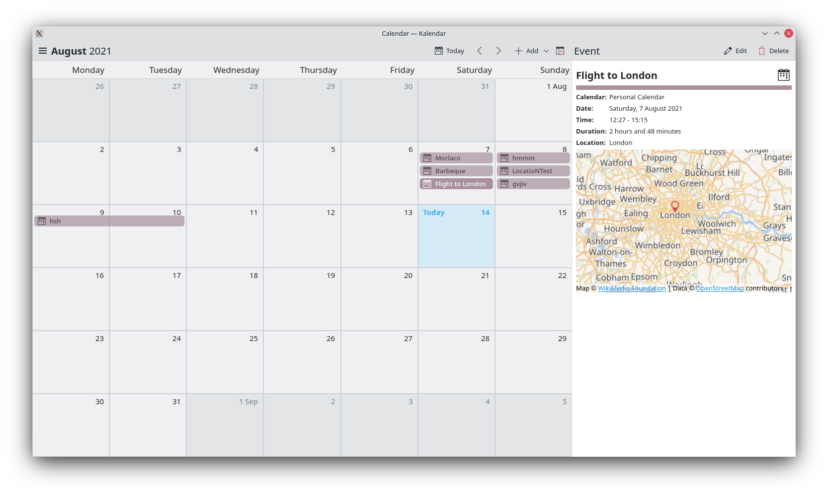
Last week we showed off our new maps in the incidence information sidebar/drawer, showing the location of an event or todo. This week we added a couple of extra location-related features.

Clicking on the location text for an incidence now copies this text to your clipboard, letting you quickly paste this location into your desired mapping application. Clicking on the map itself now opens OpenStreetMaps at the incidence’s set location, for extra convenience. You can still click and drag the map to see stuff as usual, but a quick click will open OSM.

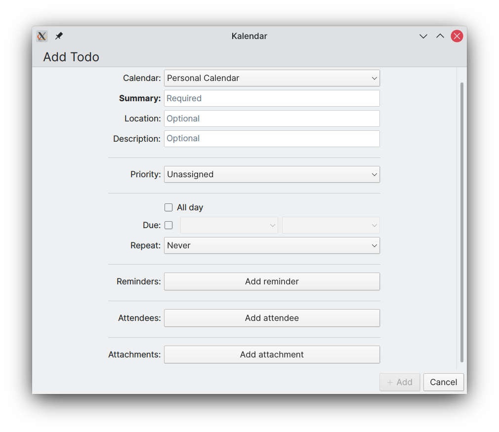
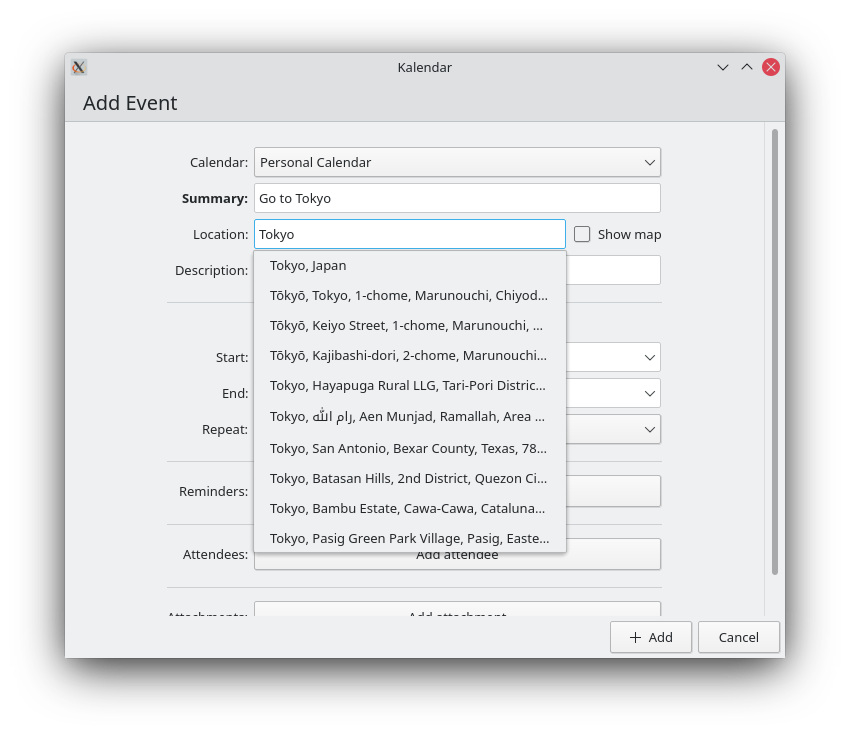
Furthermore, the event and todo editors now also have a map you can use to set an event or todo’s location. All you have to do is click on where you’d like to set this incidence and the relevant location text will be set.

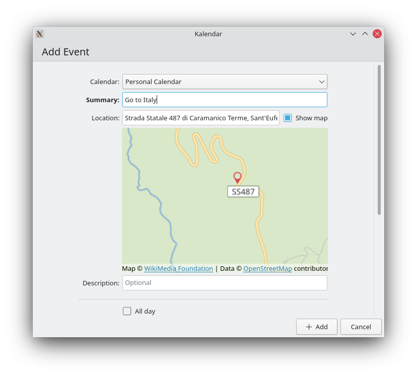
While setting a location manually, you’ll also now get location suggestions automatically, making it quicker for you to fill in this field!

Volker Krause also kindly submitted a merge request adding support in Kalendar for Akonadi incidences that have their locations set as coordinates. This should enable compatibility with certain applications and plugins such as KMail’s Itinerary plugin.

Visual tweaks and improvements

!17: Collection of fixes for bugs and visual tweaks throughout Kalendar

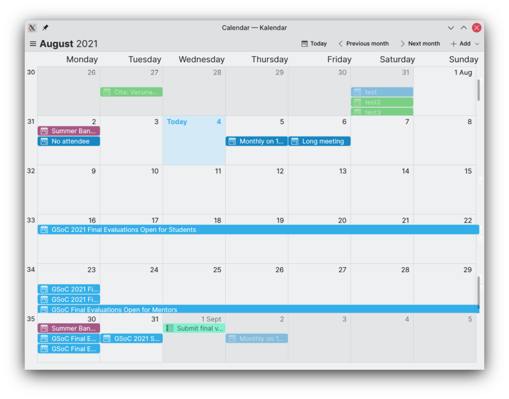
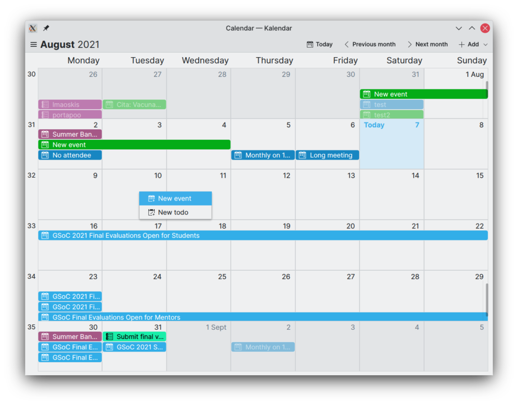
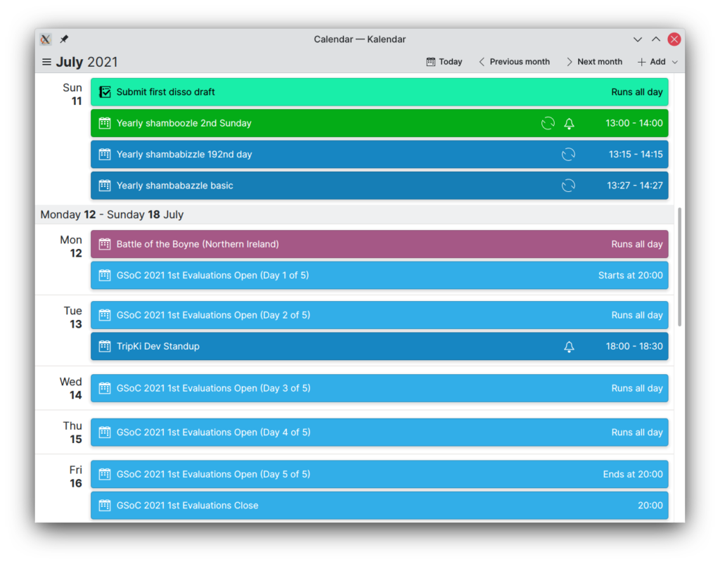
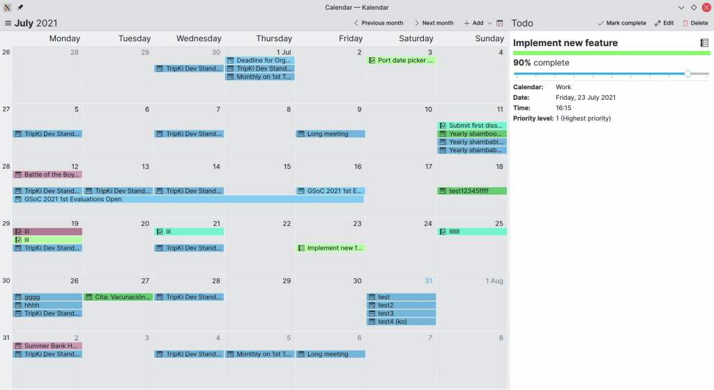
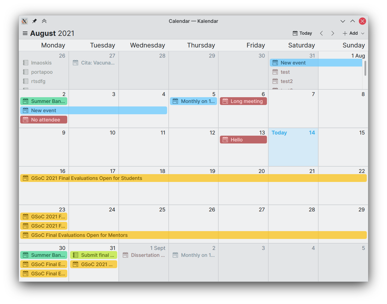
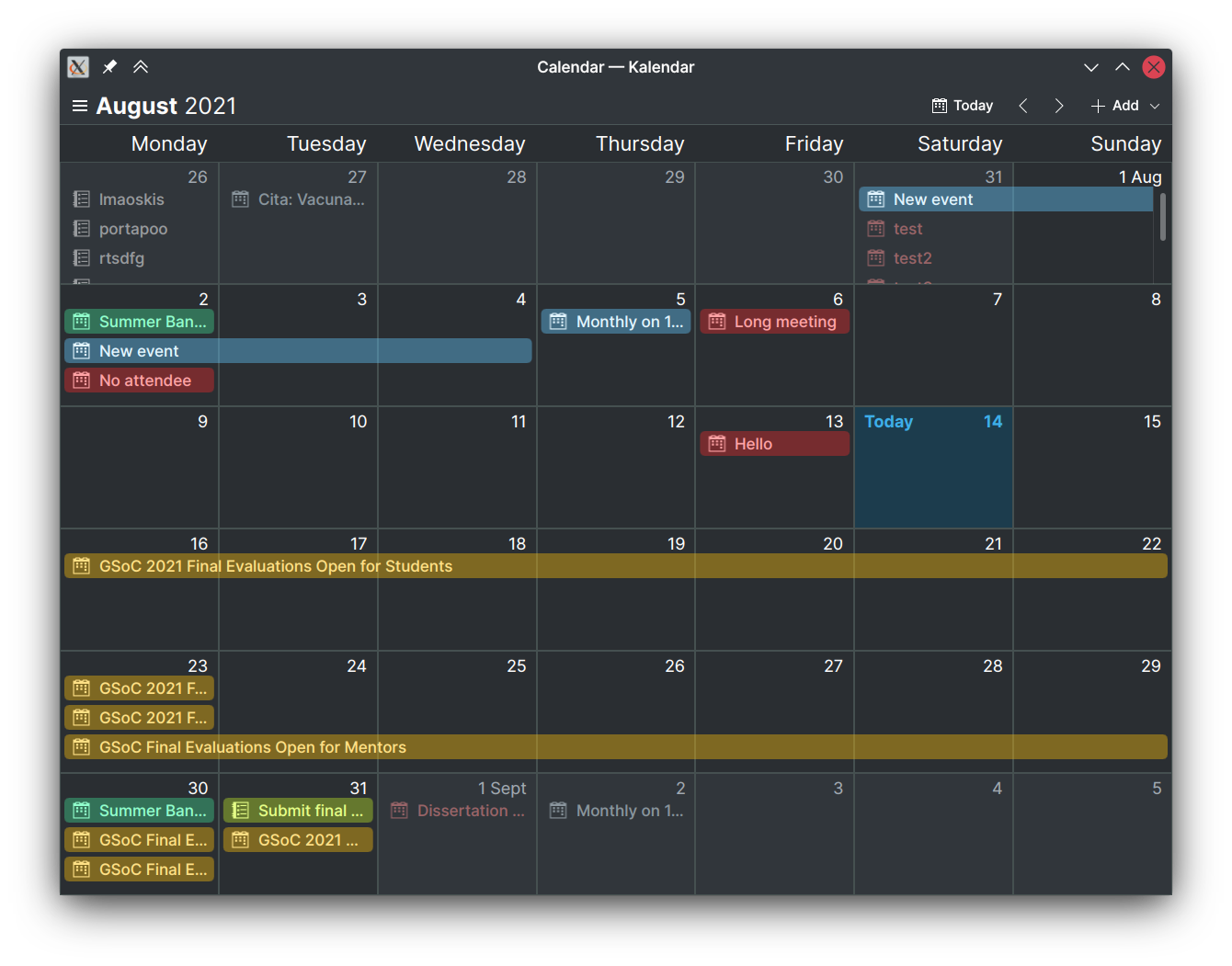
We have changed the colouration of the incidence lines to now be even prettier than before. Whereas incidences were previously coloured as a solid colour, with black or white text, incidences now have slightly transparent backgrounds with matching coloured text. We have taken care to make sure there is still enough contrast to make text readable, tweaking and refining our colours and slightly thickening incidence texts so that they remain readable. We have also tweaked the colours depending on whether your system is set to light or dark mode for the best contrast and the coolest aesthetic possible. 😉

To further differentiate between incidences in the currently-viewed month and incidences in previous/future months, we have also changed these incidences to only show their text and no background.

When clicking on an incidence, it will be highlighted. Its background will become solid and the text will return to being black or white depending on what will provide more contrast. This way, you will know exactly what event or todo you are looking at in your views.

We have also added some padding to incidences on all sides, which should help make the view feel slightly more spacious and less cramped.

Customisation

!18: Add customisation options to Kalendar

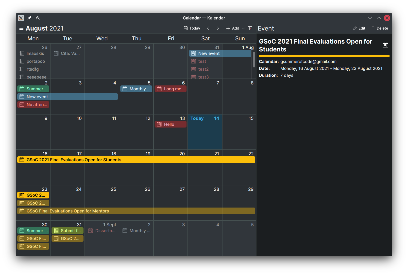
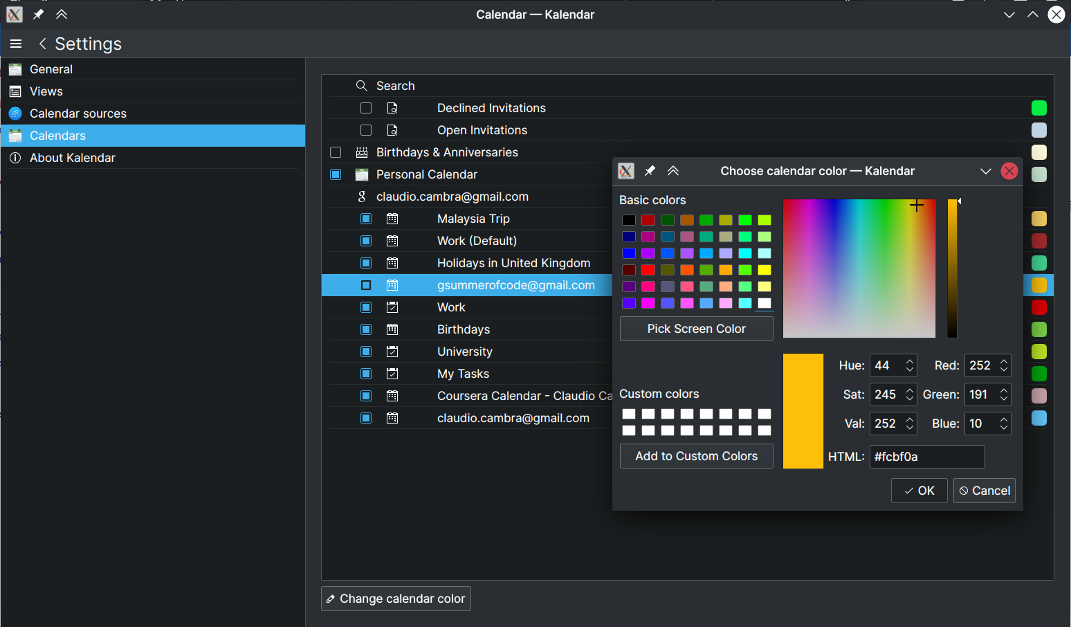
Kalendar now also lets you customise much of its appearance. A major new feature is the ability to customise your calendars’ colours. A new colorpicker can be found in Kalendar’s settings (Settings -> Calendars -> Change calendar colour), letting you select any colour you want. The calendar settings now also let you see what colour each of your calendars is set to have.

Some of the month view’s aesthetics can now be changed. The week numbers previously seen to the left of the month grid can now be enabled and disabled. The weekday labels can now also be customised, both in alignment and in format.

Month view with no week numbers, centre-aligned and abbreviated weekday labels

Similar options can be found for the schedule view, which now lets you enable and disable the top month header as well as the weekly section headers.

Finally, you can now also set what sort of marker you’d like to see for the set locations of Kalendar’s maps. Your choices are either a pin, which shows a place’s exact location, or a circle, which shows the location’s overall area.

Bug-fixes

This week, we have fixed many bugs, both the annoying and the disastrous kind.

!17: Collection of fixes for bugs and visual tweaks throughout Kalendar

  • Dates are now all aligned correctly in the month grid view no matter what timezone you are in. This was caused by a bad conversion from a C++ QDate object to a QML date object.
  • Rewrote the layoutLines function that handled laying out all incidence’s lines in the month view. Now it is faster and less bug-prone. No longer will some incidences cover up others.
  • Incidences now no longer sometimes leave an empty line when there are all-day events in the month grid view. Now, all incidences go top to bottom, as you’d expect.
  • Fixed horizontal scrollbars appearing on each of the month grid’s rows.

!18: Add customisation options to Kalendar

  • Calendar colours are now correctly pulled from the Akonadi backend, meaning calendar services that support synchronisation of your calendar colours will now have matching colours. Kalendar will now also try to pull user-set calendar colours from KOrganiser if these exist.
  • Fixed clipping issues in the month view, affecting weekday labels and the ‘Today’ text on the current day of the grid.
  • Fixed ‘Calendar sources’ page of settings not working properly on mobile.

These fixes should go a long way to letting more of you test Kalendar!

Coming up next

We’re getting close to a usable product here! We do want to add a couple of new views (todo and week views, mainly) and to also iron out remaining issues.

Is there anything you’d like to see added to Kalendar? Get in touch! I’m @clau-cambra:kde.org on Matrix.

Making Kalendar pretty — Kalendar week 9 (GSoC 2021)

This week, we spent some time making Kalendar more pleasant to look at. We took some of your feedback from last week (thank you for your ideas!), and we think you will like what we have in store for you in this post.

There’s another feature some of you have asked for that you will also see here. 😉

Improved the appearance of the month view and visual consistency across views

!14: Improve month view and schedule view visually

Here’s a comparison of the old (left) month view, and the new (right) month view:

Better, right? Well, a lot of little visual tweaks do add up to make a big difference. We started with the event ‘lines’, which were previously not very contrast-y and sometimes tough to read. Now, we have given these event lines more vibrancy and ensured that the text colour changes depending on the colour for better contrast.

We have also given these lines slightly more padding, making them feel less cramped. Adjustments to the border radius now also make their shape match those of the incidence cards in the schedule view.

More changes for consistency include the separation lines between the cells in the month view grid, which are now the same colour as the Kirigami separator components used in the schedule view.

The most noticeable change is the differential colouring of the month view cells. Cells that correspond to months other than the selected month are now darker, and their events have less contrast. For the cell corresponding to the current day, the background is now highlighted, and the day number is bolded with “Today” text being featured alongisde it. This should make it much easier for you to locate the current day on the grid.

By the way, we also added the “Today” highlight to the schedule view. 🙂

Added location map to incidence information drawer

No MR yet: code can be found on branch work/location_map

We are also working on including a map in the incidence information drawer for incidences that have a set location. I know some of you asked for this, and I’m glad you did: it looks pretty cool!

When opening the drawer, Kalendar fetches data from OpenStreetMaps to display the area where your event or todo is taking place, overlaying a blue circle for the exact location. In cases where a location can’t be found from the event’s set location information, you’ll see a dismissible warning instead.

If you like exploring around the map, that’s fine: as soon as the location leaves the map’s viewable area, a button will show up that will take you right back to the location.

This feature, unfortunately, comes with a big caveat. There are several reports of QtLocation Map components crashing QtQuick applications on some systems (including my own!). We are going to keep working on this feature, and hopefully most of you will be able to enjoy it — but it will be opt-in so that users with machines affected by these crashes can still use Kalendar as normal.

If you know about this issue and know of a workaround/fix, please let me know!! It’ll make me very, very, very happy. 😀

Added “Today” button in all views

!14: Improve month view and schedule view visually

Both the month view and the schedule view now feature an action that lets you quickly return to the current day. This should make it easier to get back to where you want to be in your calendar.

Day drop-down menu now also available in the month view

!14: Improve month view and schedule view visually

Right-clicking on a day in the month view now popups a helpful drop-down menu that lets you quickly and easily add incidences of your choice to your calendar.

To be honest, this should have been working before, but it wasn’t. Now it is. Yay!

Added additional icons to the schedule view

!14: Improve month view and schedule view visually

Previously, the cards on the schedule view displayed an icon when an incidence had a set reminder. Now, the cards in the schedule view also display whether an event is recurring or not.

Bug-fixes

Two important bugs have been squashed over this past week.

These fixes should go a long way to letting more of you test Kalendar!

Coming up next

Work on the location map will continue over the course of next week. Fingers crossed, we’ll be able to find a fix for the map crashes and get that feature rolled out to everyone. We’re also in the process of making a todo view, which should let Kalendar take care of much of your time-related productivity needs.

Is there anything you’d like to see added to Kalendar? Get in touch! I’m @clau-cambra:kde.org on Matrix.

Meeting with your mates — Kalendar week 8 (GSoC 2021)

Last week’s large merge request added the ability for Kalendar to add, edit, view and delete todos alongside events. That MR was merged on Friday and you can now play around with it on Kalendar’s master branch!

This week, a lot of time was spent polishing that MR as well as adding a few additions to make it even nicer for you to use todos. A new MR has also been added this week which adds a convenient new feature to the incidence creation process.

Let’s go through what’s new!

Making todo completion more granular and accessible

!12: Add support for more incidence types

Since last week, you were able to create and view new todos and mark them as complete or incomplete from the incidence information drawer. That was nice, but it didn’t offer much granularity over setting exactly how complete a todo was.

This week, the incidence view component now includes a slider that lets you easily change how complete an ongoing todo is. The completion of a todo is also clear and easily visible near the top of the drawer.

Adding support for todo-specific features

!12: Add support for more incidence types

Kalendar now also lets you adjust the priority level of a task. Priority levels will let you quickly see how important a task is, and to manage your schedule in accordance to the importance of different todos. Priority levels can be set on a scale of 1-9 (descending order of importance). This is then presented to you in the information drawer, with a short description of what that priority level means.

Another new feature specific to todos is the ability to create todos without a set due date. This currently makes the todo invisible on Kalendar, as it won’t show up on the currently-supported time-based views… but this will not be the case forever. 😉

Making incidences’ right-click drop-down menus more useful

!12: Add support for more incidence types

Whereas in past weeks right-clicking on an event or todo only presented you with the choices ‘Edit’ and ‘Delete’, the drop-down menu is now a little more useful. Two new options have been added: the first is ‘View’, which opens the information drawer in much the same way that left clicking an incidence would do. On todos, you are also presented with the option to mark the todo as complete or incomplete depending on its status, which should make it easy for you to quickly alter that todo’s status.

Adding a contact picker

!13: Add a contact picker for easy attendee addition

Kalendar’s incidence editor now features a convenient contact picker. You are given the choice of using it when choosing to add new attendees to an incidence, helping you add guests more quickly and easily than doing so manually.

The contact picker features a list of your contacts (including those in your synchronised online accounts), letting you select them, remove them, or search through them as you please. Adding a contact as an attendee is as simple as tapping them, with their addition indicated by a checkmark next to their names. Doing the same on a contact that has already been added will remove them from your attendees.

The contact picker’s user interface is heavily based on the work done by the Plasma Mobile Phonebook team, so a big thanks to them for making such a nice-looking app. 🙂

Coming up next

Remember when I said that those todos without due dates won’t be inaccessible forever? Well, work is ongoing on a todo view that will let you view, edit, and sort through your todos exclusively. Thanks to comments from readers like you, we also have some ideas about new additions we can make to areas such as the information drawer.

Is there anything you’d like to see added to Kalendar? Get in touch! I’m @clau-cambra:kde.org on Matrix.